Brutalist Color Palette Ideas for Grounded Architectural Living

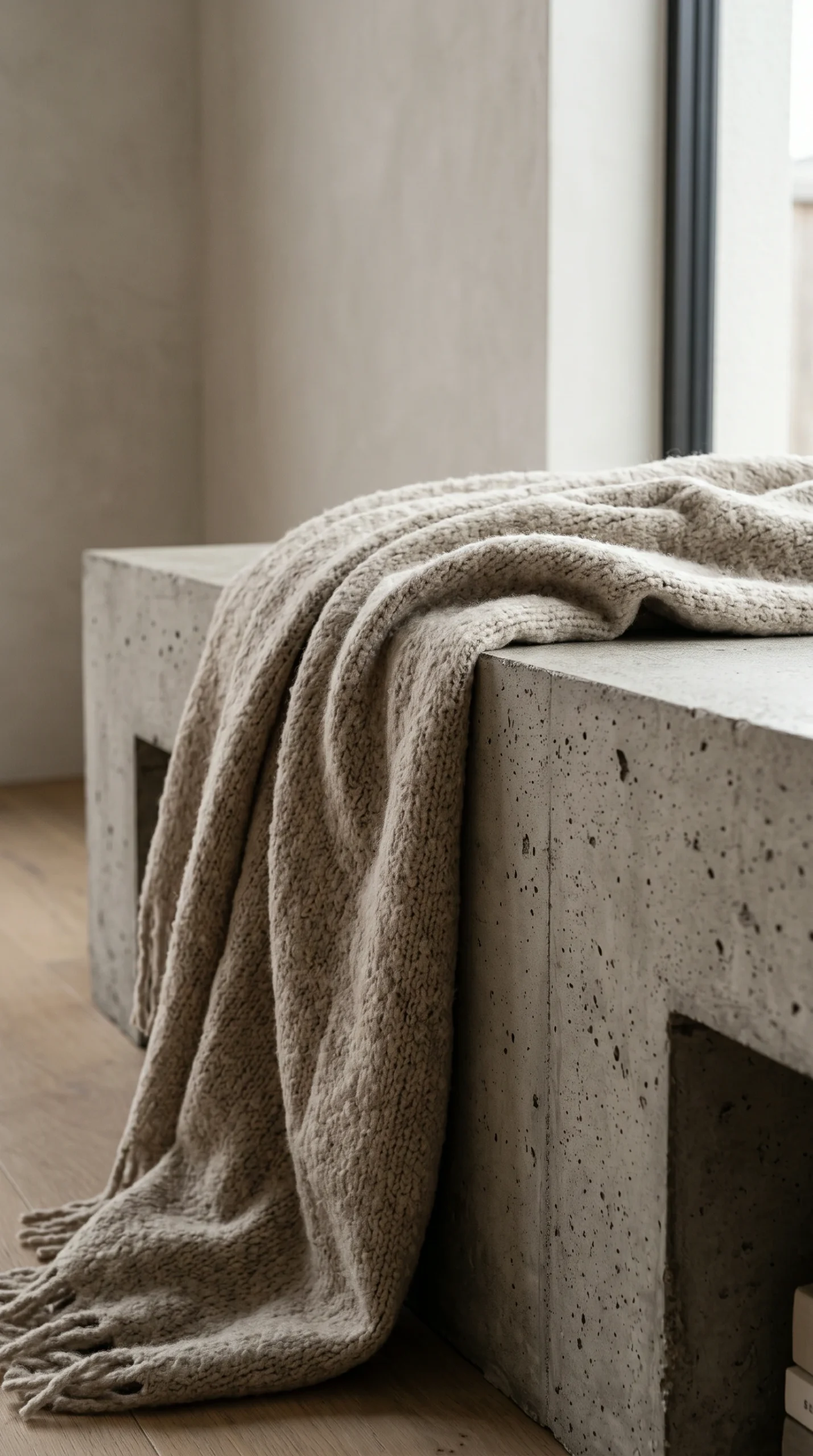
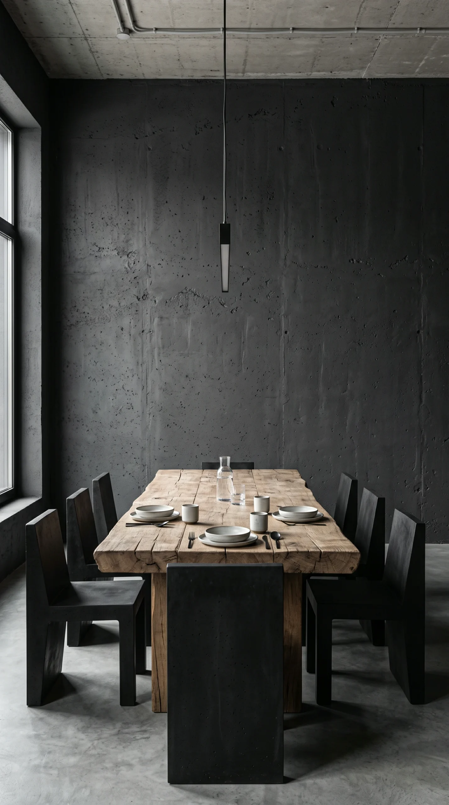
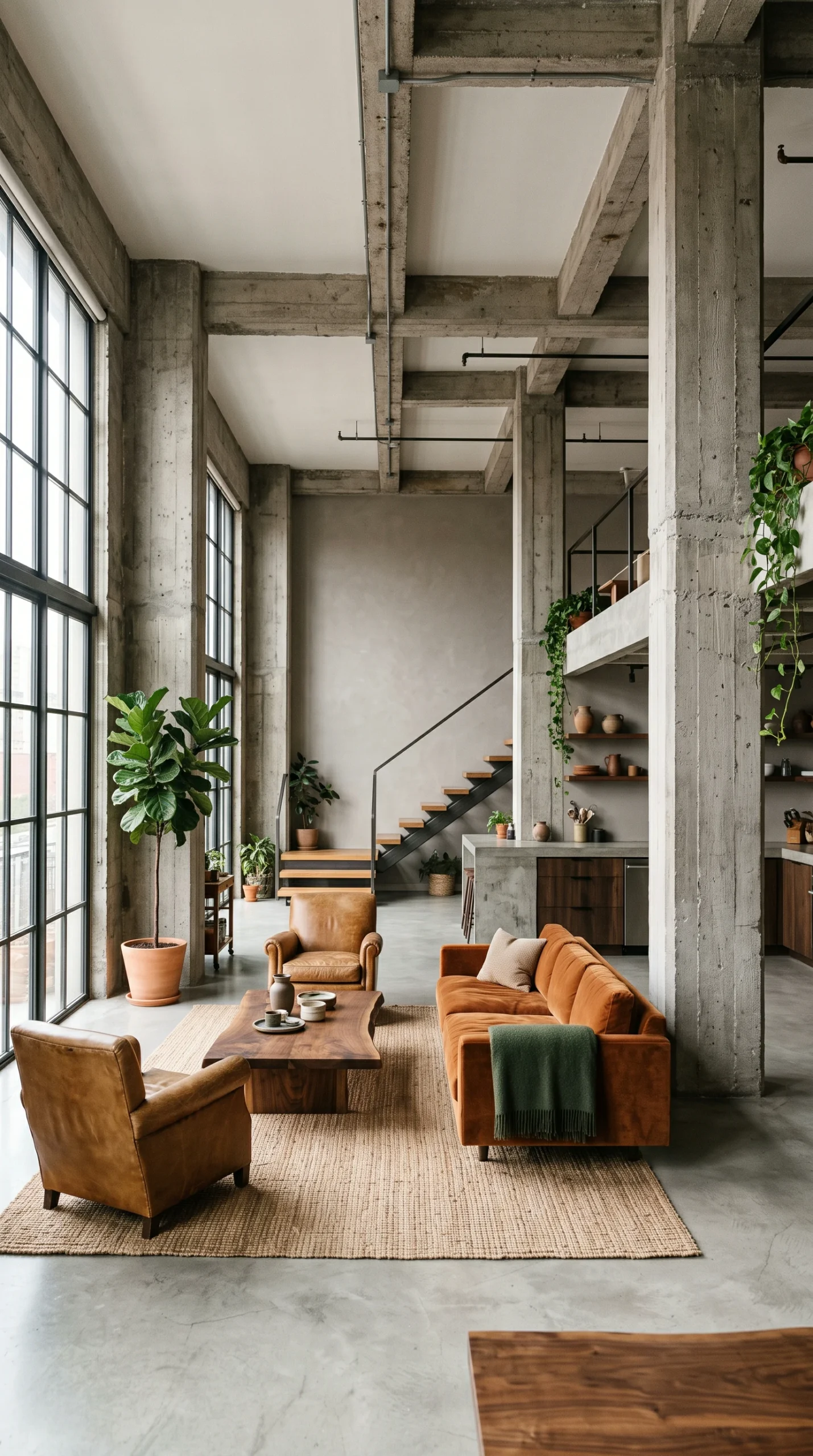
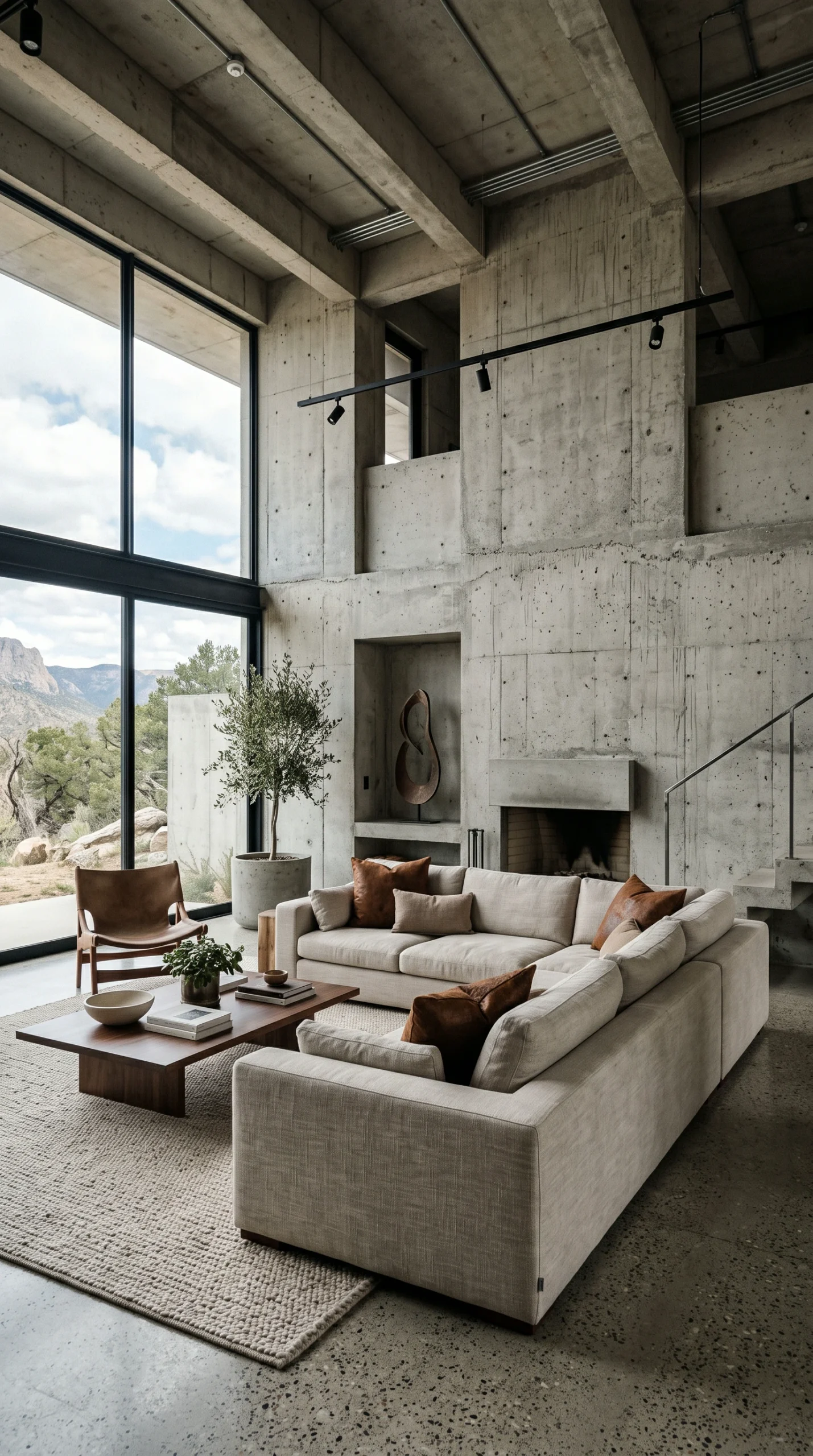
Brutalist color palettes are defined by the geological honesty of raw materials rather than synthetic paints. By balancing a 60% concrete grey matrix with 30% warm smoked walnut and 10% oxidized rust and bronze accents, you create an interior of profound architectural depth and warmth.

Concrete Matrix (60%)

Establish a foundation using light ash to medium concrete greys (LRV 35 to 50) on continuous floors and feature walls to keep spaces open.

Timber Anchors (30%)

Incorporate rich smoked oak, dark walnut, and raw travertine on furniture and vanities to introduce essential biological warmth.

Ember Accents (10%)

Layer oxidized bronze lamps, rusted velvet pillows, and blackened steel to provide rich focal contrast against cool masonry.

Warm Spectrum Light

Calibrate lighting strictly to 2400K to 2700K warm white (CRI 90+) to neutralize cool cement undertones and highlight texture.

Raw Concrete, Void Black, and Oxidized Bronze Palettes

Explore curated Brutalist palettes featuring poured concrete walls, void-black kitchens, aged zinc tables, and dark walnut joinery.

Essential Planning Checks for Brutalist Color Schemes

Review these critical undertone, reflectance, and lighting considerations before finalizing finishes in a Brutalist interior.

Balance the 60-30-10 Ratio

Combine 60% concrete grey surfaces, 30% warm dark timber, and 10% patinated bronze or rust accents for natural harmony.

Check Cement Undertones

Avoid pairing cool blue-cast Portland cement with yellow off-whites; use chalk white, mineral greige, or warm lime plaster.

Monitor Light Reflectance

Keep primary masonry surfaces between 35 and 50 LRV to prevent dark grey rooms from absorbing too much daytime light.

Test Under Varied Light

Assess material swatches under both cool morning daylight and warm 2400K to 2700K evening lighting before committing.

Embrace Living Metals

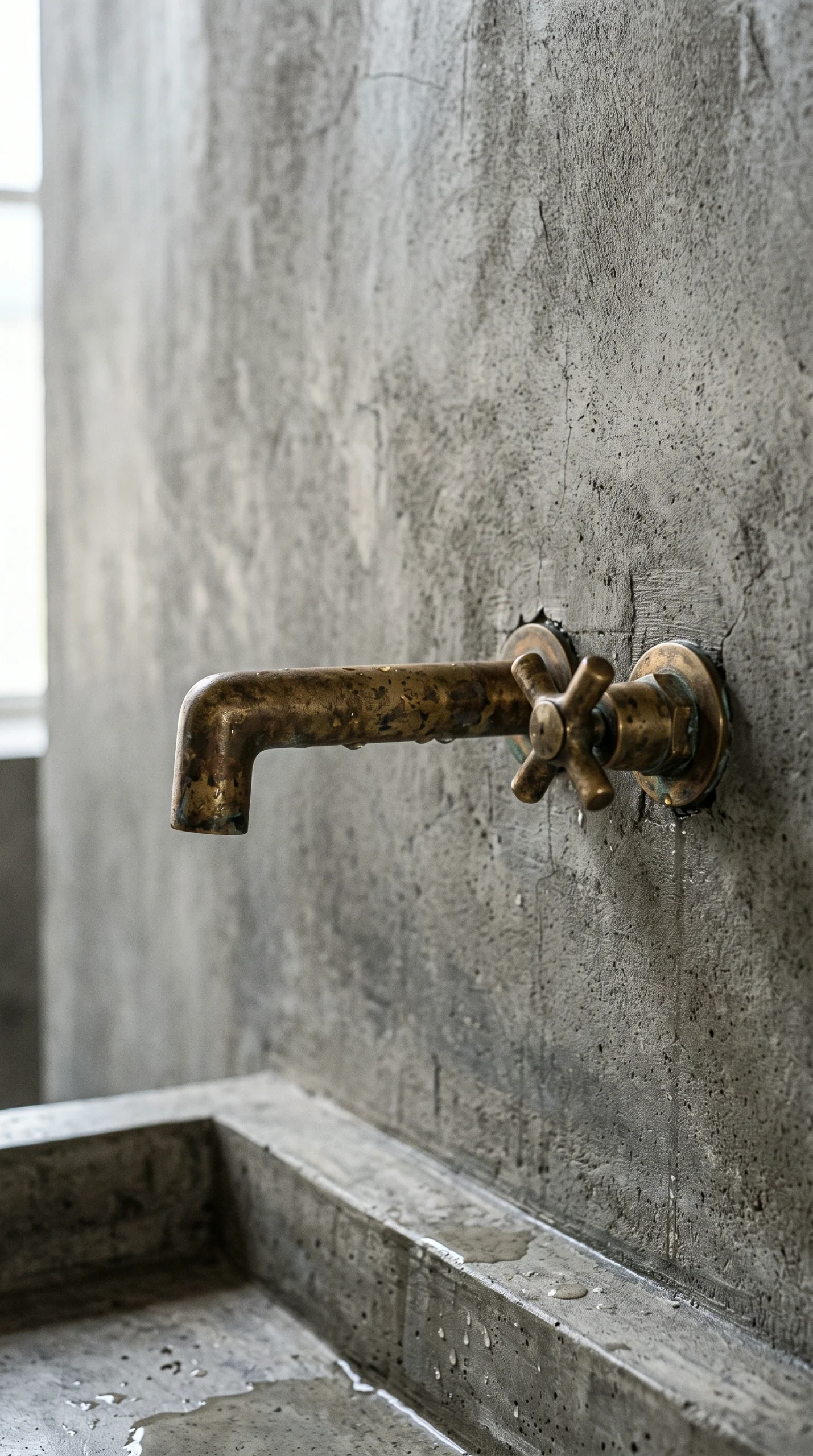
Incorporate aged zinc, oxidized bronze, and raw brass whose evolving natural patina mirrors the weathering of concrete.

Architectural Material Palettes: Color Strategy in Brutalist Interiors

Brutalist interior design is often misunderstood as an aggressive monoculture of cold, sterile greys. While early civic megastructures in the mid-twentieth century relied primarily on unadorned Portland cement, residential Brutalism uses color far more intentionally. In a living space, an authentic Brutalist palette does not come from a synthetic paint fan deck; it is drawn directly from the geological honesty of raw materials—poured concrete, aged zinc, oxidized bronze, charred timber, and natural earth pigments.

When curating colors for a Brutalist home, the goal is not to eliminate warmth, but to root that warmth in raw, unvarnished substance. By understanding material undertones, balancing light reflectance, and introducing earthy accent tones, you can assemble a color scheme that feels grounded, architectural, and deeply atmospheric.

The 60-30-10 Architectural Ratio for Raw Spaces

In standard interior decorating, color formulas often balance primary, secondary, and accent paint shades. In Brutalist design, this ratio is translated into physical surfaces and textural materials.

60% Dominant Foundation: The Concrete Matrix

The dominant surface area—typically encompassing continuous floors, structural columns, or primary feature walls—sets the architectural baseline:

  • Light Ash to Medium Concrete Greys: Concrete surfaces with a Light Reflectance Value (LRV) between 35 and 50 reflect enough natural daylight to keep rooms feeling spacious while retaining industrial gravity. Poured concrete, microcement, and light lime plaster form this calm foundation.
  • Avoiding Sterile Bright Whites: Standard brilliant white ceiling paint (LRV 85+) creates an aggressive, high-contrast shock against grey masonry. Instead, choose muted chalk whites, soft oatmeal, or warm greige that blend organically with cement aggregate.

For guidance on applying continuous microcement across rooms, explore our guide to small Brutalist apartment ideas.

30% Secondary Anchor: Warm Timber and Heavy Stone

A room wrapped solely in grey concrete feels like an unfinished construction site. The secondary material layer provides biological warmth and visual grounding:

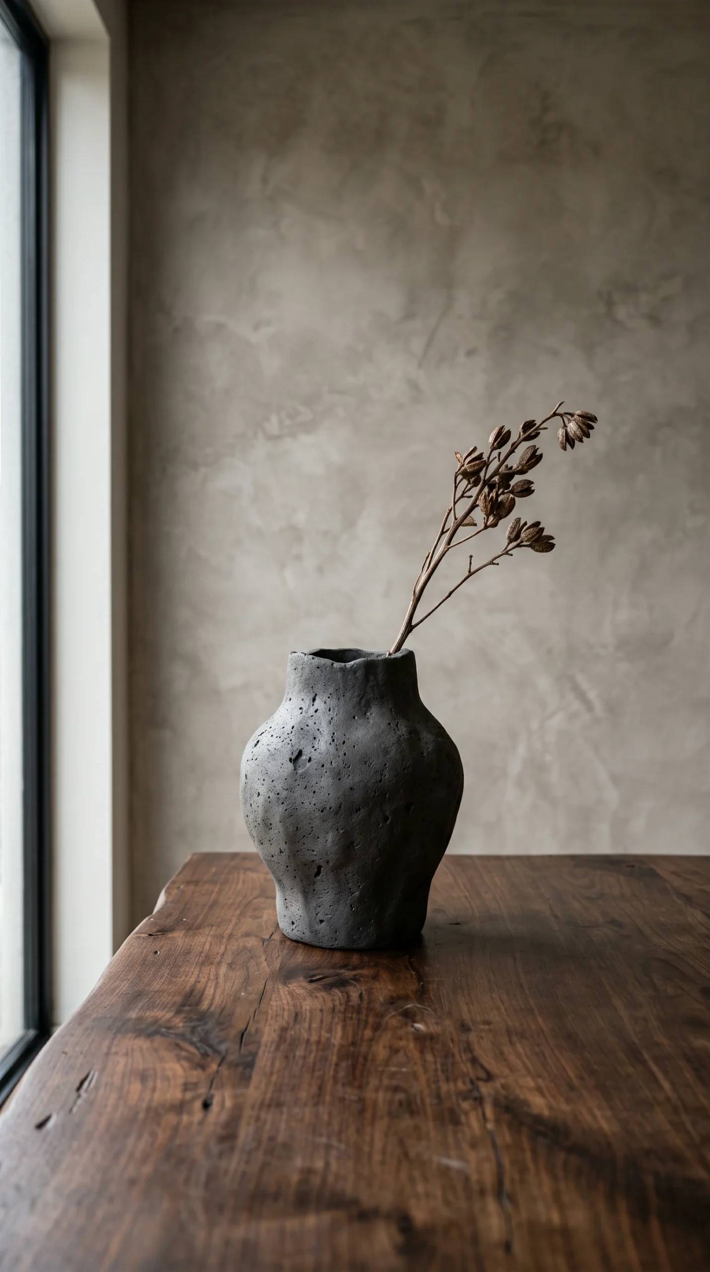
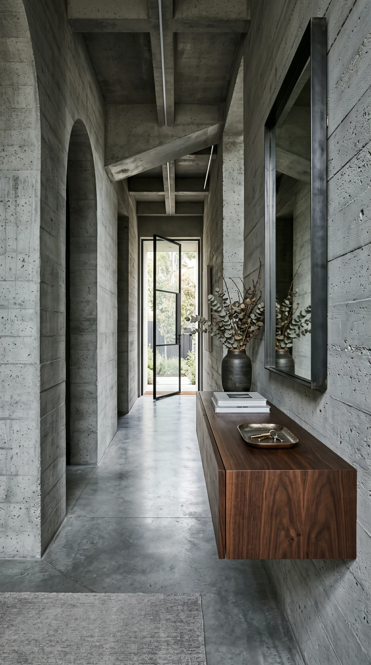
  • Deep-Toned Hardwoods: Rich dark walnut, smoked European oak, or reclaimed timber consoles and dining tables introduce warm amber and cocoa brown undertones that counterbalance cool masonry.
  • Textured Masonry and Basalt: Incorporate honed slate, charcoal basalt, or warm pitted travertine on countertops, floating vanities, and fireplace surrounds to introduce mineral complexity without adding bright colors.

To see how these woods and stones translate into monolithic furnishings, review our guide to Brutalist furniture ideas.

10% High-Contrast Accents: Oxides and Metals

Accent colors in Brutalist interiors should feel forged or weathered rather than applied with a paintbrush:

  • Rust and Burnt Earth: Velvet throw pillows, raw ceramic bowls, or cognac leather upholstery in deep terracotta, rusted iron, or raw umber bring intense thermal warmth to living areas.
  • Patinated Living Metals: Oxidized bronze lamps, aged zinc side tables, and blackened steel hardware introduce dynamic shadows and metallic highlights that age beautifully alongside stone.

For advice on curating bronze lamps, sculptural vessels, and raw stone decor, consult our guide to Brutalist decor ideas.

Managing Undertones: Avoiding Sickly Clashes

One of the most common pitfalls in concrete decorating is undertone friction. Not all greys are created equal, and pairing the wrong wall color with concrete can make a home feel muddy and awkward.

The Cool Portland Trap

Standard Portland cement possesses natural blue and cool green undertones. Pairing cool-cast concrete directly with creamy, yellow-based off-white paint creates an unpleasant greenish-yellow cast where the two surfaces meet. Instead:

  • Pair cool concrete with crisp chalk white, mineral greige, or soft stone taupe.
  • If you want warmer walls, apply natural lime plaster tinted with raw earth umber. Lime plaster has a breathable, crystalline structure that scatters light smoothly, bridging the gap between warm furnishings and cool masonry.

To see how these palettes flow into relaxing bedrooms, review our guide to Brutalist bedroom ideas, and discover living room palettes in Brutalist living room ideas.

Room-by-Room Palette Transitions

Maintaining a cohesive color story while tailoring mood to room function is the mark of thoughtful interior architecture.

The Moody Culinary Zone

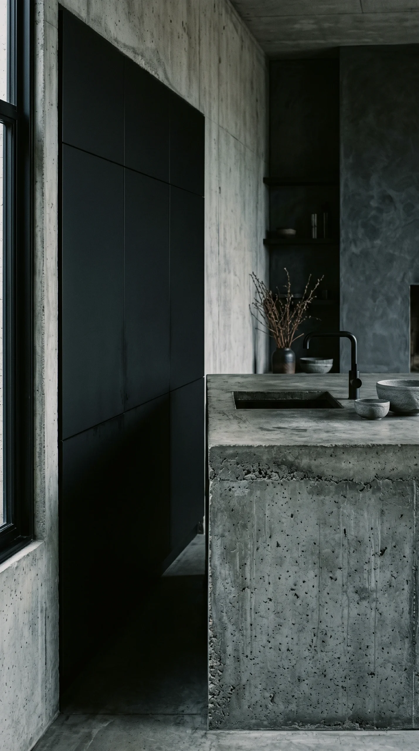
In the kitchen, combine seamless void-black cabinetry with a massive poured concrete island and honed black granite or stainless steel countertops. Matte black surfaces absorb glare, allowing the tactile wood grain of board-formed concrete or aged brass hardware to stand out as sculptural highlights. For detailed layout and worktop guidance, visit our guide to Brutalist kitchen ideas.

The Spa-Inspired Wet Room

In bathrooms, pair medium slate grey microcement walls with a custom floating dark walnut or raw oak vanity and dark concrete vessel sinks. Aged brass or gunmetal wall-mounted faucets provide rich metallic warmth that contrasts against continuous waterproof plaster. Learn more in our guide to Brutalist bathroom ideas.

The Soft Brutalist Transition

If you prefer a gentler interpretation, Soft Brutalism lightens the dominant palette to pale ash, warm beige lime plaster, and oat boucle upholstery, while retaining raw concrete columns as structural focal points. Explore this balance in our guides to soft Brutalism interior design and soft Brutalism interior design ideas.

Lighting Calibration: How Kelvins Transform Color

A concrete color palette lives and dies by its illumination. Because concrete is non-reflective and dense, lighting color temperature dramatically alters perceived wall colors.

The 2400K to 2700K Golden Rule

Light fixtures should be chosen to enrich material undertones:

  • Avoid Cool White Bulbs (4000K+): Cool daylight bulbs emphasize the blue-grey chill of concrete, giving domestic spaces the clinical atmosphere of an underground parking garage.
  • Specify 2400K to 2700K Warm LEDs: Warm golden light (CRI 90+) neutralizes cold grey tones, transforming concrete into a warm, hospitable stone backdrop.
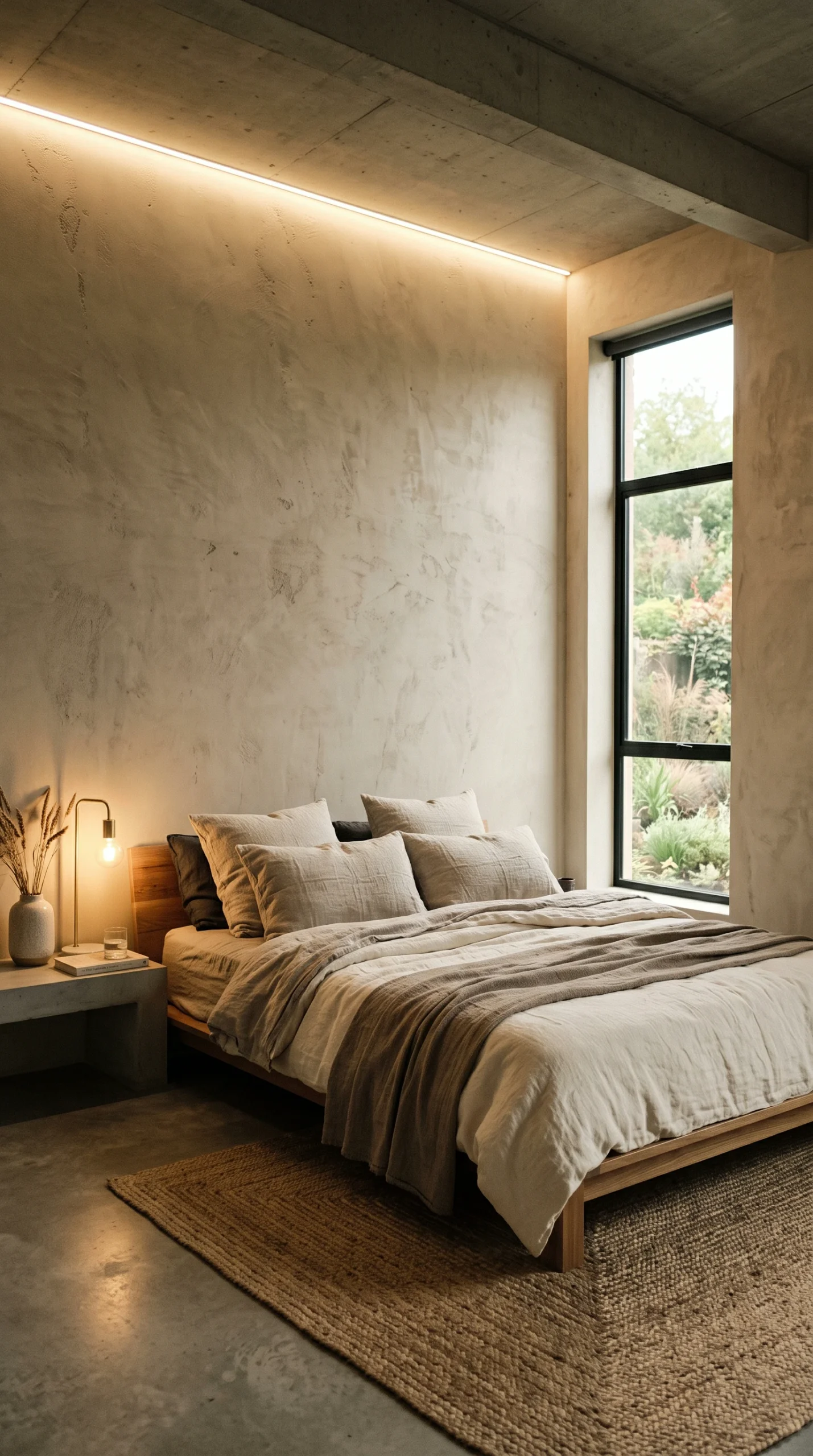
  • Concealed Perimeter Wash: Use recessed LED strips behind floating consoles or along ceiling coves to wash light down textured plaster walls, creating deep gradient shadows that accentuate color variation.

Real-World Drawbacks and Maintenance Realities

Living with a dark, material-driven color palette involves practical considerations:

Light Absorption of Low-LRV Surfaces: Deep charcoal concrete, iron ore plaster, and blackened steel have low Light Reflectance Values (often below 15%). These dark surfaces absorb significant natural and artificial light. In rooms with small north-facing windows, dark walls can make spaces feel gloomy during overcast winter months unless balanced with generous warm ambient lamps.

Difficulty of Touching Up Pigmented Mineral Plasters: Unlike standard latex paint, which can be touched up with a small brush, pigmented lime plaster and colored microcement cannot be spot-repaired invisibly. If a wall is scratched or chipped, blending a patch will leave a visible halo; repairing the damage properly often requires re-troweling the entire wall section.

Mineral Water Spots on Dark Matte Surfaces: In bathrooms and kitchens, matte dark grey concrete and black composite fixtures show chalky white calcium deposits from hard water very quickly. Surfaces require drying with a microfibre cloth and periodic wiping with mineral oil to keep dark tones uniform.

Dust Highlighting on Dark Horizontal Planes: Void-black dining tables, floating dark walnut shelves, and charcoal consoles show white airborne household dust much faster than light wood surfaces, requiring frequent dusting with a microfibre cloth.

By curating raw materials with complementary undertones, applying the 60-30-10 ratio, and layering warm golden illumination, a Brutalist color palette delivers timeless architectural strength and grounded domestic comfort. To explore how to apply this aesthetic across your entire home, consult our pillar guide to modern Brutalist interior design ideas.

Frequently Asked Questions About Brutalist Color Palettes

Practical answers on concrete undertones, warming up grey rooms, light reflectance values, and mineral plaster care.
No. While concrete grey provides the dominant architectural foundation (roughly 60% of surfaces), an authentic Brutalist palette incorporates rich organic secondary tones like dark walnut, smoked oak, and honed travertine (30%), punctuated by accents of oxidized bronze, rust velvet, and charred steel (10%).
Standard Portland cement has cool blue and green undertones. When placed directly against yellow-based cream paint, optical color interaction creates an unattractive greenish-yellow clash. To avoid this, pair concrete with neutral chalk whites, soft greiges, or tinted lime plasters.
LRV measures the percentage of light a surface reflects (0 is pure black, 100 is pure white). Medium concrete greys with an LRV of 35 to 50 reflect adequate natural daylight to keep rooms feeling spacious. Surfaces below 20 LRV absorb light heavily and require supplemental lighting.
During overcast winter months, unheated grey concrete can feel somber. Counterbalance this by introducing warm ember accents—such as rusted earth cushions, cognac leather chairs, and dark walnut joinery—paired with 2400K to 2700K warm white lighting on dimmer switches.
Use warm white LED bulbs between 2400K and 2700K with a 90+ Color Rendering Index (CRI). Cool 4000K+ daylight bulbs make concrete look like an underground parking lot, whereas warm amber light neutralizes cool undertones and enriches wood and bronze.
Dark charcoal and void black walls absorb significant ambient light, making small rooms feel confined and requiring more artificial lighting. Additionally, dark matte surfaces show white chalky dust and water spots much more visibly than light finishes.
No. Pigmented mineral plasters and microcement cannot be spot-touched with a paintbrush without leaving an obvious halo ring. Minor scuffs must be accepted as authentic patina, or the entire wall section must be re-troweled.
Living, unlacquered metals with rich natural patina work best: aged zinc, oxidized bronze, blackened steel, and brushed raw brass. Their organic weathering and shadow variation harmonize naturally with the porous texture of stone and concrete.
It is an architectural balance ratio: 60% dominant concrete or microcement foundation, 30% secondary warm timber (walnut, oak) or natural stone (travertine, basalt), and 10% high-contrast metallic or earth-toned accents (bronze, rust, blackened iron).
Apply large 2×2 foot test swatches directly in the room. Observe them in morning east daylight, afternoon west light, and under 2400K to 2700K evening artificial lighting to ensure the greys and neutrals harmonize under all conditions.