Japandi Color Palette Ideas for a Balanced, Cohesive Home

Color sets the mood of an interior, but creating a calm home is not about painting every room flat beige. A thoughtful Japandi palette balances light-reflecting wall colors, warm natural wood species, and deep grounding accents that respond gracefully to shifting daylight and artificial lighting throughout the day.

Daylight Orientation

Counteract cool northern daylight with warm-undertone oatmeals; balance bright southern exposure with soft, desaturated stony neutrals.

The 70-20-10 Ratio

Dedicate 70% of surfaces to light neutral walls, 20% to warm natural wood and stone, and 10% to grounding dark accents.

Light Reflectance

Choose wall paints with an LRV between 70 and 80 to gently diffuse natural light without causing harsh glare.

Lighting Warmth

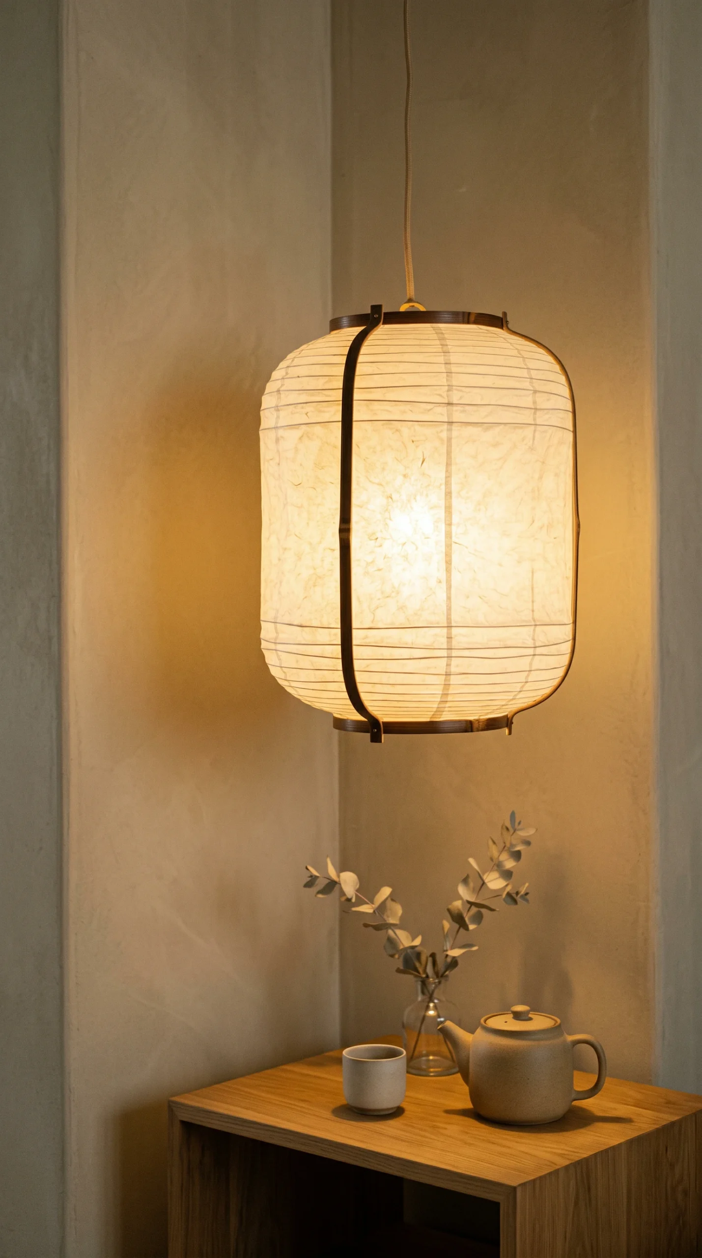
Pair earthy pigments with 2700K to 3000K warm LED bulbs featuring a 90+ CRI to keep neutrals from looking muddy after dark.

Neutral Harmony, Texture, and Contrast

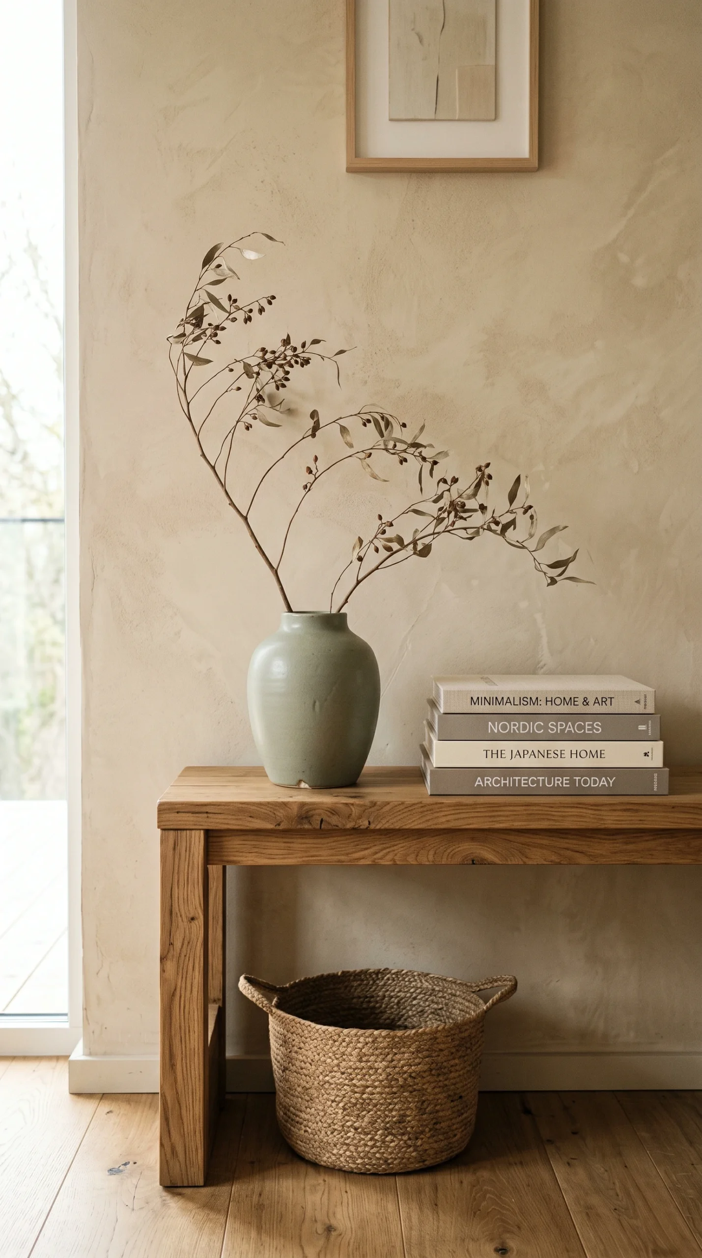
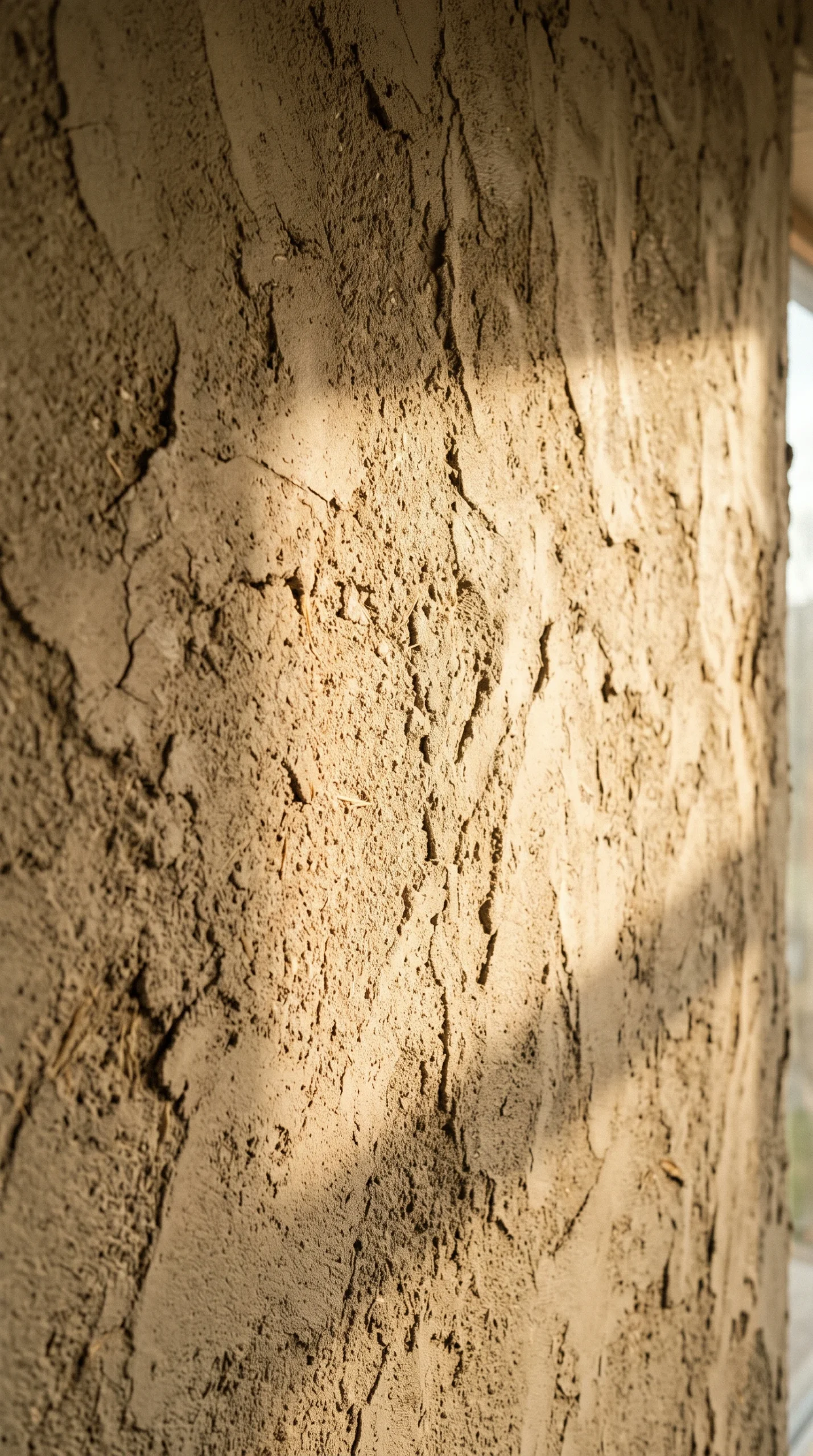
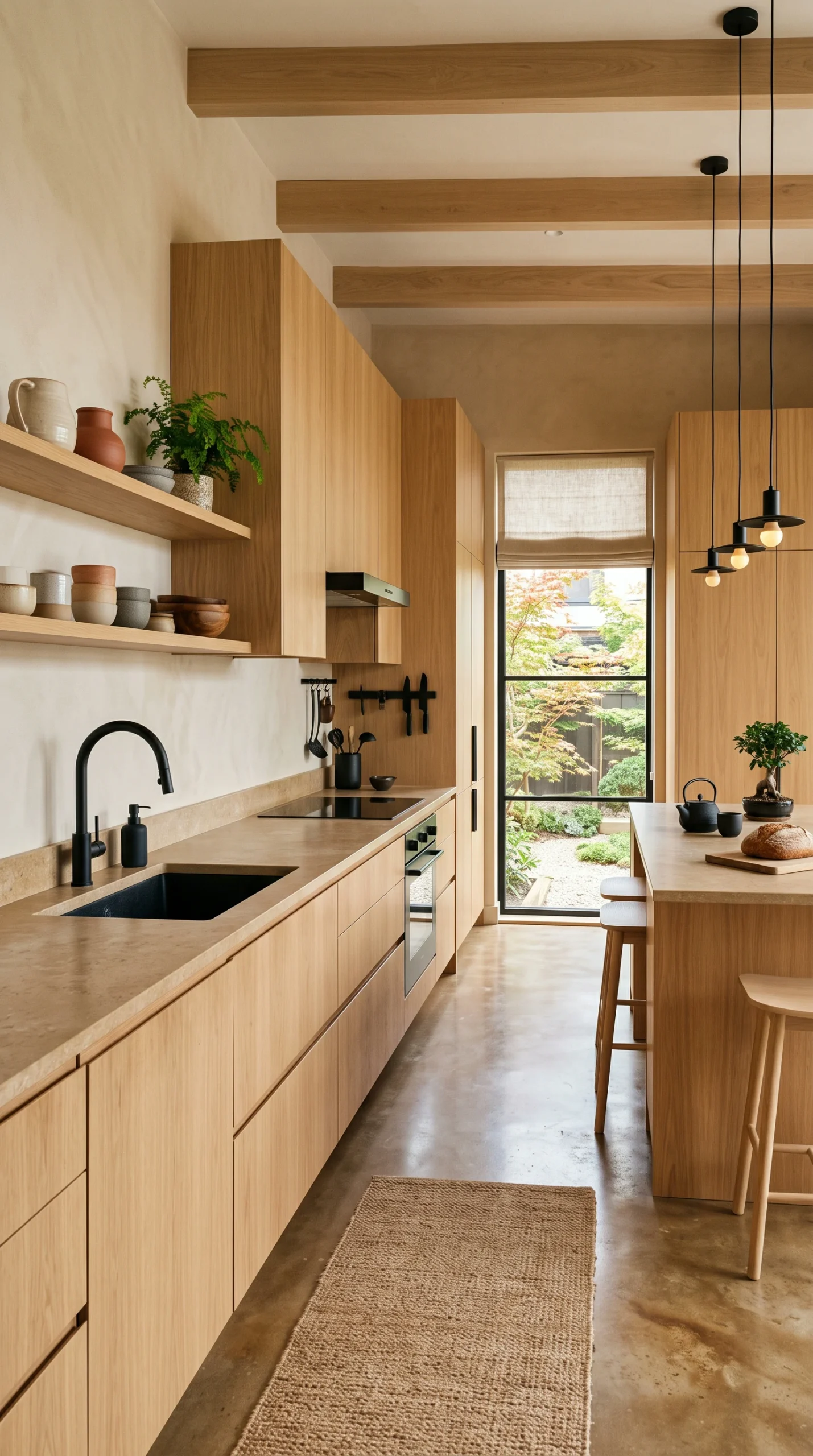
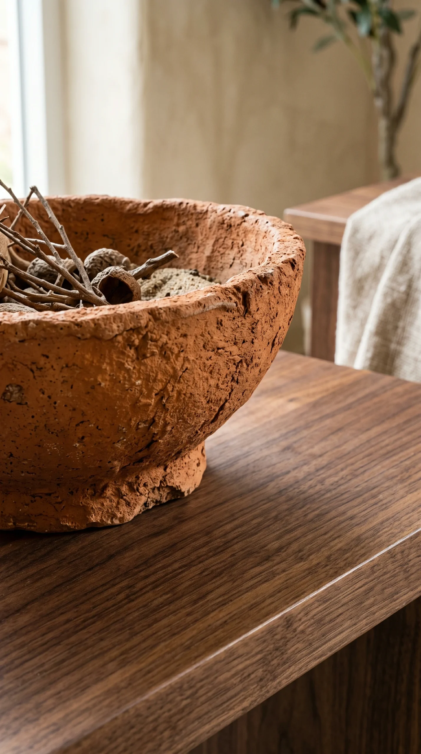
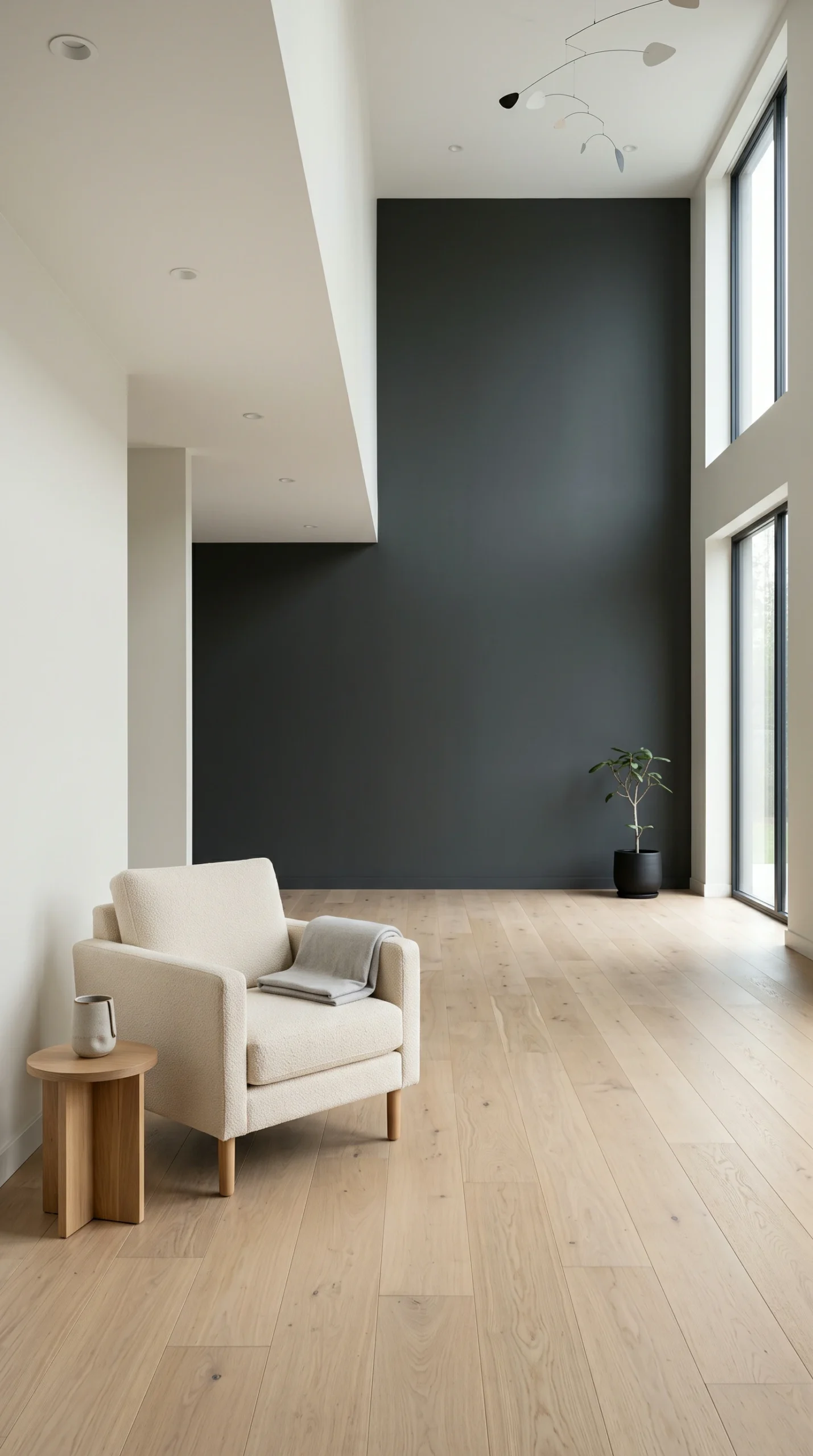
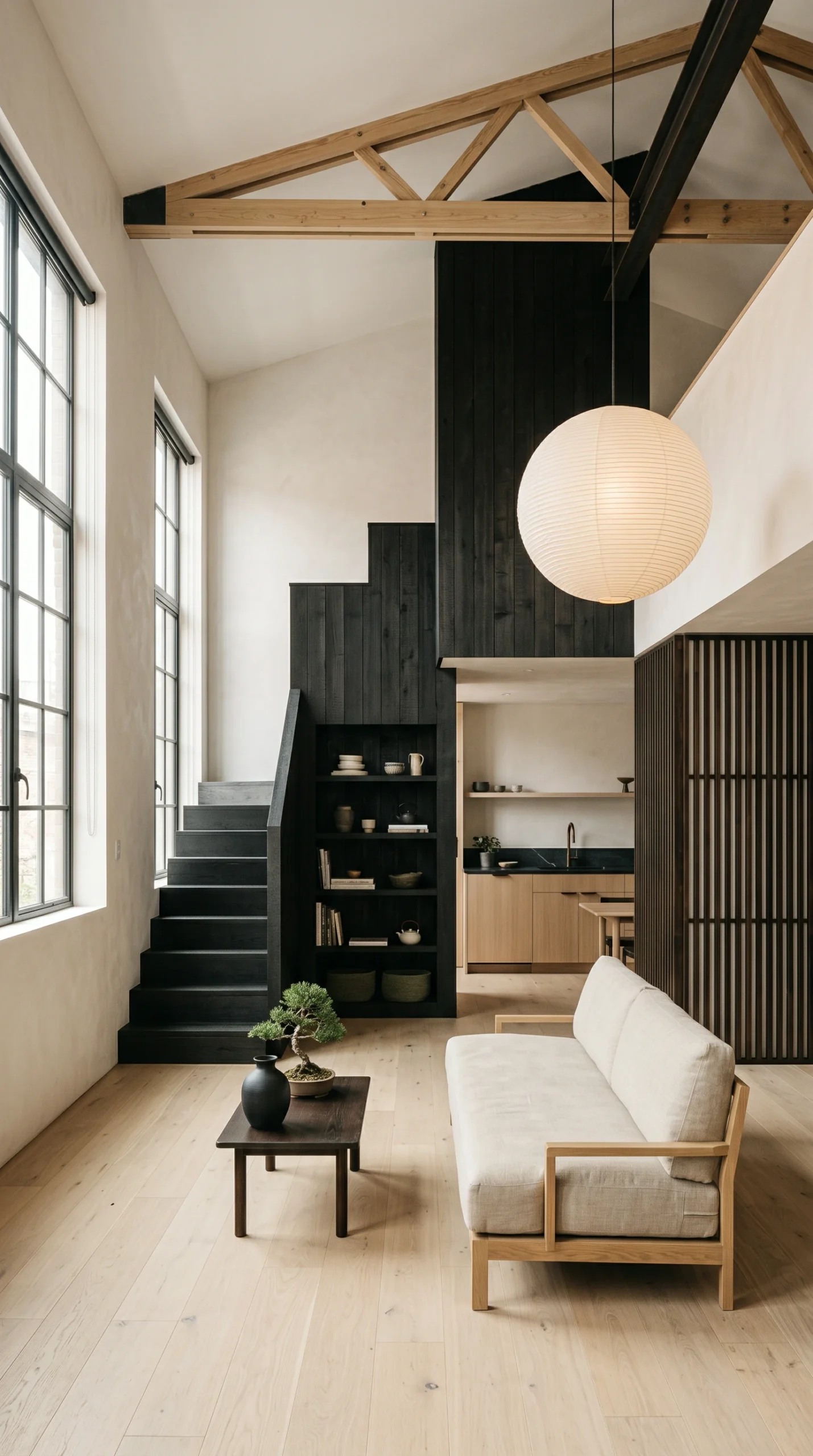
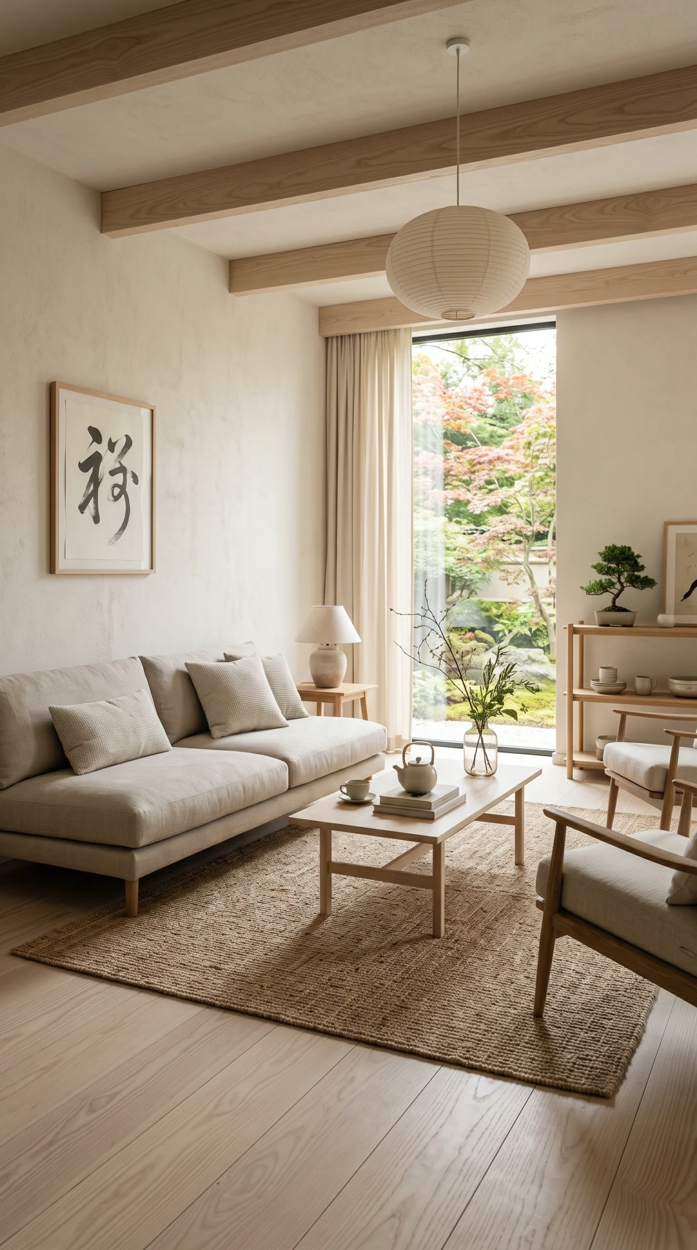
Explore practical room settings showcasing warm off-white walls, natural oak and ash timber, textured Roman clay, and grounding charcoal accents.

Practical Color Selection Guidelines

Review these foundational checks before buying paint or upholstery to avoid undertone clashes and lighting surprises.

Check Natural Light

Identify window direction before choosing paint; cool north light requires warmer undertones, while bright south light handles neutral greiges.

Harmonize Wood Undertones

Match wall paint to your flooring; pair golden oak with neutral off-whites, and avoid pairing pink-undertone woods with stark cool greys.

Use Large Sample Boards

Paint 12 by 12-inch sample boards and move them around the room to observe colors at morning, noon, and under evening lamplight.

Choose Washable Matte Sheens

While dead-flat finishes look soft, washable matte formulations provide the same non-reflective look with better scuff resistance in hallways.

Anchor with Grounding Contrast

Include small touches of charcoal, blackened bronze, or dark walnut (roughly 10% of the room) to keep light neutral spaces from feeling washed out.

Designing a Balanced Japandi Color Scheme for Real Homes

Color sets the psychological foundation of an interior before you even notice the furniture or layout. In many online decor guides, the Japandi palette is reduced to an oversimplified formula: paint everything beige and add a plant. When real homeowners attempt this, they often end up with rooms that feel washed out, visually flat, or unexpectedly yellow once the lights come on in the evening.

Creating an effective Japandi color scheme requires understanding how natural daylight, artificial lighting, and architectural materials interact. By blending the light-reflecting neutrals of Scandinavian interiors with the grounded, earthy contrasts of Japanese design, you can build a palette that feels restful, balanced, and durable for everyday life.

Natural Daylight and Undertone Selection

Paint colors never exist in a vacuum; their appearance changes constantly throughout the day depending on the orientation of your windows and the quality of outdoor light entering the room.

North-Facing vs. South-Facing Daylight

Evaluating window orientation prevents costly repainting mistakes:

  • North-Facing Rooms: Daylight from northern windows is cool, indirect, and slightly blue-tinted. Painting a north-facing room in a stark, pure white or a cool grey can make the space feel chilly and shadowed. Instead, choose warm off-whites, creamy oatmeals, or soft greiges with subtle yellow, beige, or red undertones that counteract the cool northern exposure.
  • South-Facing Rooms: Southern exposure brings warm, intense golden light throughout the day. In these spaces, overly yellow creams can read as intensely yellow or dingy. Slightly cooler, desaturated stony neutrals or chalky off-whites balance the golden sunlight without feeling clinical.
  • East and West Exposures: Eastern light is warm and bright in the morning but cools down in the afternoon. Western light shifts from quiet morning light to intense, warm afternoon glare. Test swatches across both times of day to ensure the color holds its composure under changing conditions.

A helpful benchmark when selecting interior wall paints is Light Reflectance Value (LRV), which measures the percentage of light a color reflects. For main living walls in a Japandi home, aim for paints with an LRV between 70 and 80. This level reflects daylight gently across the room without creating the blinding glare associated with high-LRV pure whites (85 to 90+). For an overview of styling balanced spaces, explore our comprehensive Japandi interior design ideas.

The Seventy-Twenty-Ten Color-Blocking Framework

To keep neutral spaces visually engaging without adding visual clutter, interior designers rely on proportion rules. The 70-20-10 distribution provides a reliable framework for layering tones harmoniously:

The Seventy Percent Base: Light Architectural Neutrals

Roughly 70 percent of the visual plane—including perimeter walls, ceilings, large area rugs, and primary sofa upholstery—should feature your light base neutral. Soft off-whites, unbleached linen, and pale oatmeal provide an open canvas that maximizes room volume and bounces light into darker corners. In compact floor plans, such as those covered in our small Japandi apartment ideas, keeping this large surface area consistent between adjoining spaces creates seamless visual flow.

The Twenty Percent Mid-Tone: Natural Wood and Warm Stone

Approximately 20 percent of the space introduces organic warmth through natural materials rather than paint. This includes hardwood flooring, solid timber dining tables, slatted room dividers, and large stone or ceramic surfaces. Pale ash, white oak, and light birch supply natural grain patterns that break up solid painted walls with tactile depth. To see how these wood finishes coordinate with functional joinery, review our guide to Japandi furniture ideas.

The Ten Percent Accent: Japanese Charcoal and Earthy Greens

The remaining 10 percent provides grounded architectural tension. Without this contrast, an all-beige room lacks focal points and feels adrift. Use deep Japanese-inspired tones—such as charcoal ink, blackened bronze, smoked walnut, or deep slate—in small, deliberate doses:

  • Slender metal lighting fixtures, door handles, or picture frames.
  • A dark accent chair or small blackened wood side table.
  • Muted botanical greens, such as dried eucalyptus, moss, or subtle sage linen cushions.
  • Earthy terracotta or raw clay ceramics that add warmth without introducing bright primary colors.

You can see how these accents tie into larger living spaces in our guide to Japandi living room ideas.

Textural Finishes: Limewash, Roman Clay, and Paint Sheens

In a restrained palette, surface texture acts as a substitute for bold pattern. Flat, uniform drywall can sometimes look clinical, which is why traditional Japanese and Scandinavian architecture both celebrate tactile, artisanal wall treatments.

Comparing Wall Treatments

Different wall finishes offer unique visual character, but each comes with distinct practical trade-offs:

  • Standard Matte Emulsion: Affordable, easy to roll, and relatively simple to touch up. A dead-flat or ultra-matte sheen absorbs light softly, minimizing drywall imperfections and giving off-whites a powdery, calm appearance. However, standard matte paint can scuff when scrubbed with abrasive sponges.
  • Limewash Paint: Made from slaked lime and natural pigments, limewash cures through carbonation, producing a breathable, cloud-like, multi-tonal patina that mimics aged European plaster or Japanese clay plaster. It adds subtle movement to large walls, but it has notable limitations discussed below.
  • Roman Clay: Applied with a trowel, Roman clay creates a smooth, stone-like surface with subtle sheen variations. It is warmer and more tactile than flat paint, making it a popular choice for bedroom accent walls or fireplace surrounds.

For ideas on styling restful sleeping environments with these tactile surfaces, see our guide to Japandi bedroom ideas.

Harmonizing Wood Undertones with Wall Colors

One of the most common decorating errors is choosing paint colors without considering the undertones of existing wooden floors and cabinetry. Wood is a major color component that reflects strong secondary hues onto surrounding walls.

Preventing Undertone Clashes

Before buying wall paint, identify whether your timber leans warm, cool, or neutral:

  • Golden and Honey Woods (Pine, Natural Birch): Pairing golden wood with a beige paint that has heavy yellow undertones can make the room look uncomfortably monochromatic and dated. A soft, neutral greige or chalky off-white with subtle green or gray undertones balances the warmth of the wood.
  • Pink and Red Woods (Red Oak, Cherry): Pairing red-tinted floors with a cool gray wall accentuates the pink tones in the wood. A warm ivory or oatmeal wall tone creates a much gentler transition.
  • Pale Ash and White Oak: These relatively neutral, pale hardwoods are the most versatile, pairing comfortably with warm creams, soft stone greys, and muted greens.

To see how these timber tones work in entrance corridors, explore our guide to Japandi entryway ideas.

Artificial Lighting and Metamerism

Metamerism is the optical phenomenon where two colors appear identical under one light source but noticeably different under another. A paint sample that looks like a balanced, neutral oatmeal under midday sunlight in a hardware store can look pink, green, or muddy once illuminated by artificial bulbs at night.

Selecting the Right Bulbs

To maintain color consistency from day to night:

  • Color Temperature: Choose LED bulbs between 2700K (warm white) and 3000K (soft white). Bulbs at 2700K enhance the warmth of wood grain and off-white walls, creating a relaxing evening atmosphere. Avoid cool daylight bulbs (4000K to 5000K), which cast a harsh blue tint that flattens warm earthy tones.
  • Color Rendering Index (CRI): Always select bulbs with a CRI rating of 90 or above. Standard low-CRI bulbs distort color reproduction, making beige fabrics and clay pottery look dull or discolored.

Real-World Drawbacks and Maintenance Realities

While magazine spreads showcase immaculate neutral walls, living with an earthy, matte palette involves practical maintenance challenges that every homeowner should anticipate:

Limewash Spot-Cleaning Limitations: Limewash and raw mineral plasters cannot be scrubbed with wet household cleaners. Liquid spills, grease splashes, and pet marks soak directly into the porous lime coat. Scrubbing the spot with a damp sponge will wash away the pigment and create an unsightly watermark. In high-traffic hallways, kitchens, or children’s rooms, a scrubbable washable matte paint is far more practical.

Charcoal and Black Scuff Marks: Dark charcoal accent walls and ebonized furniture show dust, dry skin flakes, and chalky scuffs much faster than lighter surfaces. In high-sunlight rooms, airborne dust settling on a dark horizontal surface becomes visible within hours.

Light Upholstery Soil: Off-white linen and oatmeal sofas look beautiful, but they show everyday dirt, indigo dye transfer from blue jeans, and food spills quickly. Opt for performance fabrics with stain-resistant coatings or choose removable, washable slipcovers that can be laundered.

The Sample Board Rule: Avoid testing paint by painting small 2-inch squares directly onto the wall. Instead, paint large sample boards measuring at least 12 by 12 inches (30 by 30 cm) on heavy cardstock. Move the boards around the room to observe them against your baseboards, flooring, and furniture in morning light, afternoon sun, and under your artificial evening lamps. For finishing decorative touches that complement your palette, see our guide to Japandi decor ideas.

Frequently Asked Questions About Japandi Color Palettes

Practical advice on paint undertones, light temperatures, limewash care, and dark accent walls.
Pure, stark whites often contain blue or violet undertones that reflect light harshly, making living rooms feel cold and institutional—especially in rooms with indirect or northern daylight. Warm off-whites, soft oatmeals, and chalky creams (with an LRV of 70 to 80) provide a much softer, welcoming glow.
It is a practical proportion guideline: allocate 70% of the space to your light background neutral (walls, ceilings, large rugs), 20% to warm organic mid-tones (wood flooring, timber furniture, stone surfaces), and 10% to grounding dark accents (charcoal chairs, black hardware, subtle sage or terracotta accents).
North-facing daylight has a cool, bluish cast that makes cool greys look dull and cold. Choose warm neutrals with yellow, beige, or subtle red undertones—such as unbleached linen, warm almond, or soft oatmeal—with an LRV between 70 and 78 to reflect light warmly.
Light bulb color temperature changes how pigments appear. Cool daylight bulbs (4000K+) can make warm beige look muddy or greenish. Use warm white LED bulbs between 2700K and 3000K with a high Color Rendering Index (90+ CRI) so that natural earth tones remain warm and accurate after dark.
Yes. Deep charcoal, slate, and blackened wood are traditional elements in Japanese design that provide essential visual grounding. Using dark charcoal for a small study, bedroom accent wall, or dining chairs adds sophisticated depth without overwhelming the space.
Limewash creates a beautiful, porous, cloud-like texture, but it cannot be easily wiped down with water or household cleaners. Spills, pet marks, and grease will soak in, and scrubbing causes discolored watermarks. In active households with children or pets, a washable matte paint is often more practical.
Vary texture and contrast rather than adding bright colors. Combine smooth matte walls with rough clay pottery, slatted oak paneling, textured wool rugs, and a few dark charcoal accents. The interplay of tactile surfaces creates rich visual interest without visual noise.
Stick to desaturated, nature-inspired hues: muted sage green, faded olive, soft terracotta, dusty clay, and indigo black. Avoid highly saturated primary or neon colors, which clash with natural wood grains and earthy pigments.
Paint large 12 by 12-inch (30 by 30 cm) sample boards on thick cardstock rather than painting directly on the wall. Move the boards around the room to observe how the color shifts between morning light, direct afternoon sun, and artificial evening lamplight.
Avoid painting walls with heavy yellow-beige undertones, which can make the room look overly yellow and dated. Instead, choose a neutral off-white or soft greige with subtle grey or green undertones that gently balance the warm golden tones of the flooring.