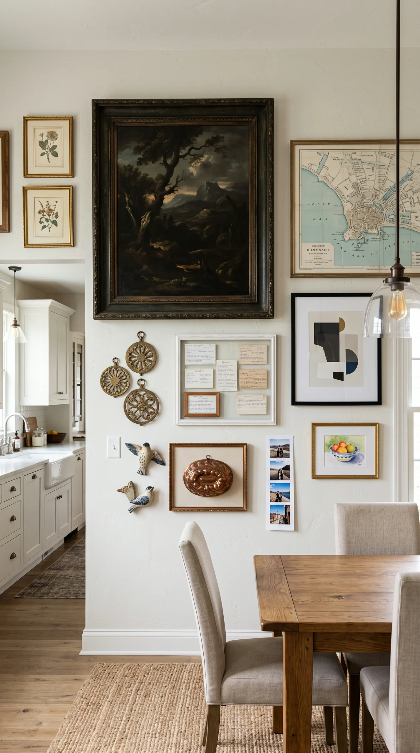
In an asymmetrical layout, the largest, heaviest, and darkest piece of art must be placed first, slightly off-center, to ground the wall.
The negative space between frames is the glue that holds the gallery together. Keep gaps strictly between 1.5 to 3 inches.
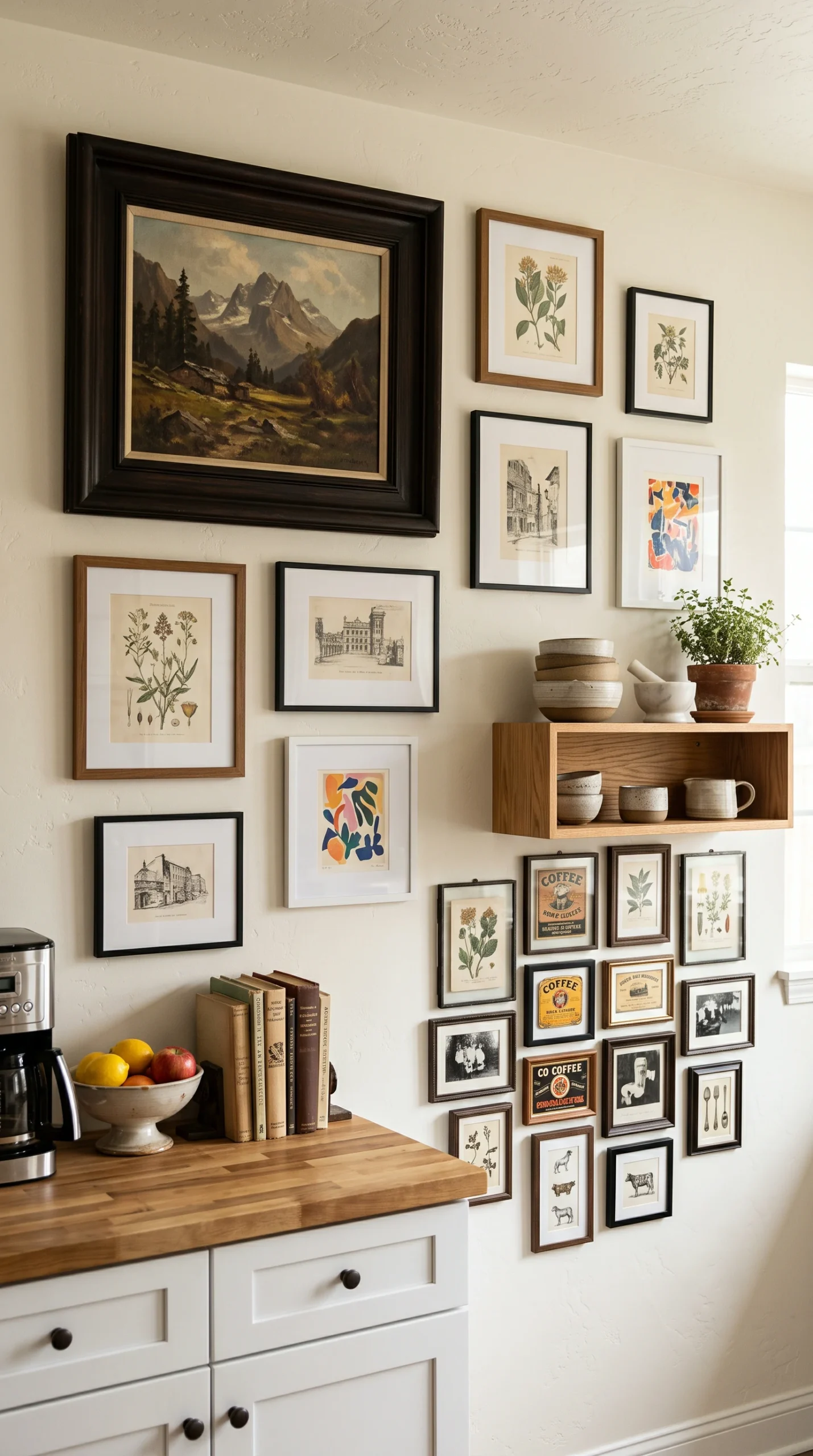
If you place a massive, dark frame on the top left, you must balance it with a cluster of smaller, dark frames on the bottom right.
Never drill until you have cut paper templates of every frame and taped them to the wall to perfect the arrangement.
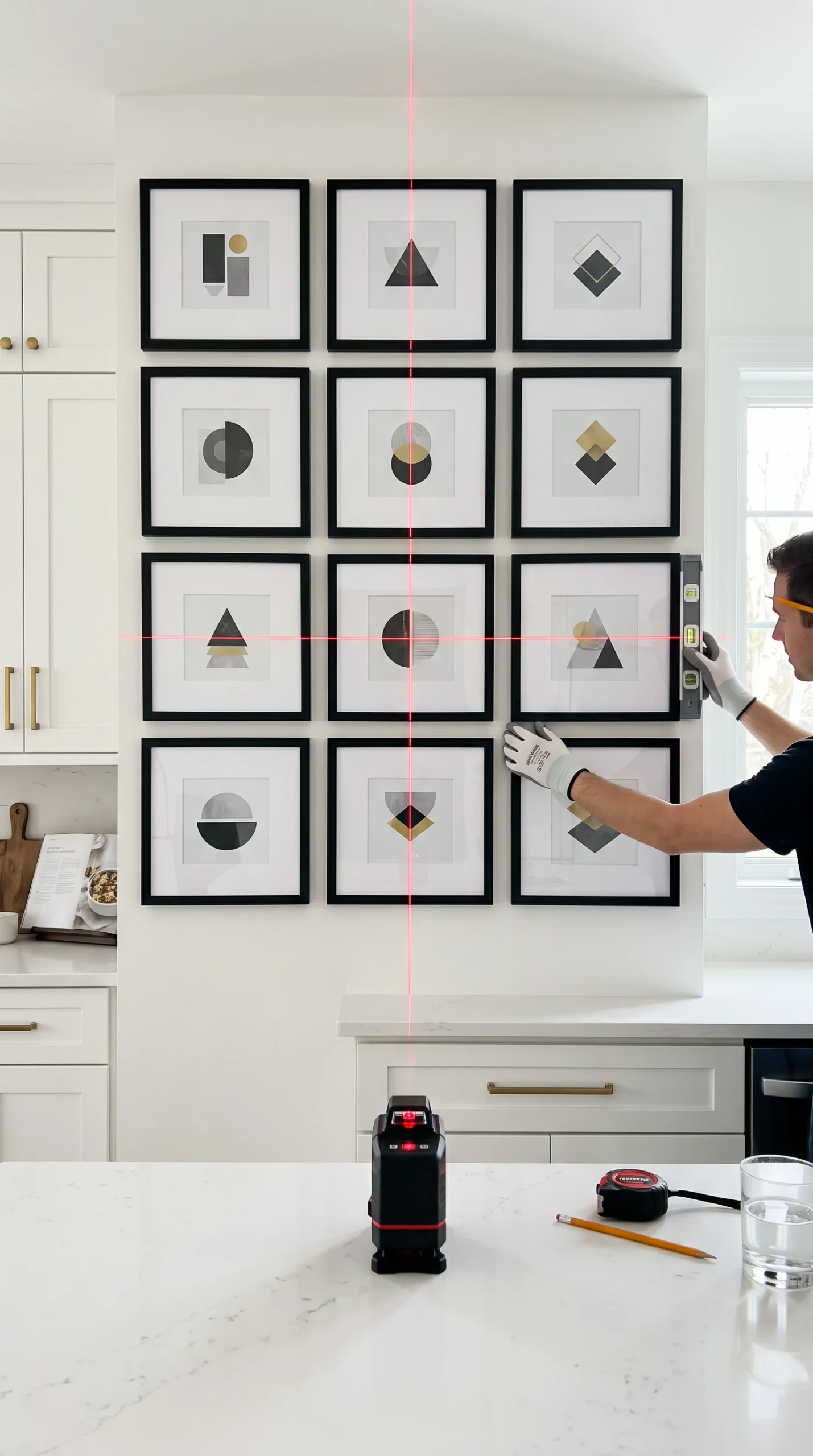
In a symmetrical grid, the outer boundaries of the entire collection must form a perfect rectangle or square. No frames should break this line.
The center of your main art piece (or the center of the grid) should hang roughly at eye level, about 57 to 60 inches from the floor.
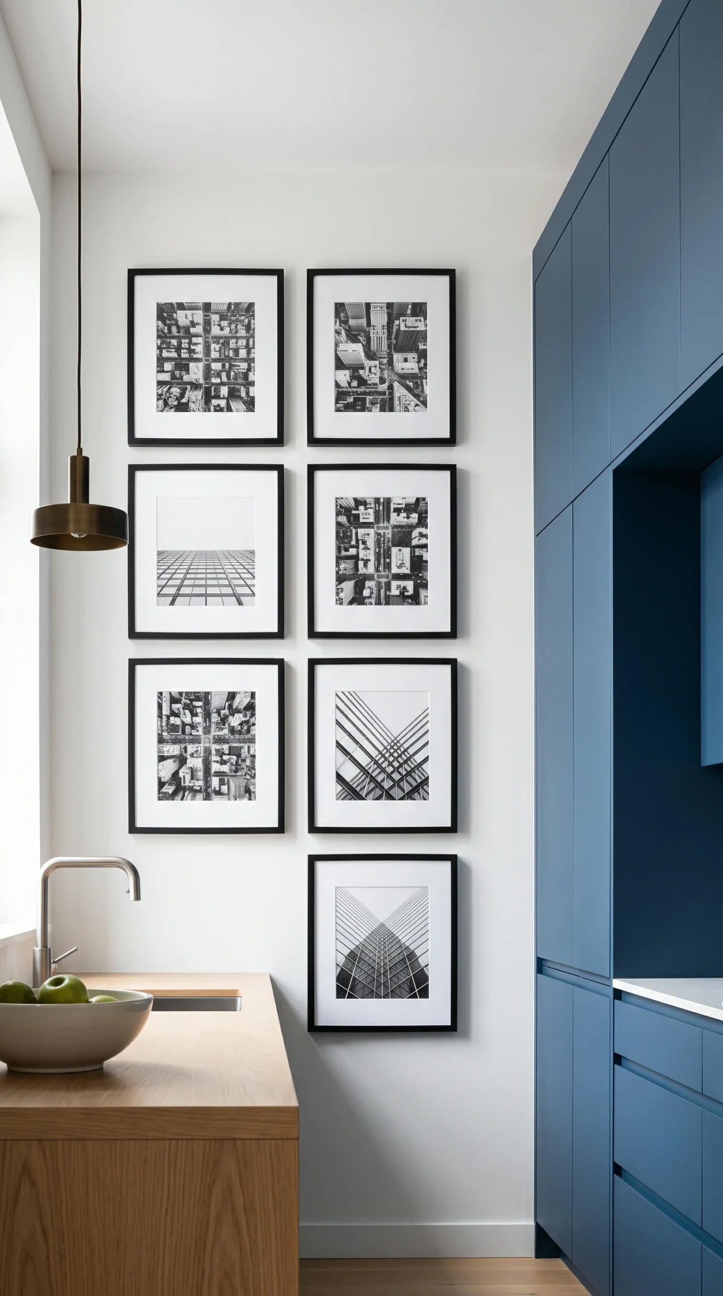
For a modern, highly tailored aesthetic, the symmetrical grid is the undisputed king of kitchen gallery wall layout ideas. This layout demands absolute perfection. You must use identical frames and identical mats. The most common configurations are a 2×3 grid (six frames) or a 3×3 grid (nine frames). The critical rule here is that the outer boundary of the entire collection must form a flawless rectangle or square. The spacing between the frames (the ‘gutters’) must be mathematically identical—if the vertical gap is exactly 2 inches, the horizontal gap must be exactly 2 inches. This severe, unbroken geometry acts as a massive architectural window, providing incredible structure and calming order to the kitchen space.
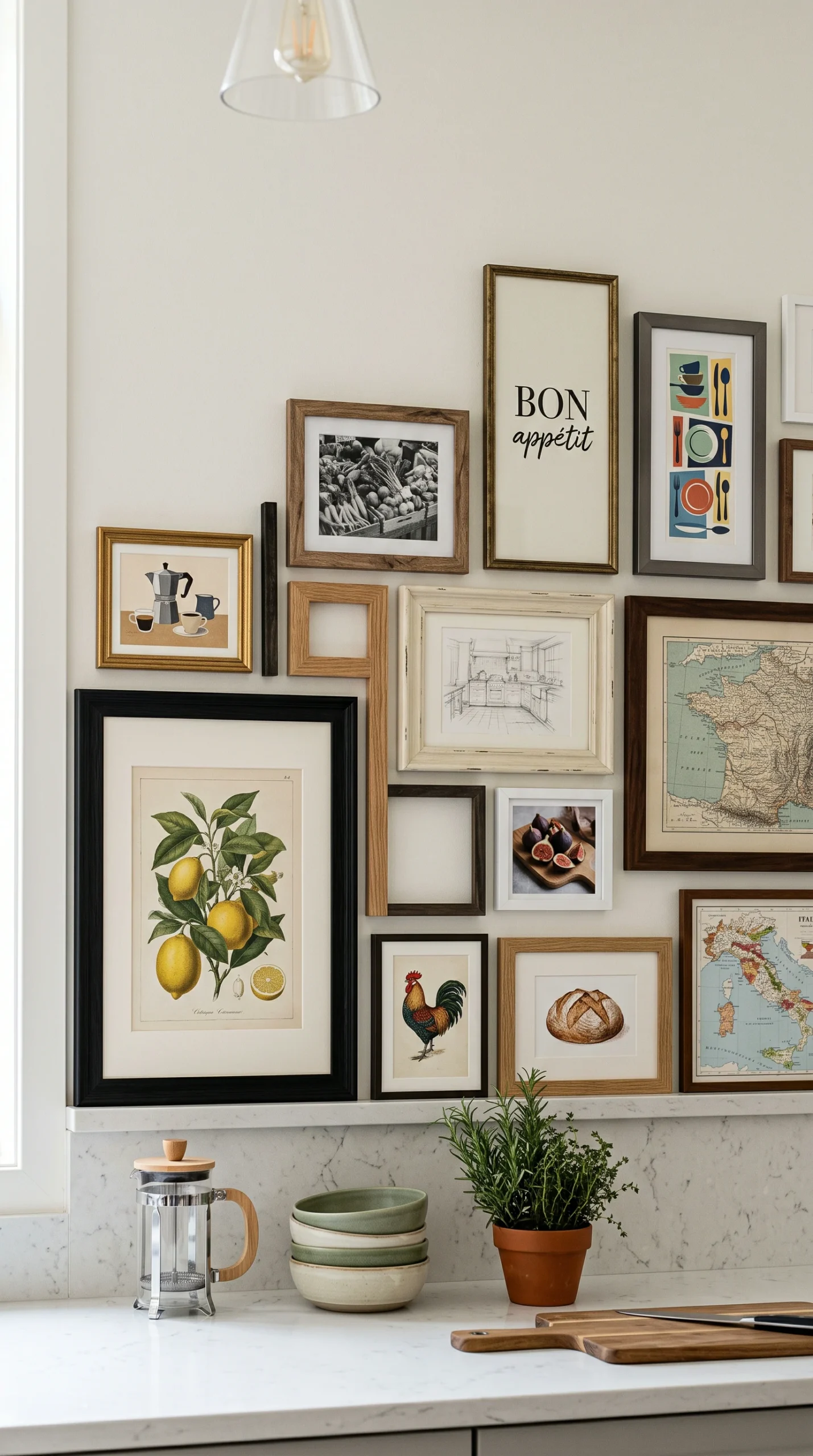
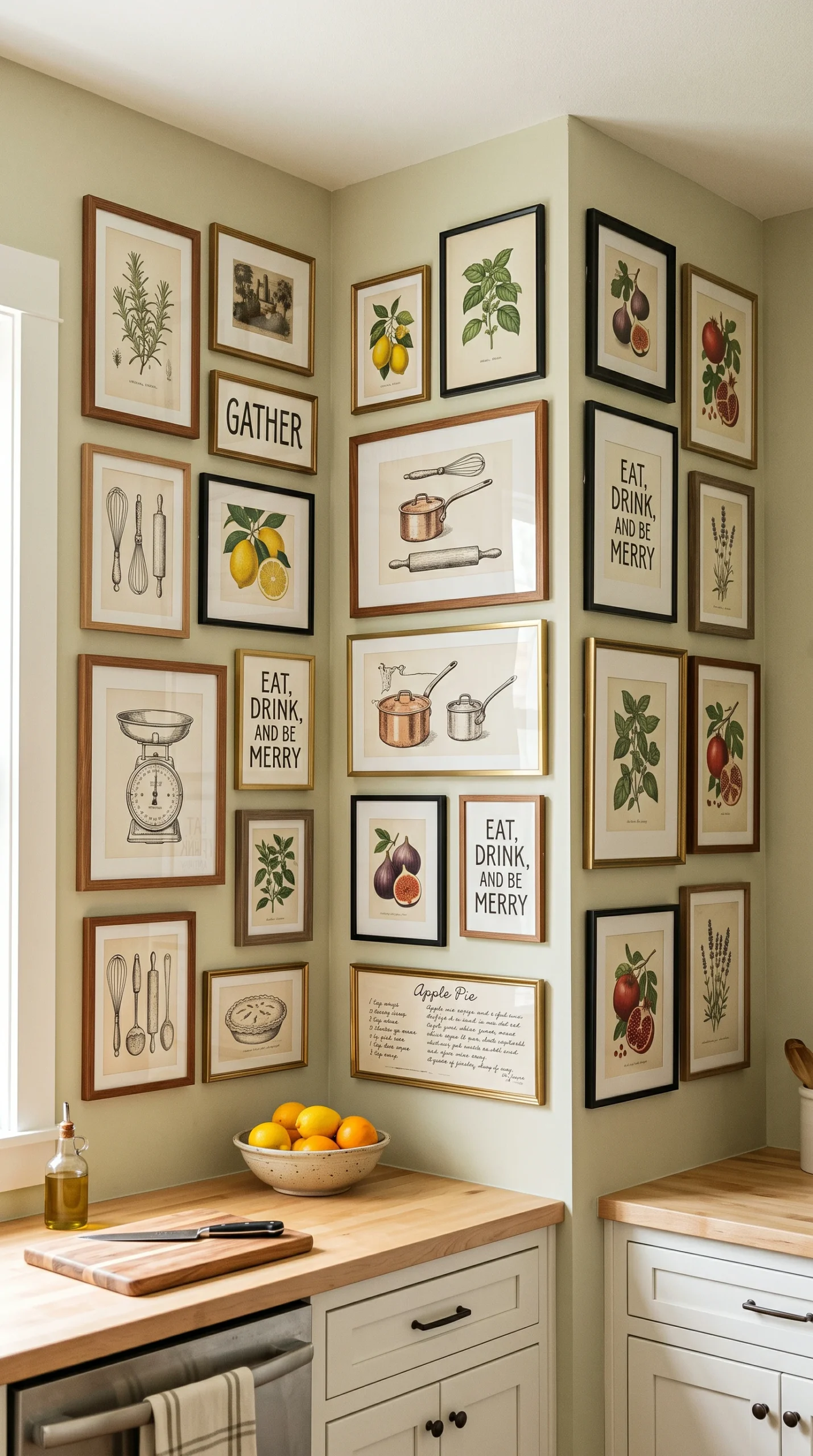
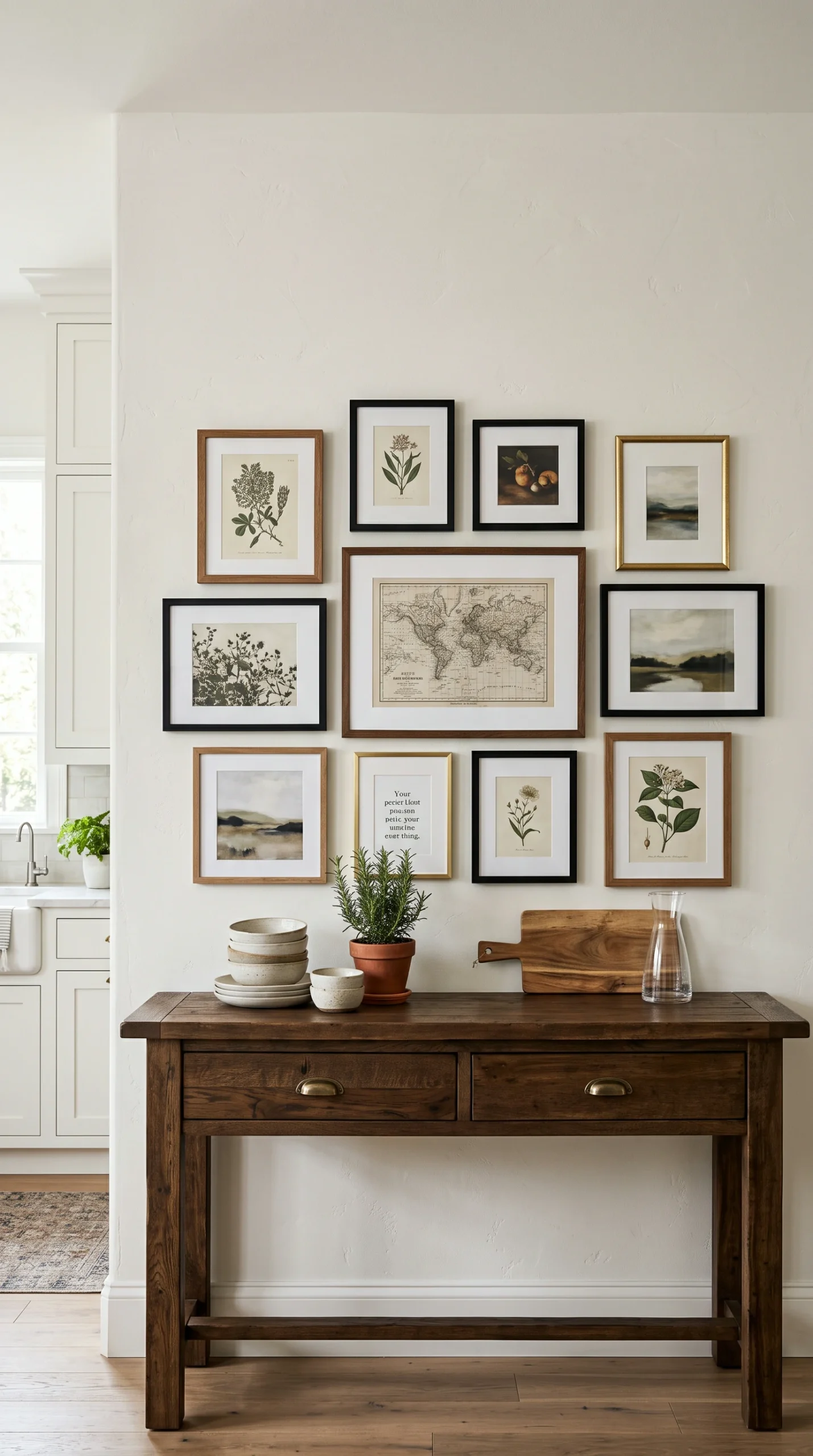
If you prefer a collected, historical, or farmhouse aesthetic, you must utilize an asymmetrical, ‘salon-style’ layout. However, organic does not mean random. The most crucial of all kitchen gallery wall layout ideas for an asymmetrical wall is the ‘Anchor Piece’. You must select your largest, heaviest, and visually darkest piece of art. Place this anchor piece near the center of your planned arrangement, but slightly offset (never perfectly dead-center). This heavy piece grounds the entire wall. From there, you organically nest the smaller frames tightly around it, building outward to fill the negative space. The anchor piece prevents the collection from floating away and provides the eye a firm place to rest.
In an asymmetrical layout, physical size is not the only thing that matters; you must master visual weight. A very small, stark black frame holds significantly more visual weight than a large, pale white frame. The secret to flawless kitchen gallery wall layout ideas is balancing this weight diagonally. If you place a heavy, dark oil painting in the top-left quadrant of your gallery wall, the wall will feel lopsided and top-heavy. You must aggressively balance that weight by placing another dark element—perhaps a cluster of two small black frames or a heavy brass mirror—in the bottom-right quadrant. This diagonal tension keeps the entire, chaotic arrangement perfectly balanced and stable to the human eye.
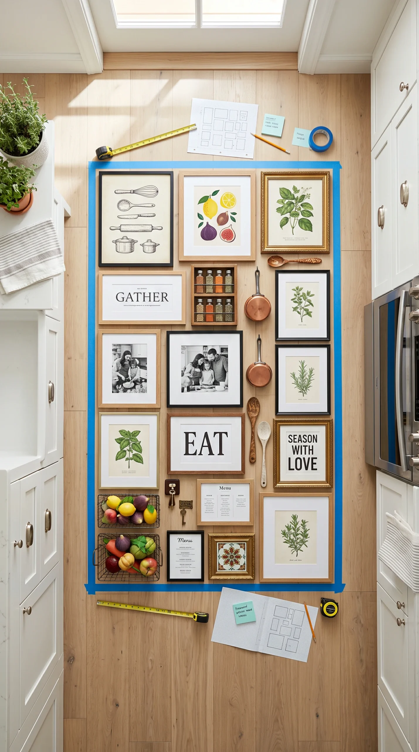
Do not ever begin hammering nails based on a mental picture. The only way to guarantee the success of your kitchen gallery wall layout ideas is the paper template method. Roll out cheap brown craft paper or save old cardboard boxes. Trace every single frame and 3D object onto the paper and cut them out. Label the center of each template and mark exactly where the hanging wire or D-ring hits. Tape these paper templates to the wall using low-tack painter’s tape. This allows you to step back, analyze the visual weight, and infinitely adjust the tight, 2-inch spacing until the geometry is absolutely perfect. Only then do you hammer the nail directly through the marked spot on the paper template.
A gallery wall should never float aimlessly on a blank wall; it must tie into the existing bones of the room. The most advanced kitchen gallery wall layout ideas utilize architectural alignment. If you are hanging a grid next to your kitchen cabinets, align the very top edge of the gallery grid perfectly with the top edge of the cabinets. If you are hanging a gallery above a dining console, align the bottom edge of the gallery to create a sharp, straight line parallel to the table. By tethering the geometry of the artwork directly to the physical structure of the kitchen, the installation feels custom-built and permanently integrated into the home.
When executing a highly structured, symmetrical grid, a standard tape measure and a bubble level are insufficient and will lead to compounding errors. If the first frame is off by 1/8th of an inch, the final frame will be off by a full inch. To execute perfect modern kitchen gallery wall layout ideas, you must invest in a cross-line laser level. Mount the laser on a tripod and project a perfectly straight, bright horizontal and vertical crosshair directly onto the drywall. This ensures that every single frame across a massive 8-foot span is aligned with absolute, mathematical perfection, resulting in a breathtaking, high-end professional finish.