Modern Kitchen Gallery Wall Ideas for a Sophisticated Look

Executing flawless modern kitchen gallery wall ideas requires an uncompromising commitment to structural order, stark contrast, and strict minimalism. Unlike traditional, eclectic art groupings that celebrate organic asymmetry and vintage charm, a contemporary gallery wall must function as a rigid, highly architectural extension of the sleek kitchen itself. By prioritizing perfect symmetry, heavy monochromatic mats, stark black-and-white photography, and razor-thin metal framing, you can transform a blank wall into a breathtaking, high-end focal point. This extensive guide breaks down the rigorous mathematical spacing and severe curation rules necessary to achieve an editorial, highly sophisticated modern aesthetic without introducing unwanted visual clutter.
Sleek Modern
Moderate
Advanced
Contemporary Homes

Sophisticated Modern Inspiration

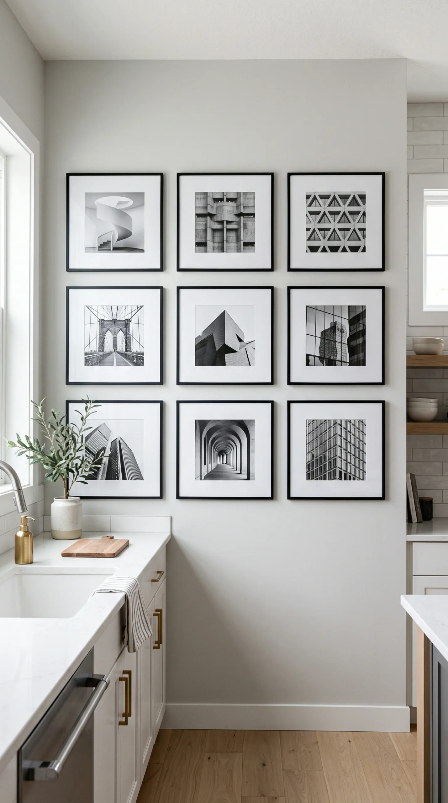
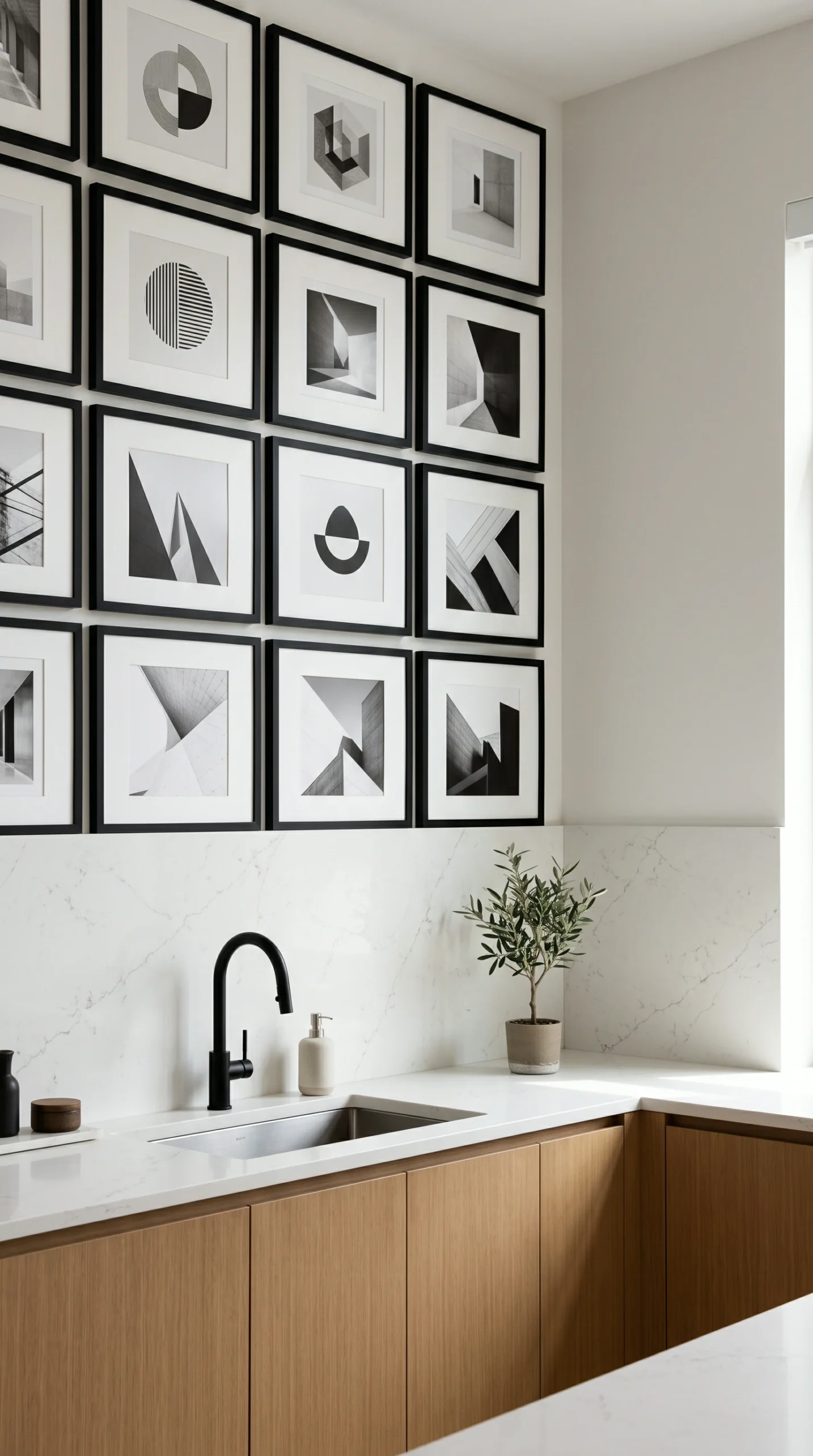
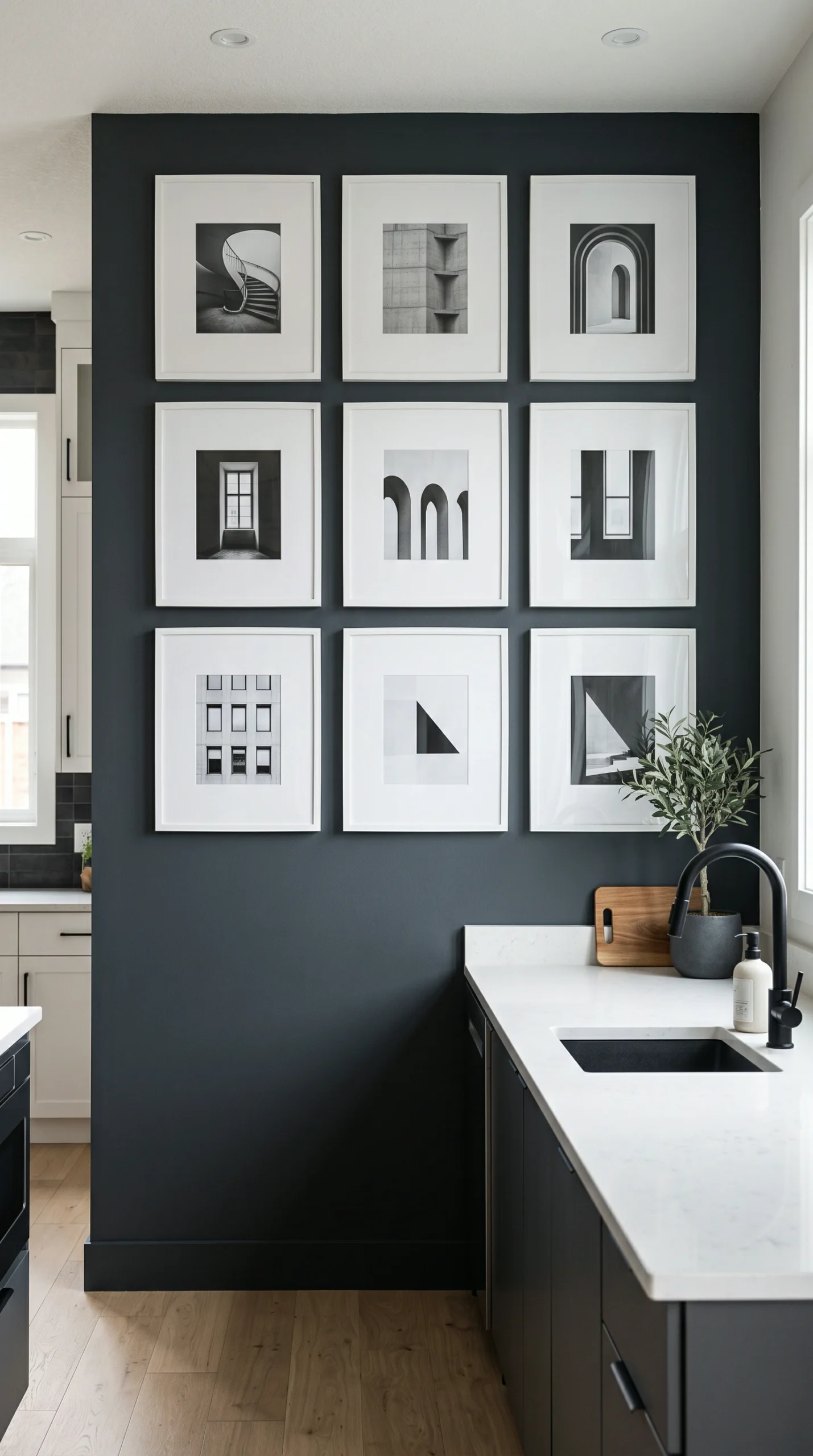
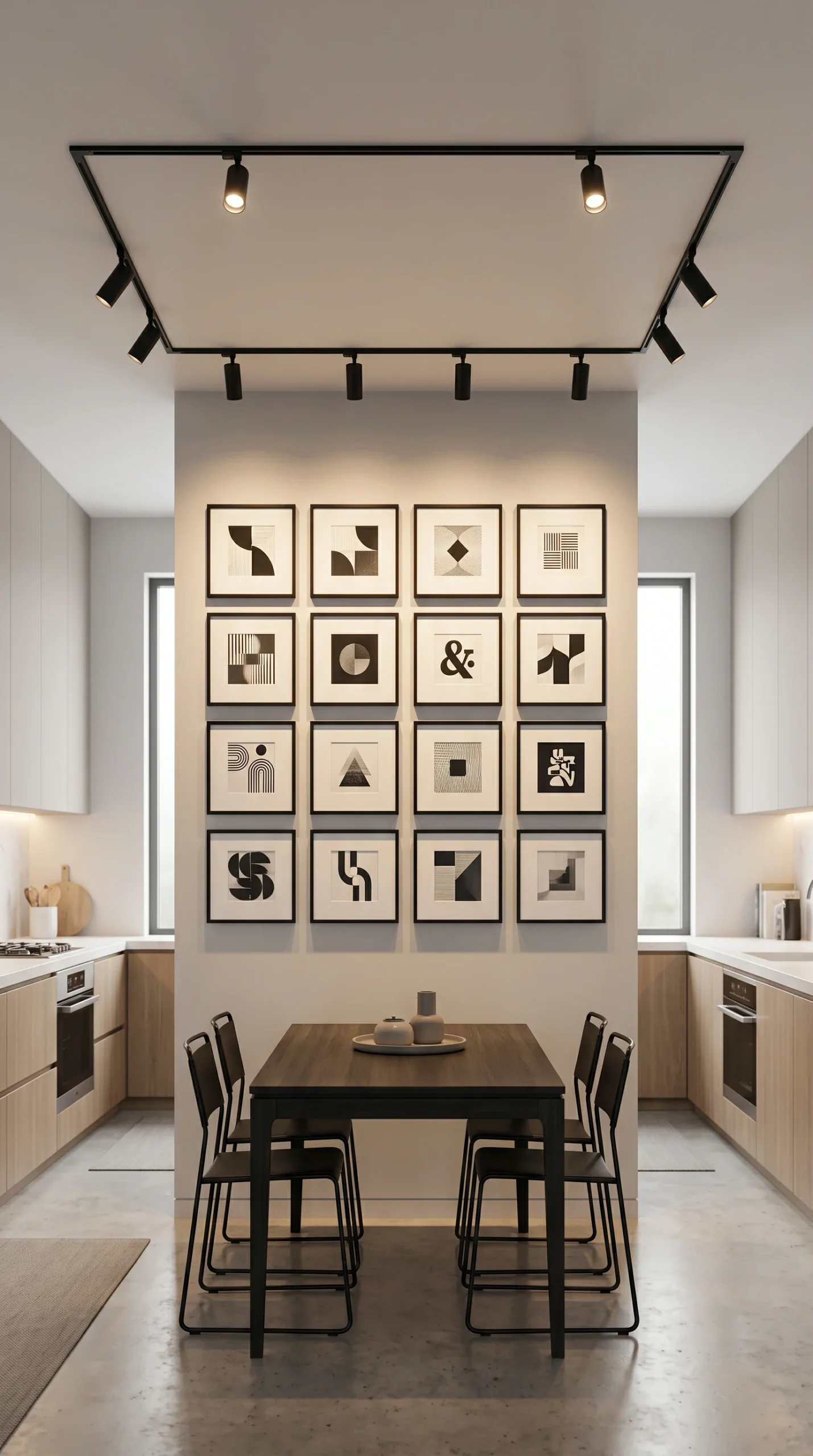
A breathtaking visual gallery of strict modern kitchen gallery wall ideas, demonstrating perfect symmetrical grids, massive white photo mats, and stark black-and-white architectural photography.

Rules for Modern Galleries

Maintain absolute visual order by strictly enforcing these essential modern kitchen gallery wall ideas.

Enforce Strict Symmetry

Do not use organic, scattered layouts. The frames must be arranged in a mathematically perfect grid (e.g., 3x3 or 2x4).

Use Identical Frames

Every single frame in the grouping must be exactly the same size, same material, and same color to maintain absolute order.

Require Massive Mats

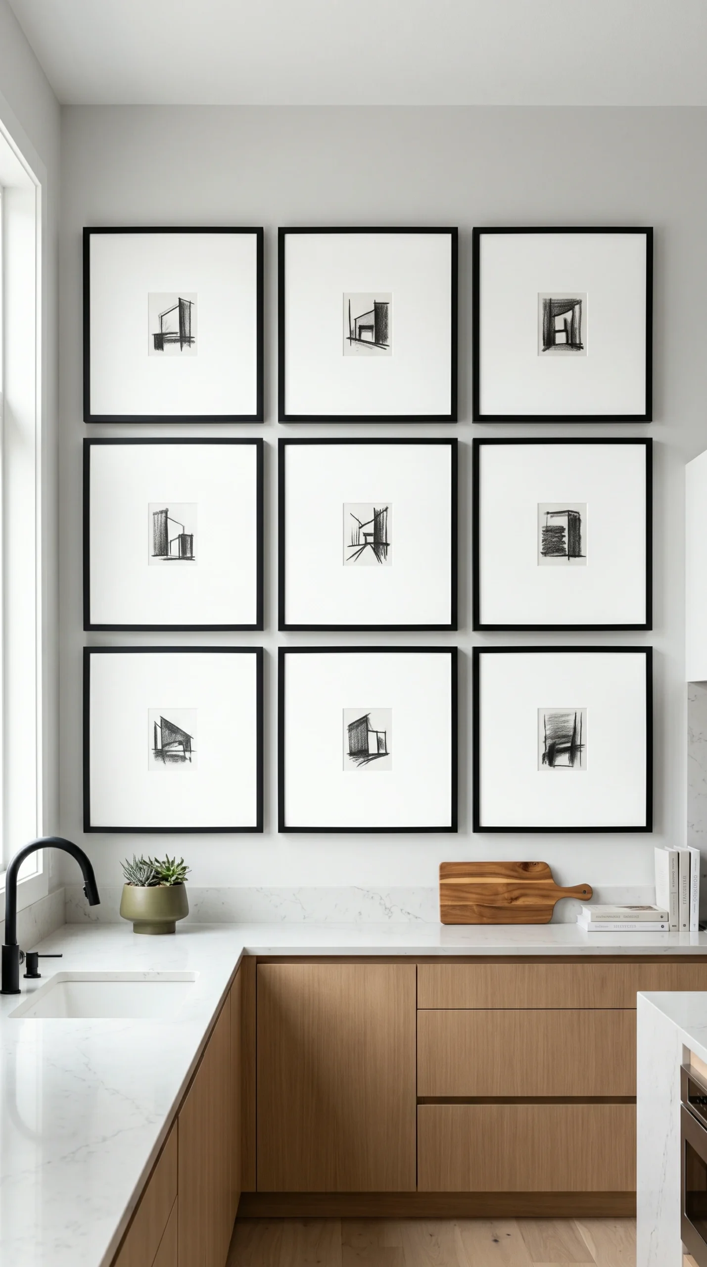
The art itself should be small, surrounded by an enormous, stark white photo mat to create necessary negative space.

Stick to Monochrome

Avoid colorful paintings. Use strictly black-and-white photography, charcoal sketches, or single-color abstract geometry.

Measure with Lasers

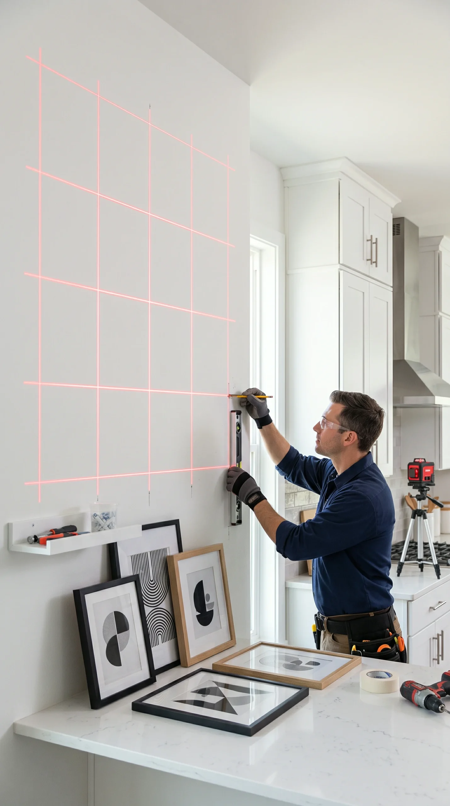
Do not eyeball the spacing. Use a laser level to ensure the 2-inch gaps between frames are flawlessly, mathematically identical.

Avoid 3D Objects

Unlike traditional walls, modern gallery walls should remain perfectly flat. Do not hang plates, mirrors, or sconces within the grid.

The Guide to a Flawless Modern Grid

The Philosophy of the Grid in Modern Kitchen Gallery Wall Ideas

The absolute foundation of executing flawless modern kitchen gallery wall ideas is the strict enforcement of the grid layout. Modern design abhors chaos and organic, unpredictable shapes. An asymmetrical, scattered gallery wall will instantly ruin the sleek, linear architecture of a contemporary kitchen. You must treat the gallery wall as a singular, massive geometric shape. Whether you choose a perfect square grid (like nine frames arranged 3×3) or a stark horizontal rectangle (like eight frames arranged 2×4), the outer boundaries of the entire collection must form a perfect, unbroken shape. This strict geometric boundary ensures the art acts as a structured architectural element rather than a random collection of pictures.

The Necessity of Identical Framing in Modern Kitchen Gallery Wall Ideas

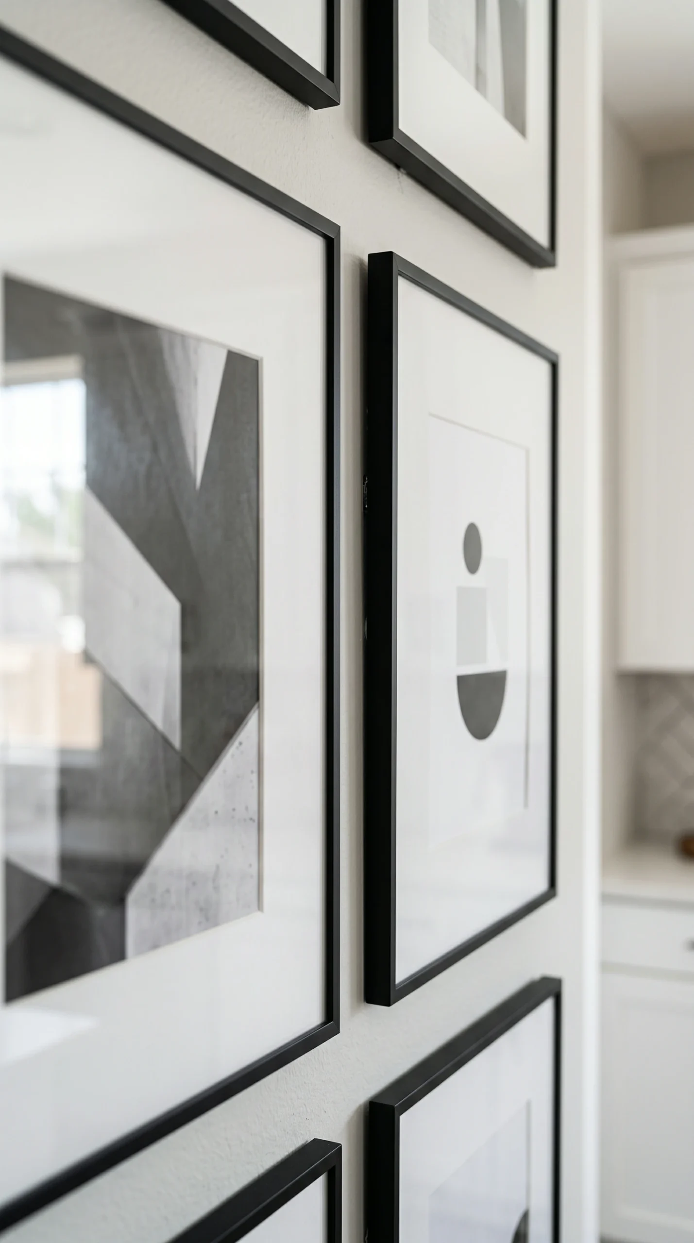
To maintain the severe, highly organized aesthetic required for modern kitchen gallery wall ideas, you must completely eliminate variation in your framing. You cannot mix wood, metal, and plastic frames. Every single frame in the grid must be absolutely identical. The most sophisticated choice is a razor-thin, stark matte black metal frame or a highly polished, sleek chrome frame. The thin profile ensures the frame does not overpower the art, while the identical repetition creates a powerful, hypnotic rhythm across the wall. This absolute consistency is the hallmark of high-end, professional modern interior design.

Maximizing Negative Space in Modern Kitchen Gallery Wall Ideas

In modern design, negative space (the empty space around an object) is just as important as the object itself. When selecting the art for your modern kitchen gallery wall ideas, you must utilize massive photo mats. Do not fill the entire frame with the image. For example, if you are using a large 16×20 inch frame, the actual photograph inside should only be 8×10 inches, surrounded by a massive, stark, crisp white mat. This huge expanse of white space gives the dark photography incredible breathing room, preventing the large grid from feeling heavy or oppressive, and maintaining the airy, elevated feel of the contemporary kitchen.

Curating the Art for Modern Kitchen Gallery Wall Ideas

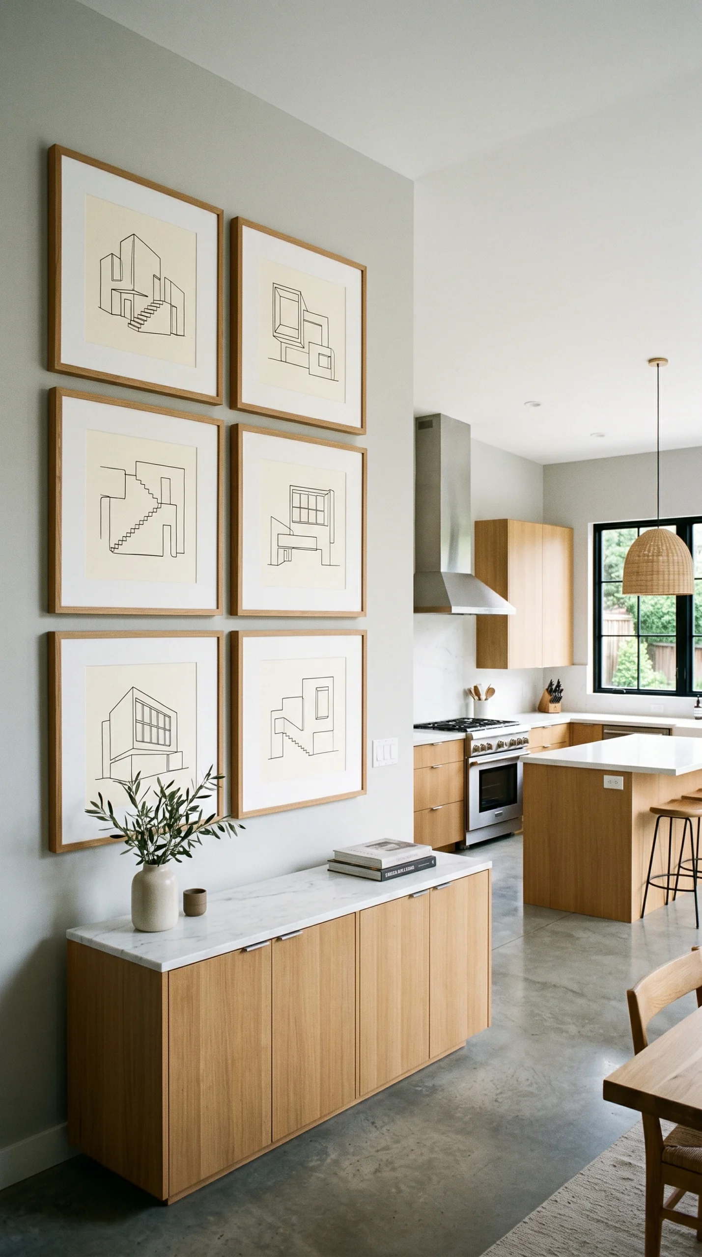
The subject matter of the art itself is critical to the success of modern kitchen gallery wall ideas. You must completely avoid traditional landscapes, colorful florals, or vintage portraits. The art must be as sleek and restrained as the kitchen itself. The absolute gold standard is high-contrast, black-and-white architectural photography—stark images of bridges, skyscrapers, or severe geometric shadows. Alternatively, you can use highly minimalist, abstract charcoal sketches or single-line ink drawings. By removing color from the art entirely, you ensure the gallery wall provides massive graphic impact without clashing with the kitchen’s strict, monochromatic color palette.

The Importance of Laser Precision in Modern Kitchen Gallery Wall Ideas

Because modern kitchen gallery wall ideas rely entirely on the perfection of the grid, any slight misalignment will be instantly visible and highly distracting. You cannot eyeball the installation, and you cannot rely on simple tape measures. You must invest in a high-quality laser level. Project a perfectly straight horizontal and vertical grid onto the wall before you hammer a single nail. The spacing between every single frame—horizontally and vertically—must be exactly the same, ideally a very tight 1.5 to 2 inches. This flawless, mathematical precision is what separates a DIY project from a breathtaking, editorial-worthy modern art installation.

Positioning the Grid in Modern Kitchen Gallery Wall Ideas

Finally, you must position the massive grid correctly within the architecture of the room. Do not float the grid randomly in the middle of a massive wall. The best modern kitchen gallery wall ideas anchor the grid to existing architectural lines. Align the bottom edge of the gallery grid perfectly with the top edge of the kitchen backsplash, or align the top edge of the grid perfectly with the top of the upper cabinets. By tying the geometry of the art installation directly to the horizontal lines of the cabinetry, the gallery wall feels deeply integrated and custom-built for the space, rather than like an afterthought.

Questions About Modern Gallery Grids

Expert advice for achieving flawless, architectural precision.
While black-and-white is the safest, most classic choice, you can use color if it is highly restricted. For example, a grid of nine abstract prints that all feature exactly the same single shade of mustard yellow against a white background works beautifully.
You want the thinnest frame possible. A ‘gallery profile’ metal frame that is only 1/4 inch wide when viewed from the front, but perhaps 1.5 inches deep on the side, provides the sleekest, most high-end modern look.
Do not build the grid around it; that ruins the geometry. You must either choose a different wall entirely or hire an electrician to move the switch slightly so the wall is completely blank for the perfect grid.
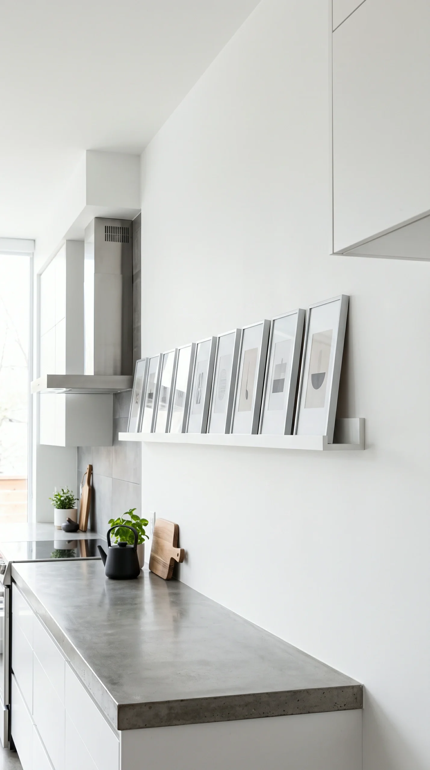
Yes, but only on a very long, floating modern picture ledge. You can lean a perfectly uniform row of identical frames overlapping slightly on a sleek, stark white ledge for a highly sophisticated, casual modern look.
It depends on the wall size, but 16×20 or 20×20 frames are generally excellent for a massive, high-impact grid. A 3×3 grid of 8×10 frames is usually too small and looks cluttered rather than architectural.
Always use high-quality, non-glare acrylic (Plexiglas) if possible. It is much lighter (making the massive grid safer to hang) and won’t shatter if accidentally bumped in a busy kitchen.
Uneven spacing. If the gap between the first two frames is 2 inches, and the next gap is 2.25 inches, the eye will catch the flaw immediately and the entire grid will look cheap and sloppy.
No. If you use a grid, every single frame must be oriented exactly the same way (all portrait or all landscape) to maintain the severe mathematical perfection of the modern aesthetic.
Use a single, very long piece of French cleat hanging hardware for each row, or use a laser level and two D-ring hangers per frame (never use a single wire, as the frames will tilt over time).
A crisp, architectural white is classic, but painting the wall behind the stark white mats a deeply saturated, dark color (like matte black or dark slate) creates incredible, high-end negative contrast.
Yes, if they are heavily edited. Convert them all to high-contrast black-and-white, increase the shadows for drama, and print them small within massive white mats so they look like fine art photography.
Avoid fussy, ornate picture lights. Use a sleek, minimalist track lighting system installed on the ceiling directly above the wall, or a completely hidden LED wash light that grazes the entire grid evenly.
Absolutely. Stand-off acrylic mounts (where the photo is sandwiched in clear acrylic and bolted directly to the wall with metal cylinders) provide the ultimate, ultra-modern floating aesthetic.
Usually, the spacing should be wider than the frame itself. If you use a very thin 1/4 inch frame, a 2-inch gap provides necessary breathing room and defines the grid beautifully.