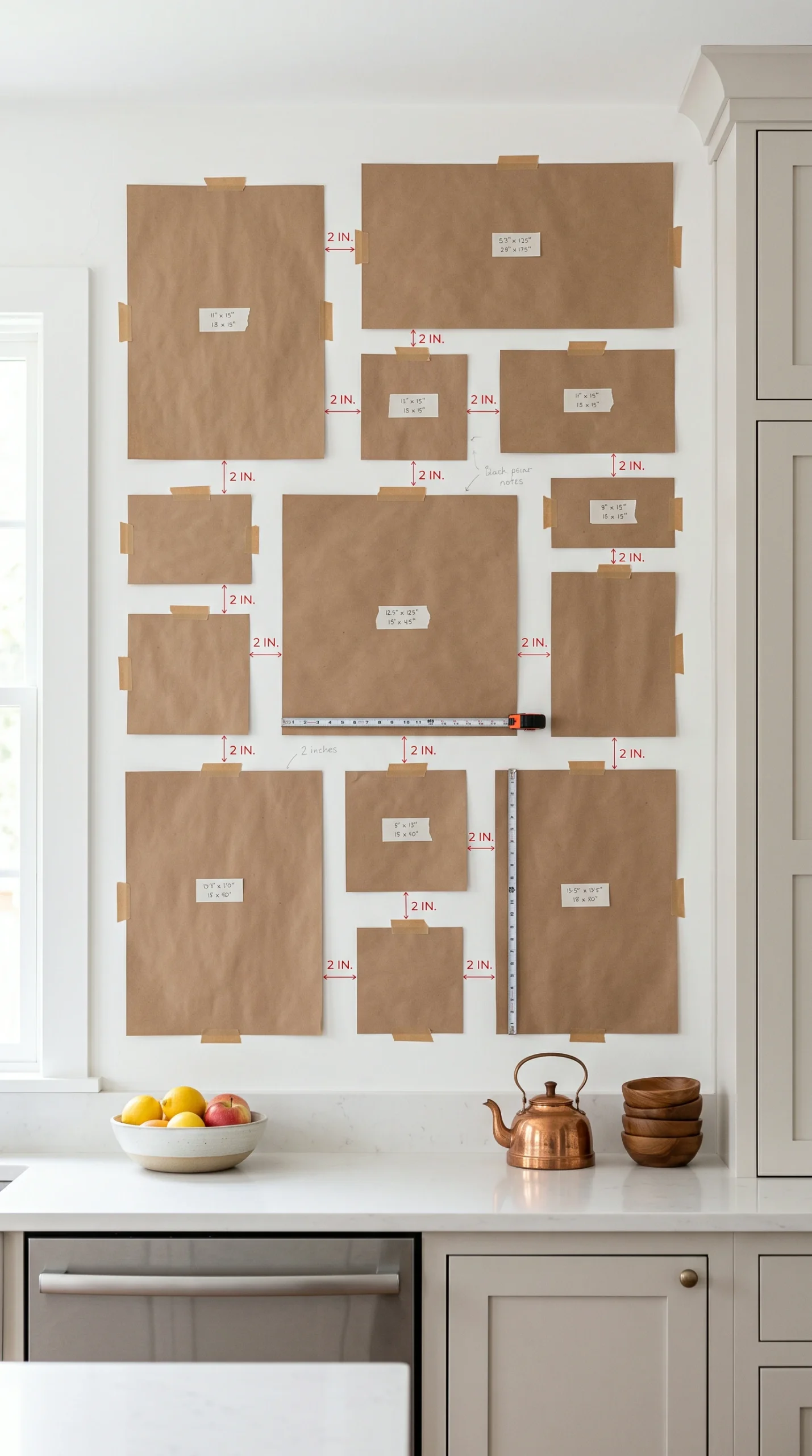
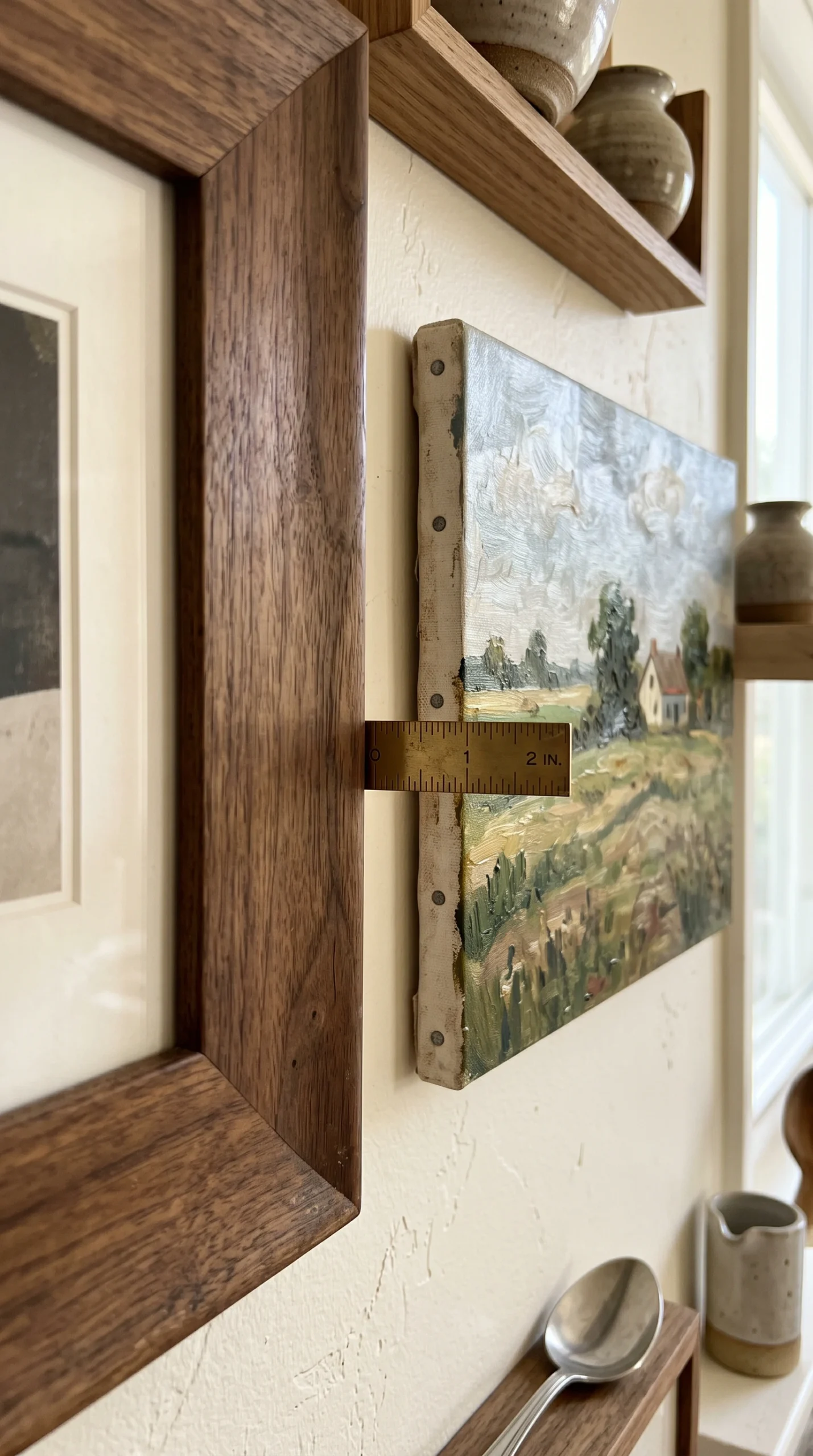
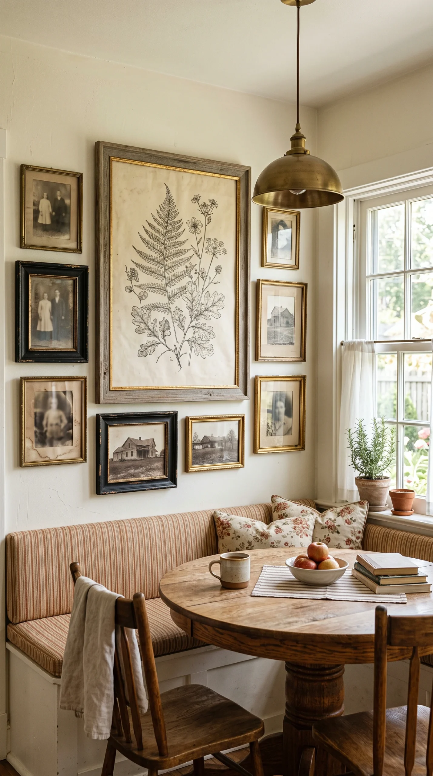
Never hang art too far apart. Keep the spacing strictly between 2 to 3 inches so the grouping reads as a single, massive focal point.
A massive wall requires massive scale. Do not use tiny 4x6 frames; anchor the gallery with at least one large 16x20 or 24x36 piece.
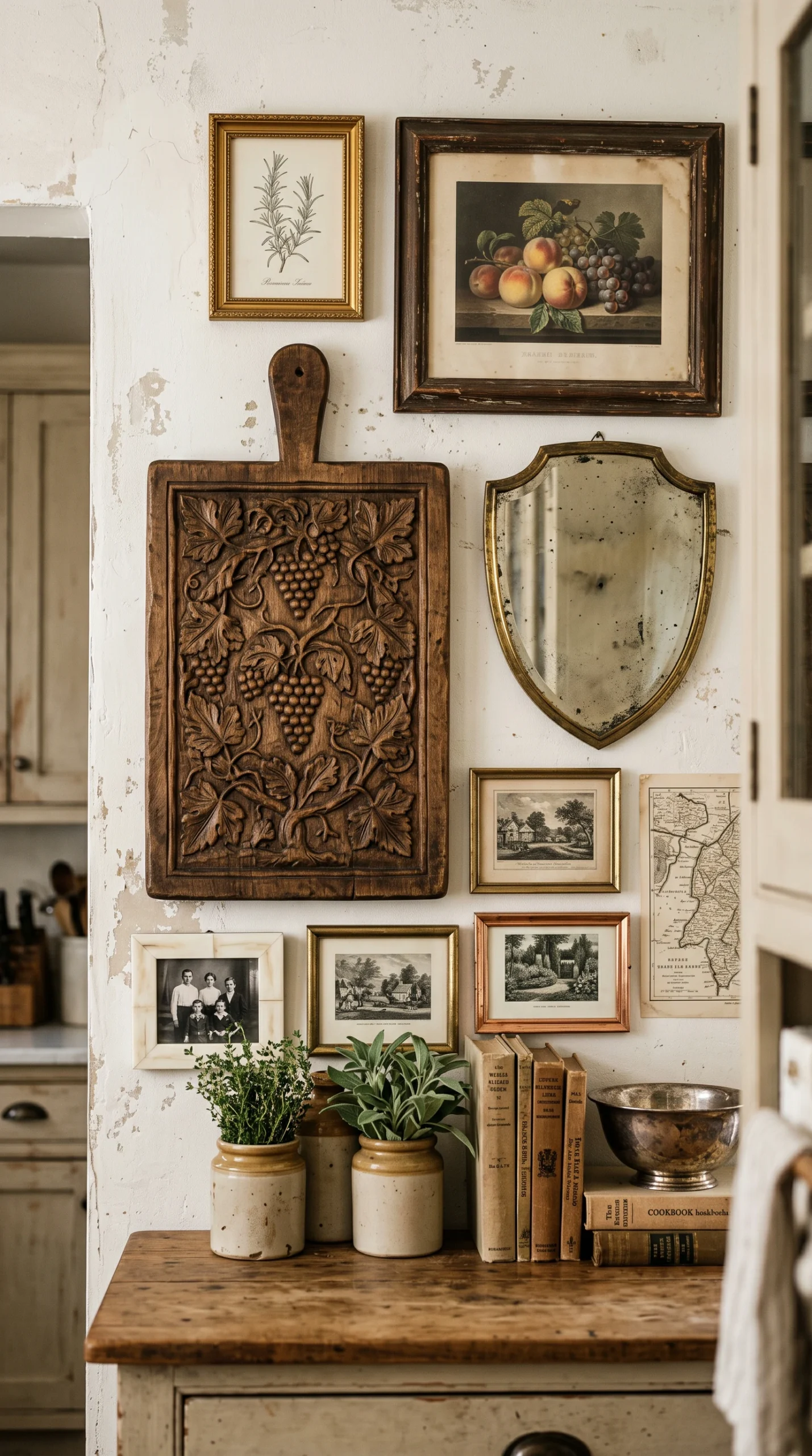
Do not just use paper prints. Incorporate small oil paintings on canvas, vintage brass plates, or a small antique mirror into the grid.
Absolutely avoid generic, mass-produced wooden signs with culinary quotes. They instantly cheapen the sophisticated gallery aesthetic.
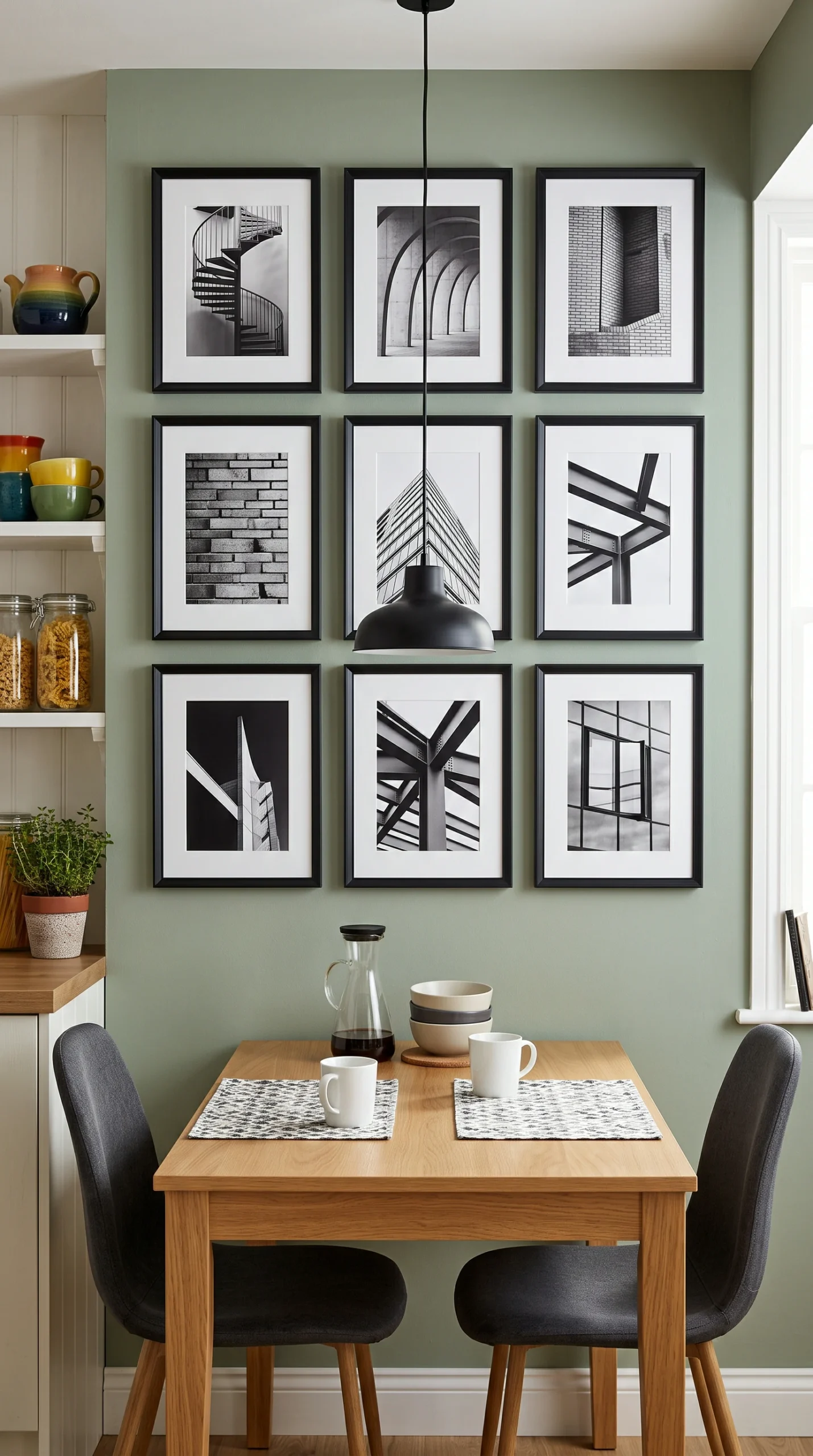
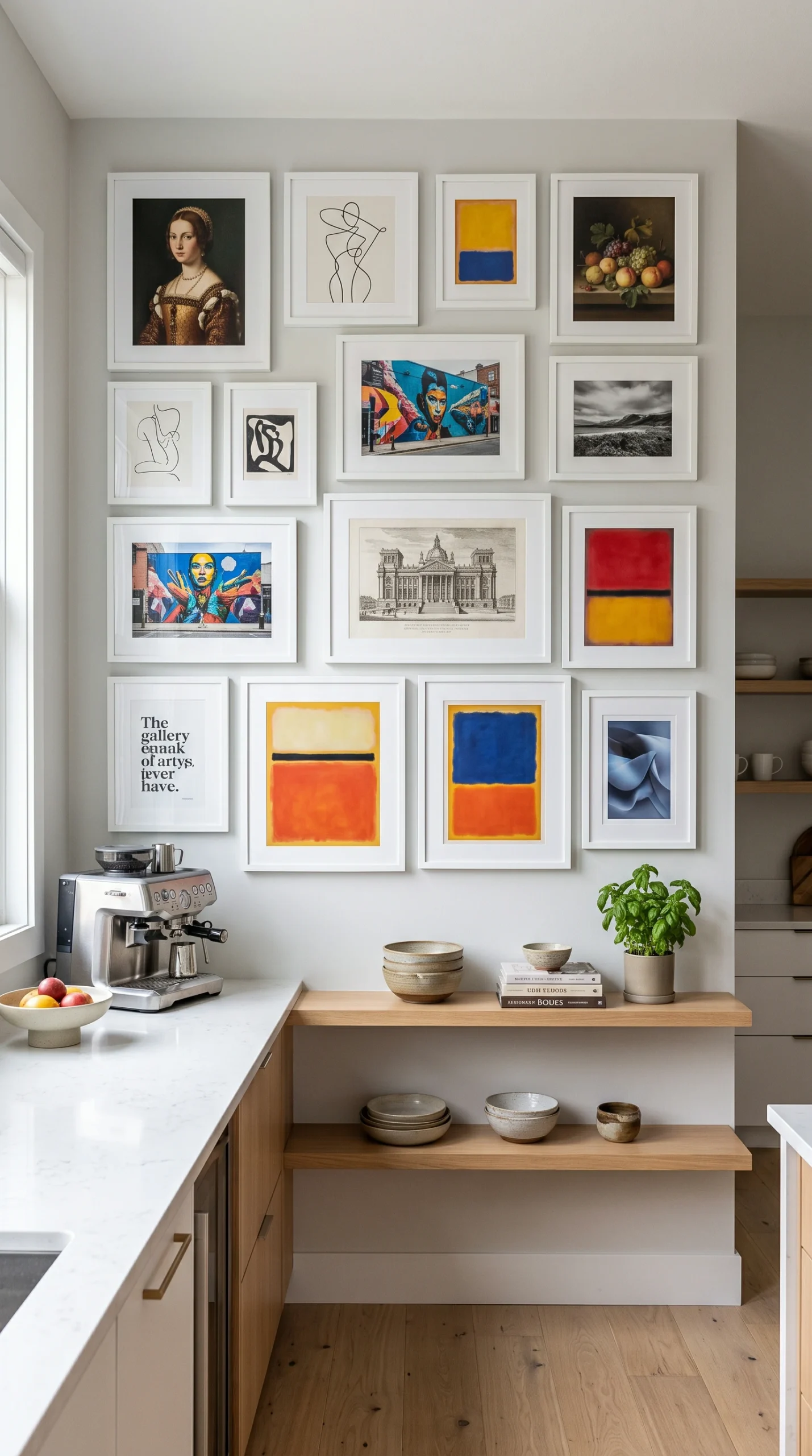
If mixing wildly different art styles, unify the entire collection by using exactly the same frame (like all thin matte black).
Never hang your valuable gallery wall directly above the stove or main prep sink to avoid devastating heat and grease damage.
The absolute most critical first step in executing flawless kitchen gallery wall ideas is selecting the correct real estate. You cannot just throw art on the first blank space you see. You must avoid the immediate ‘splash zones’—the areas directly behind the sink and above the stove. Grease, steam, and food splatter will instantly destroy fine art and expensive frames. Instead, identify the protected, highly visible areas of the room. The large, blank wall next to your breakfast nook, the empty space surrounding a doorway, or the wide expanse of wall leading into the adjoining dining room are the perfect locations. These protected zones allow you to display high-end art safely while ensuring the gallery acts as a stunning visual anchor for the entire space.
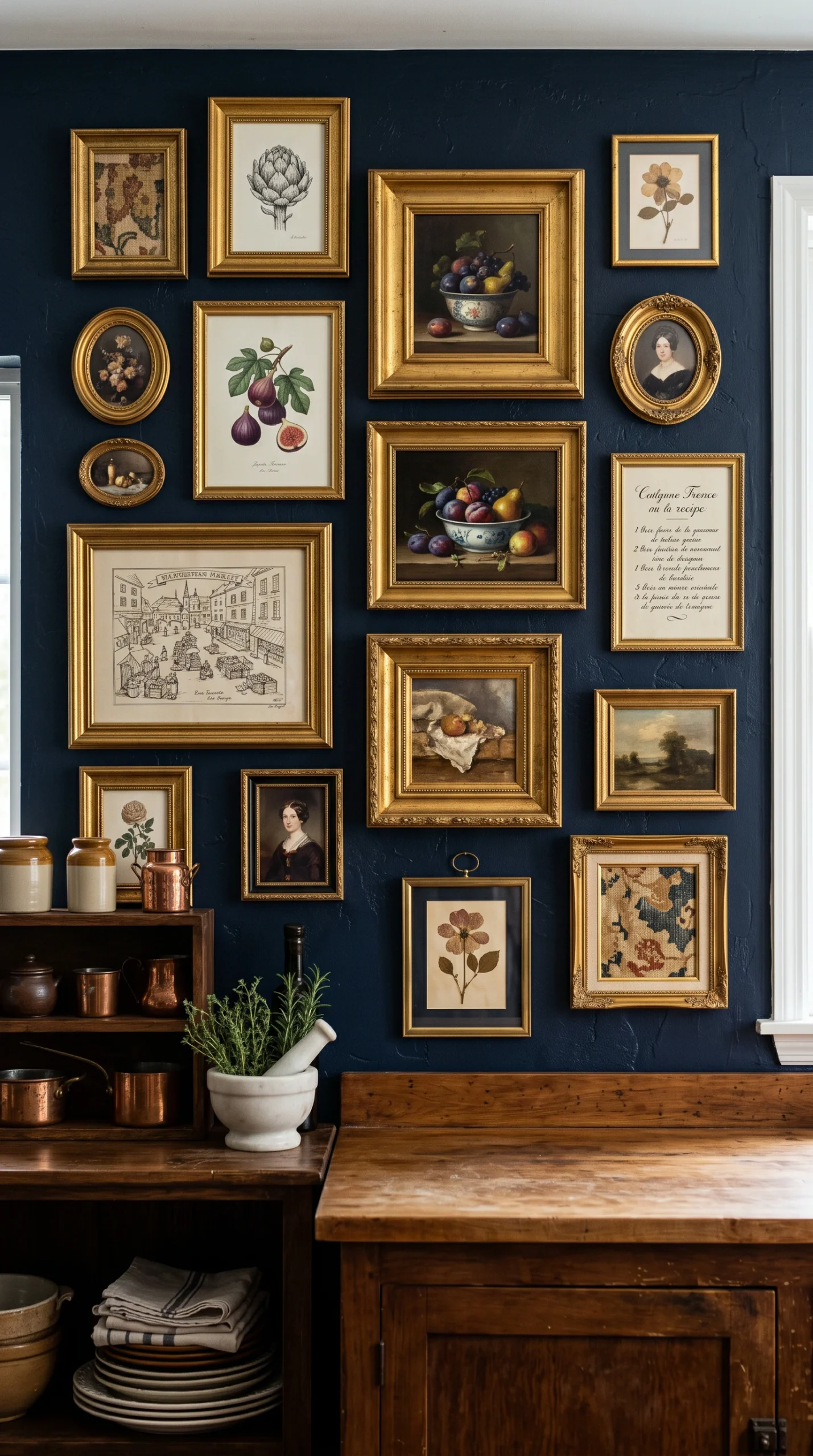
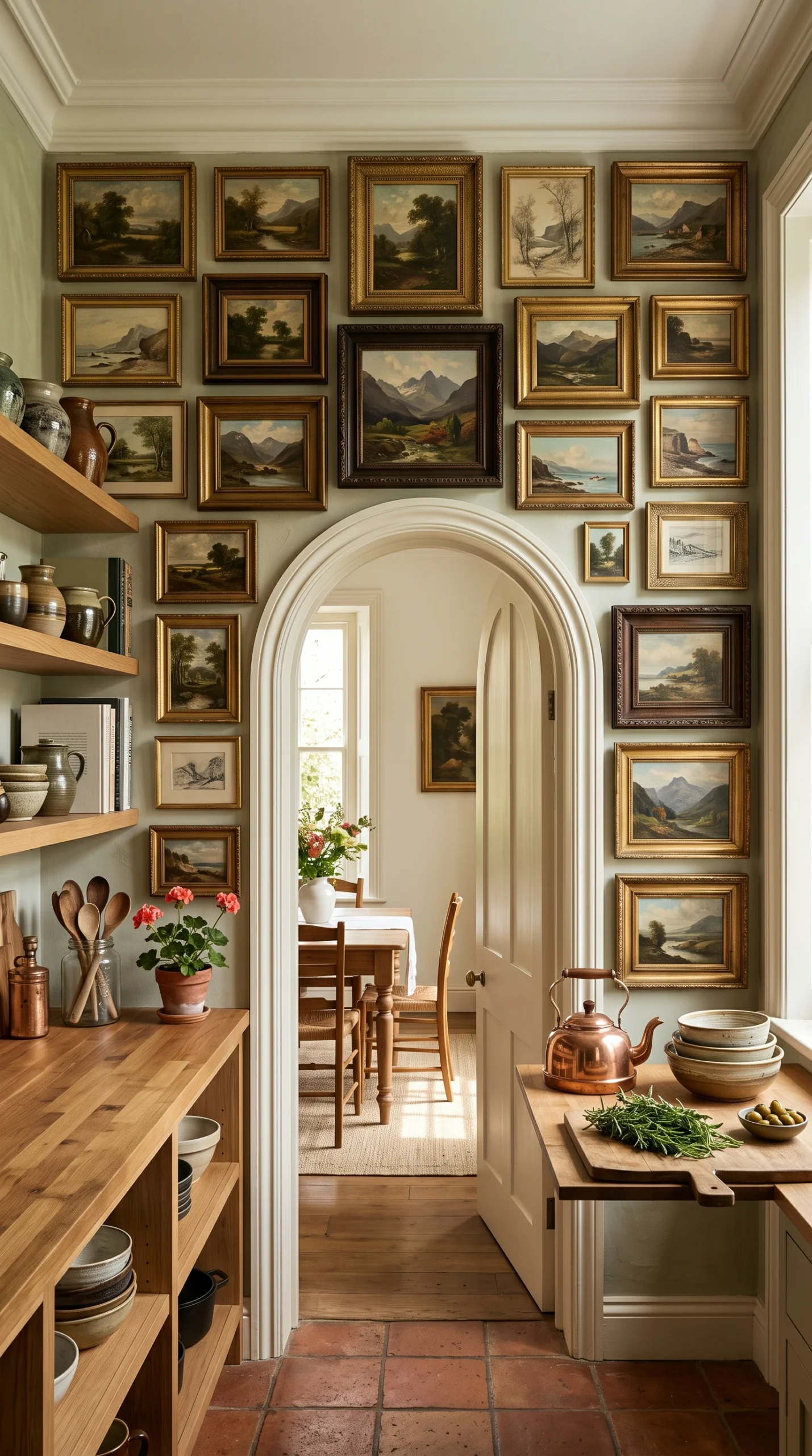
A common mistake when implementing kitchen gallery wall ideas is starting with small pieces, resulting in a chaotic, floating mess. You must establish a strong visual anchor. The most successful gallery walls start with one massive, commanding piece of art placed slightly off-center or exactly in the middle of your planned grid. This could be a large, dark, vintage oil painting or a massive, oversized botanical sketch. Once this heavy anchor is mounted securely, you can begin to build outward, nesting the medium and small frames tightly around it. This hierarchical structure provides immediate visual order and prevents the collection from looking like a random assortment of garage sale finds.
If you only use flat, framed prints, your kitchen gallery wall ideas will lack depth and historical character. The secret to a truly high-end, designer-level gallery wall is the aggressive integration of 3D objects. Break up the flat frames by introducing physical texture. Hang a beautiful, highly polished vintage copper mold, a heavy, ornately carved antique wooden cutting board, or a small, deeply tarnished brass mirror directly into the arrangement. You can even install a small, heavy brass sconce within the gallery to provide functional light. These dimensional elements add an incredible layer of shadow, texture, and unexpected historical charm that elevates the entire installation.
Spacing is the invisible geometry that dictates the success or failure of your kitchen gallery wall ideas. If you hang your art six or eight inches apart, the collection will completely fall apart visually. The eye will read them as separate, disconnected items rather than a single, massive art installation. You must be ruthless with your spacing. Keep the gaps between every single frame and object strictly between two and three inches. This extremely tight spacing creates a powerful, cohesive mass, tricking the brain into seeing one giant, highly intentional focal point rather than a dozen small, cluttered distractions on the wall.
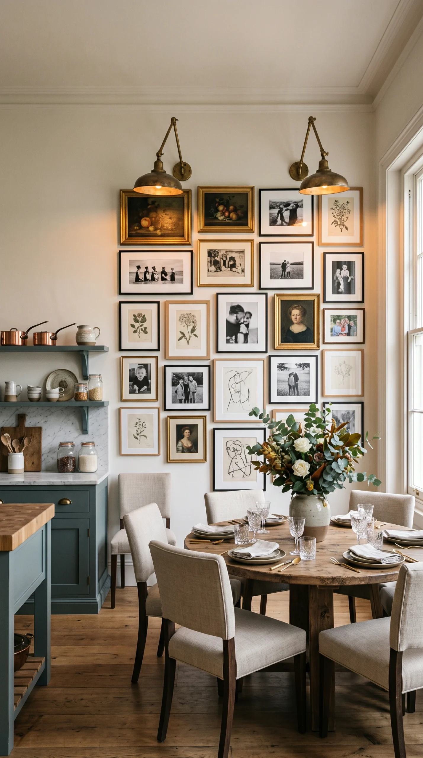
When building an eclectic collection for your kitchen gallery wall ideas, you will naturally acquire a wide variety of art styles—perhaps a modern abstract piece, a vintage landscape, and a stark charcoal sketch. If you throw them all on the wall in wildly different frames, it will look highly chaotic. You must introduce a unifying element. The easiest way to do this is through framing. If the art is highly diverse, frame every single piece in the exact same material—for example, all thin matte black metal frames or all heavy, dark walnut wood frames. This strict framing rule instantly ties the disparate pieces together, making the collection look incredibly intentional and highly curated.
Alternatively, if you want to use heavily mismatched, vintage frames (like mixing ornate antique gold with weathered wood), you must unify the kitchen gallery wall ideas through color. You must restrict the color palette of the actual artwork. For example, choose to display exclusively black-and-white photography, sepia-toned vintage sketches, or oil paintings that all feature a deep, moody olive green. By ensuring the colors within the art ‘speak’ to one another, you can mix and match wildly different frame styles without the gallery wall ever losing its sophisticated, deeply harmonious aesthetic.