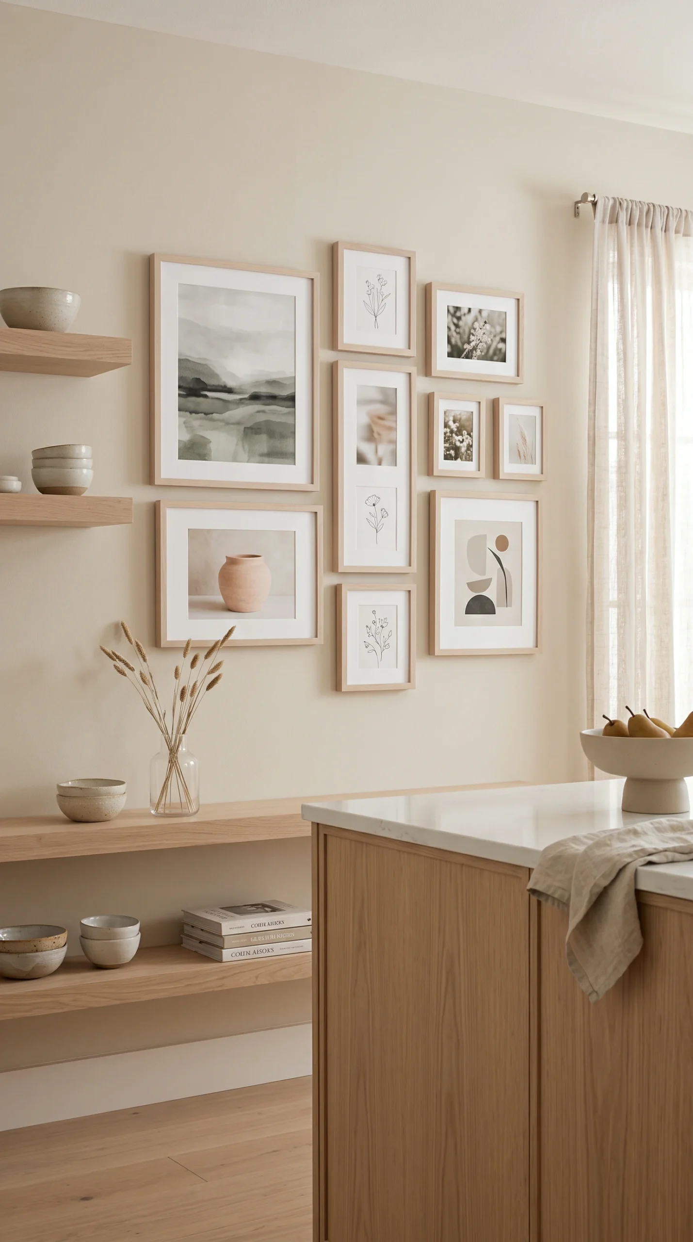
Do not let a single pop of bright blue or red into the gallery. It will instantly destroy the calming, cohesive monochromatic effect.
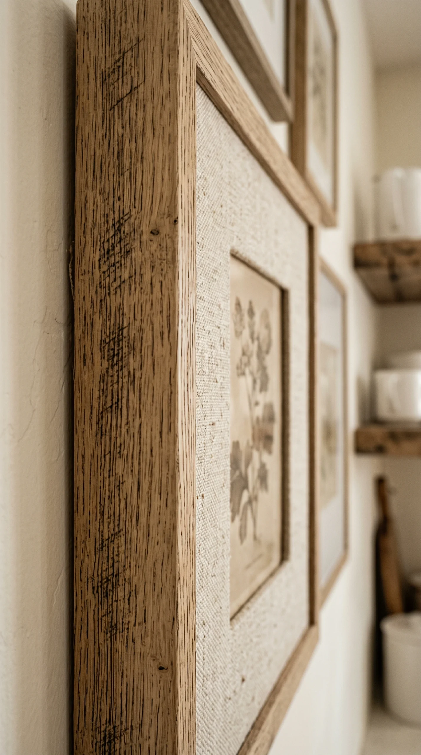
Because you lack color, you must use heavily textured raw linen mats, rough watercolor paper, and heavily grained wood frames.
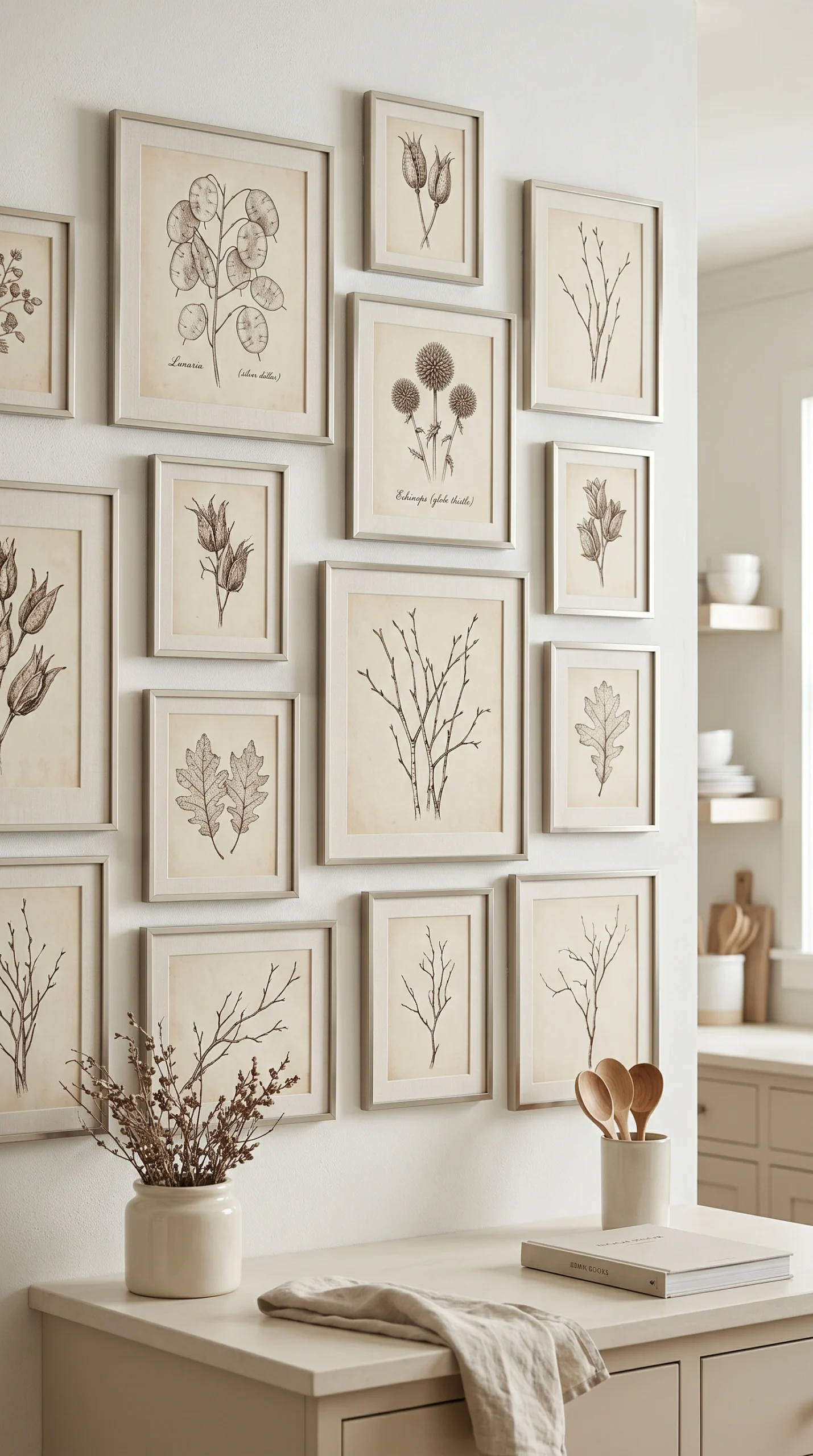
Avoid icy, cool-toned greys and stark hospital whites. Use warm alabasters, muddy mushrooms, and soft beige to keep the wall inviting.
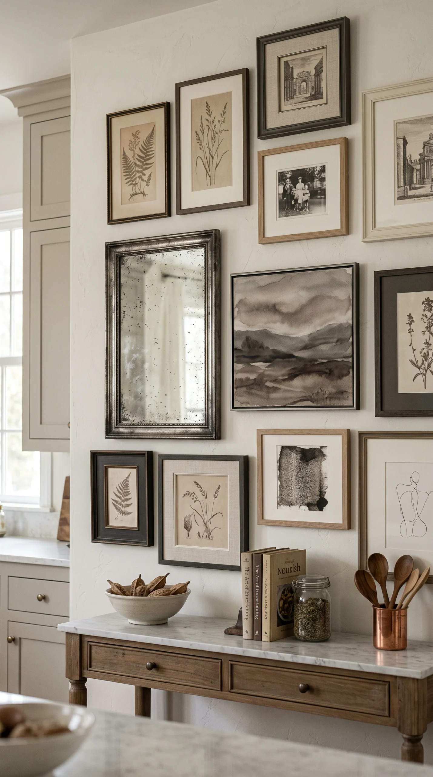
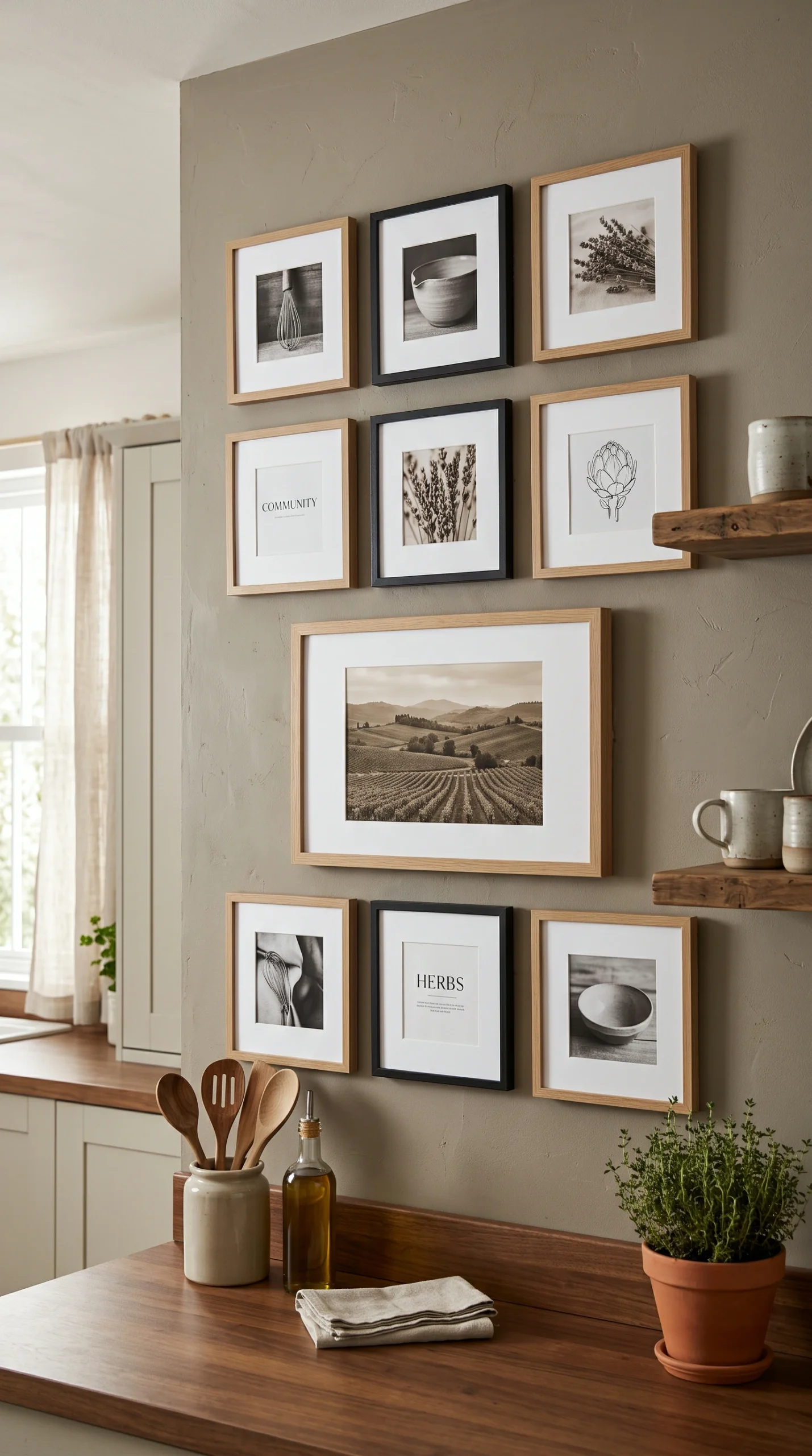
Black-and-white can be too stark for a warm neutral room. Sepia-toned vintage photography provides beautiful, muddy brown warmth.
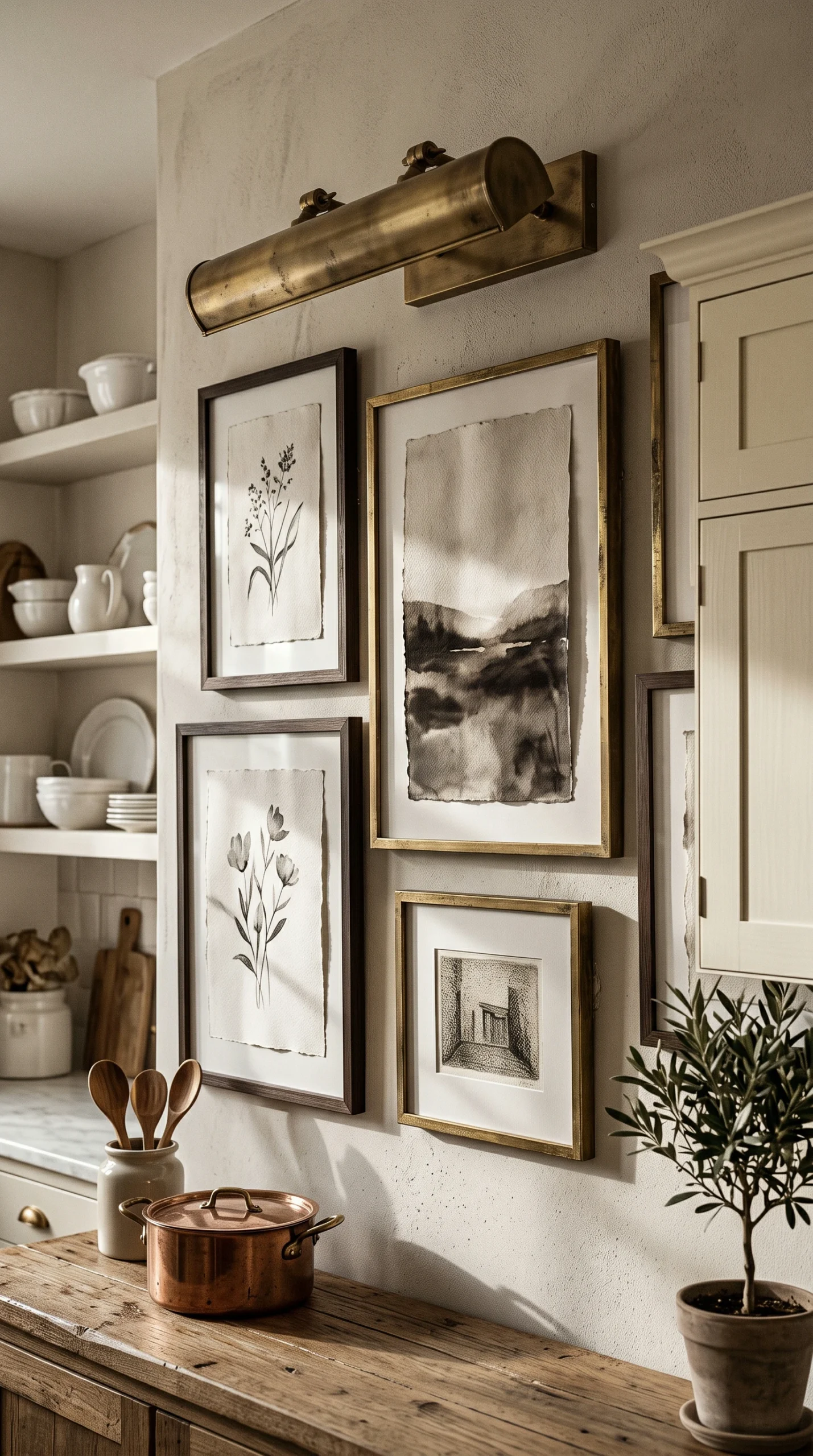
Keep the colors neutral, but mix the materials. Combine pale white oak frames with brushed nickel and heavily tarnished brass.
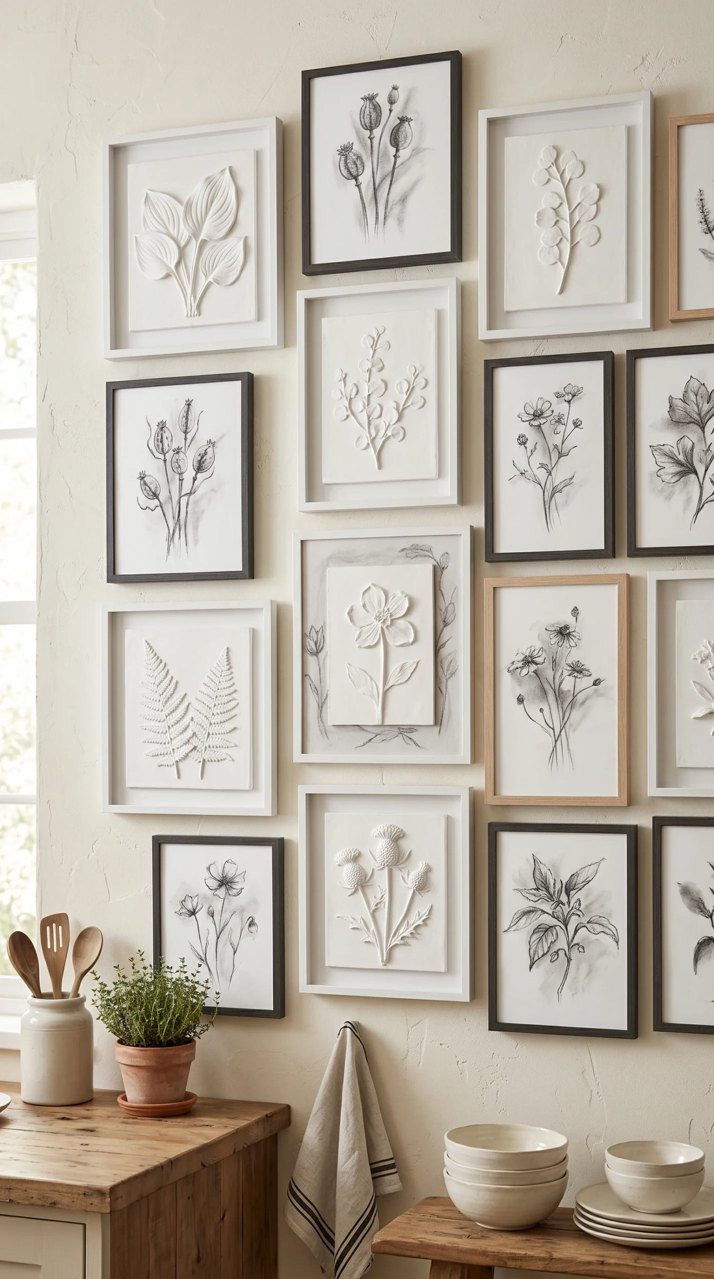
Use heavily textured, 3D white plaster wall art or minimalist relief sculptures to add massive depth without adding any color.
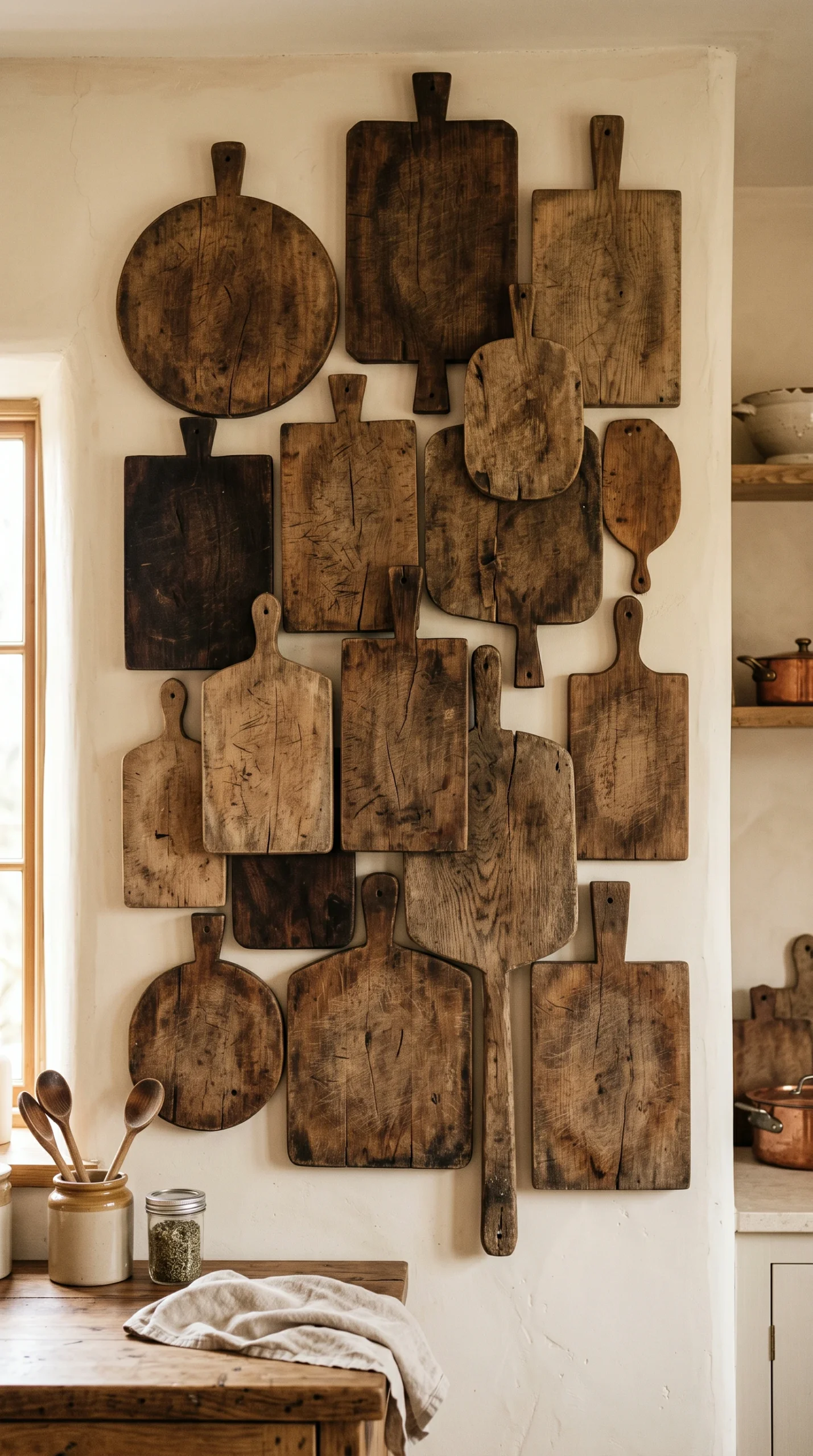
The absolute most critical rule when executing neutral kitchen gallery wall ideas is understanding that texture must completely replace color. If you use flat, smooth paper in smooth, flat plastic frames, a neutral gallery wall will look incredibly cheap and lifeless. You must introduce aggressive tactile variation. Do not use standard paper mats; spend the extra money on custom mats made of thick, raw, unbleached linen. Choose artwork printed on heavy, deeply dimpled cold-press watercolor paper. Even the frames themselves should carry visual weight—use heavily wire-brushed white oak frames that show deep, natural wood grain. This layering of subtle shadows and rough surfaces creates a rich, complex visual experience that a flat, colorful wall simply cannot match.
When choosing photography for your neutral kitchen gallery wall ideas, stark, high-contrast black-and-white can sometimes feel too severe, especially in a traditional or transitional kitchen. The perfect, highly sophisticated alternative is sepia-toned art. Sepia provides a deeply muddy, incredibly warm brown undertone that perfectly bridges the gap between stark monochrome and heavy color. A tightly spaced gallery wall featuring exclusively sepia-toned vintage landscapes or faded architectural sketches provides immense historical warmth. It looks incredibly soft and inviting, perfectly complementing warm cream cabinetry, natural stone countertops, and natural brass hardware without ever clashing.
To truly elevate a neutral gallery wall beyond simple framed prints, you must introduce dimensional artwork. The absolute best choice for neutral kitchen gallery wall ideas is 3D plaster relief art. These pieces are entirely monochromatic (usually crisp white or soft cream) but feature heavy, sculptural ridges, waves, or botanical impressions protruding from the surface. When the ambient light of the kitchen grazes the surface of the plaster, it creates a breathtaking display of deep, dramatic shadows. Hanging a few small, square plaster relief pieces seamlessly among your framed sketches adds incredible architectural depth to the wall while strictly maintaining the zero-color rule.
In a colorful gallery wall, the frames often fade into the background. In neutral kitchen gallery wall ideas, the frames are a massive part of the color palette itself. You must strictly avoid bright, shiny gold or jarring, glossy black frames, as they provide too much aggressive contrast. Instead, focus on soft, muted materials. Pale, raw white oak is the absolute gold standard for a warm, modern neutral aesthetic. Heavily antiqued, dulled silver (like tarnished nickel) or deeply aged, unlacquered brass provide beautiful metallic touches without being loud. By keeping the frames quiet and earthy, you ensure the entire installation feels effortlessly elegant.
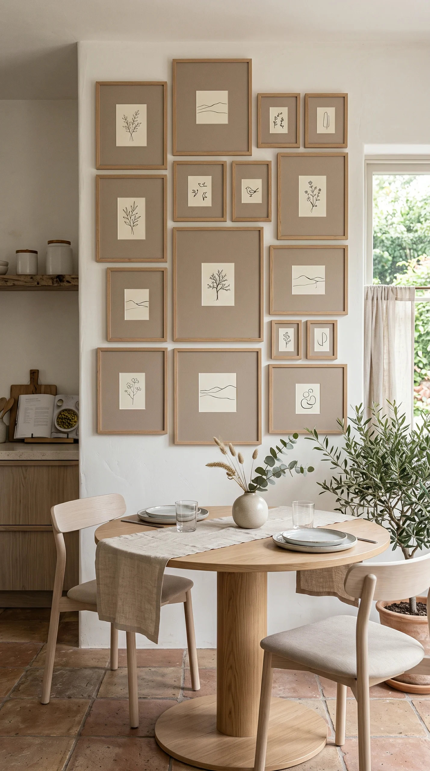
A neutral gallery wall is designed to be a place of visual rest for the eye. If you pack the wall too tightly with incredibly busy, complex line drawings, it will still feel stressful despite the lack of color. You must utilize massive amounts of negative space (white space) within the frames themselves. Choose minimalist, single-line ink sketches or tiny vintage etchings, and surround them with enormous, oversized linen mats. The art itself should only take up perhaps 20% of the frame. This aggressive use of empty space ensures the gallery wall feels incredibly airy, serene, and profoundly calming.
Finally, the most successful neutral kitchen gallery wall ideas perfectly mirror the hard finishes already present in the room. If your kitchen features a heavily veined Calacatta marble backsplash, ensure your gallery frames are pale white oak and tarnished silver to match the cool and warm tones of the stone. If your kitchen features dark walnut cabinets, use sepia art and dark bronze frames to pull those rich browns up onto the blank walls. By treating the gallery wall as a direct extension of the kitchen’s existing architectural color palette, the art feels completely integrated and custom-designed for the space.