Instead of scattering small pops of color everywhere, paint the entire kitchen island or an entire wall of cabinets one deep, solid hue.
You must test heavy paint colors (like navy or black) exclusively under warm evening lighting to ensure they do not look like a dead void.
Ensure 60% of the room is a base color, 30% is a secondary color, and exactly 10% is your bold accent hue.
If you prefer white kitchens, avoid stark, icy whites. You must use warm, creamy alabaster or mushroom to prevent the room from feeling sterile.
For maximum dramatic impact, paint the cabinets, the walls, and the ceiling the exact same dark, moody color.
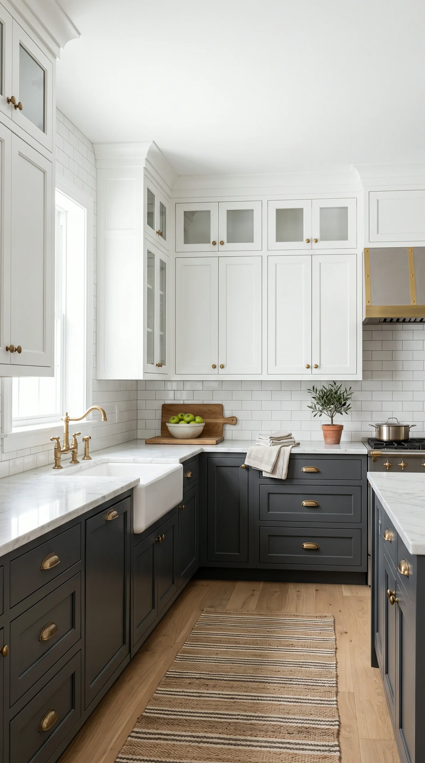
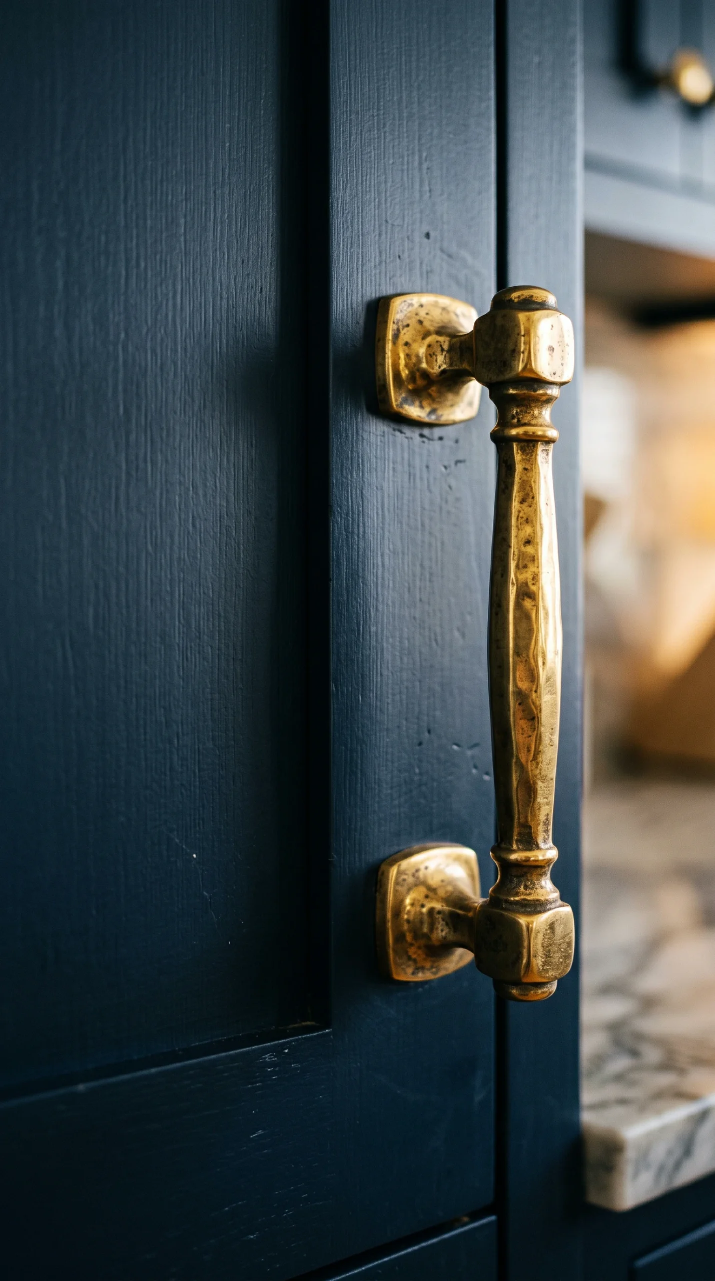
Use the color of your hardware (like bright unlacquered brass against dark green cabinets) as a vital part of your color palette.
When exploring kitchen decor ideas by color, deep, moody green has emerged as the absolute most popular alternative to white. Green is inherently connected to nature, making a deeply saturated forest or olive green feel incredibly grounding and calming, rather than loud or chaotic. To execute this beautifully, paint your lower cabinets or your massive kitchen island a rich, dark green (like Benjamin Moore’s ‘Hunter Green’). This provides immense visual weight. To prevent the room from feeling like a cave, contrast this dark green heavily with crisp white upper cabinets, light marble countertops, and warm, unlacquered brass hardware, which absolutely sparkles against the dark background.
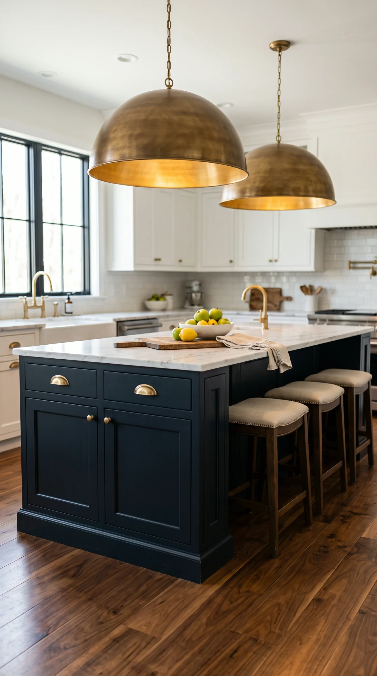
Navy blue is a timeless, highly sophisticated choice when implementing kitchen decor ideas by color. Unlike bright primary blues, which can feel juvenile or strictly coastal, a deep, almost-black navy blue acts as a ‘colored neutral’. It provides the massive drama and high-contrast elegance of black, but with a slightly softer, more approachable undertone. A navy blue kitchen island paired with heavily veined white Carrara marble is a classic, high-end combination. To truly elevate a navy palette, you must incorporate rich, dark walnut wood tones (perhaps for open shelving or flooring) to warm up the inherently cool temperature of the blue.
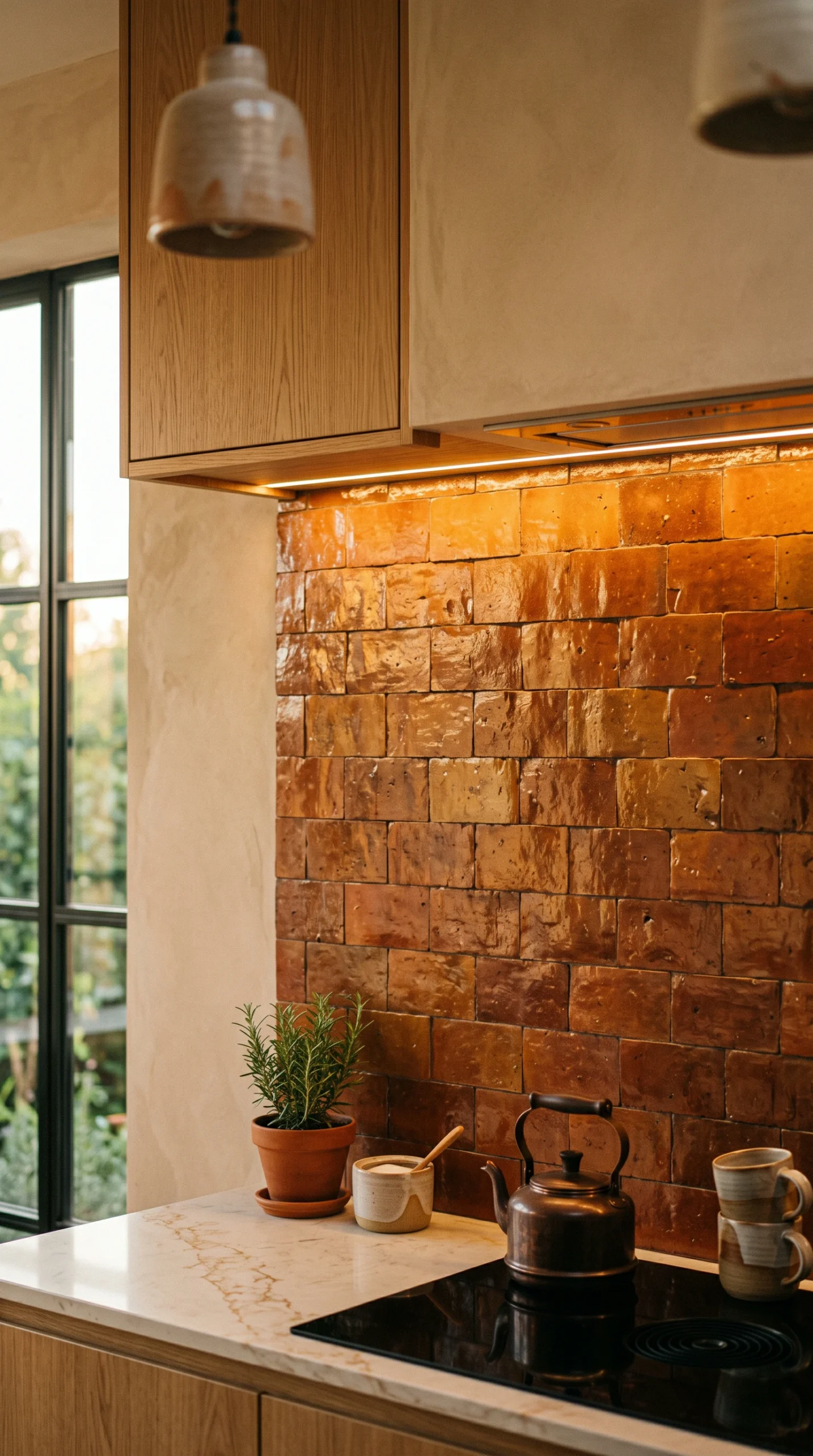
If your goal is to create a space that feels incredibly warm, rustic, and inviting, terracotta is the ultimate choice for your kitchen decor ideas by color. Instead of bright, artificial orange, terracotta offers a muddy, earthy, baked-clay hue that instantly evokes Mediterranean villas or historic farmhouses. You can introduce this color massively by installing authentic terracotta floor tiles, or using heavily textured, handmade Zellige tiles in a rust color for the backsplash. If using terracotta paint, pair it strictly with creamy, off-white upper cabinets and dark, forged iron hardware to create a deeply traditional, heavily textured aesthetic.
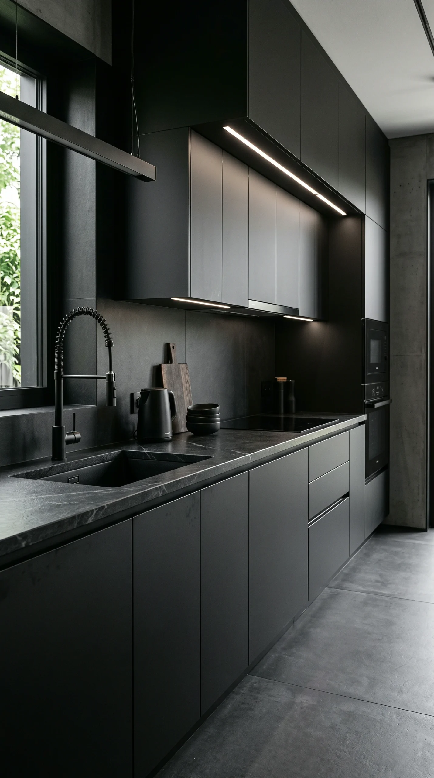
For the most severe, highly architectural modern spaces, matte black is the undisputed king of kitchen decor ideas by color. An all-black kitchen is not for the faint of heart; it makes a massive, unapologetic statement. To prevent a black kitchen from feeling oppressive, you must prioritize texture over everything else. Use matte, flat-panel black cabinets and pair them with a heavily textured, honed black soapstone counter. The absolute key to making black work is extreme lighting. You must flood the space with natural light during the day and utilize massive amounts of warm, layered ambient lighting (like under-cabinet LEDs) at night to highlight the textures and prevent the black from absorbing all the light in the room.
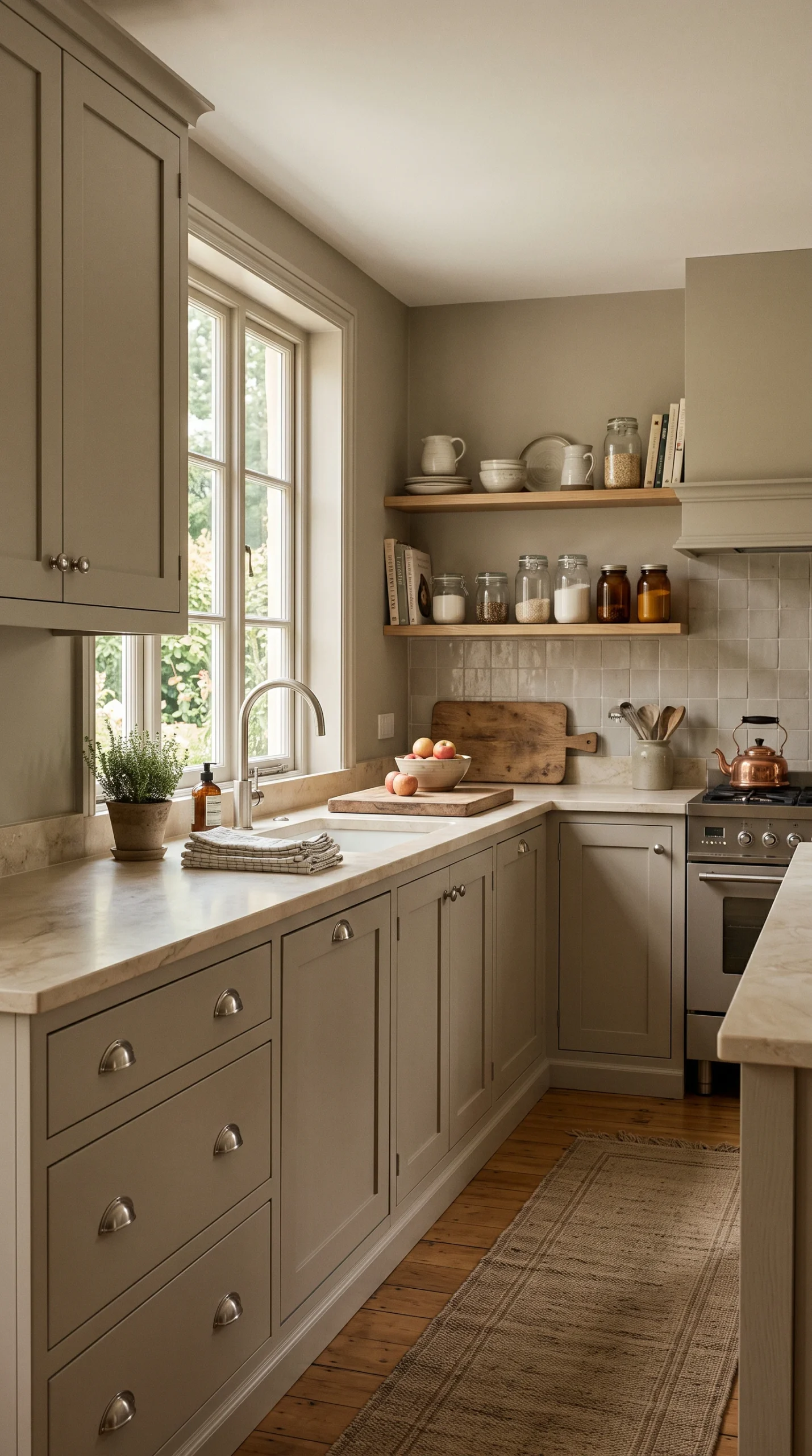
Many people want to avoid bold colors entirely, but standard white feels too sterile. The solution lies in the ‘warm neutral’ kitchen decor ideas by color. You must completely banish stark, architectural whites and cool, blue-toned greys. Instead, paint your cabinetry in deeply complex, muddy neutrals like mushroom, putty, warm taupe, or greige. These colors shift beautifully throughout the day depending on the light, providing immense sophistication and depth that standard white simply cannot achieve. Pair these warm neutrals with heavy, heavily veined warm marble (like Calacatta Gold) and soft, brushed nickel hardware for an incredibly high-end, serene aesthetic.
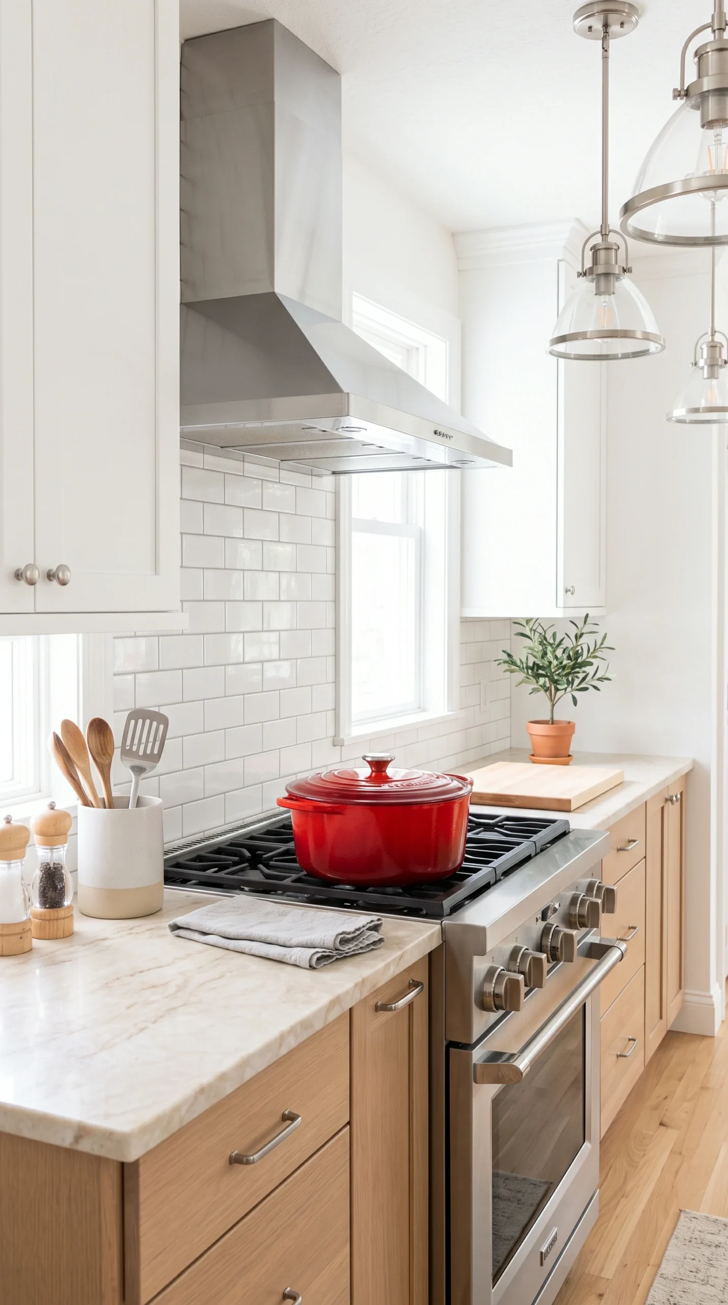
If you are not ready to paint your expensive cabinetry, you must master the art of the accent. The most effective kitchen decor ideas by color rely on the strict 60-30-10 rule. Let your white or wood cabinets be the 60% base. Let your flooring and counters be the 30% secondary neutral. Then, inject a massive, highly intentional pop of color for the final 10%. Paint a single pantry door a bright, mustard yellow. Place a heavy, bright red enameled cast-iron Dutch oven permanently on the stove. Run a heavily patterned, incredibly colorful vintage Persian runner rug down the center of the kitchen. This highly controlled injection of color provides massive personality without requiring a permanent renovation.