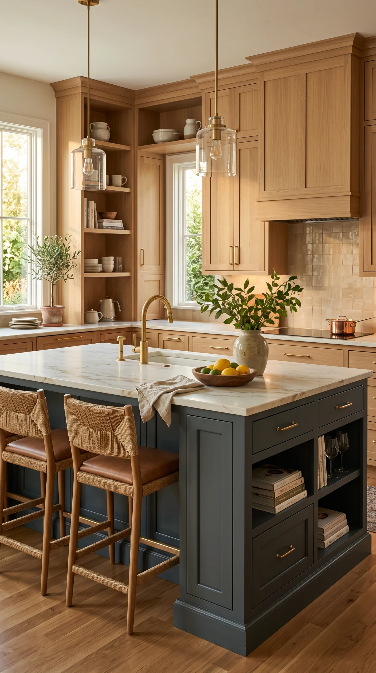
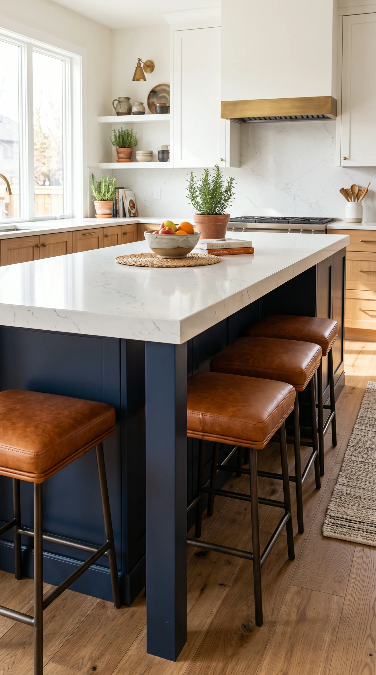
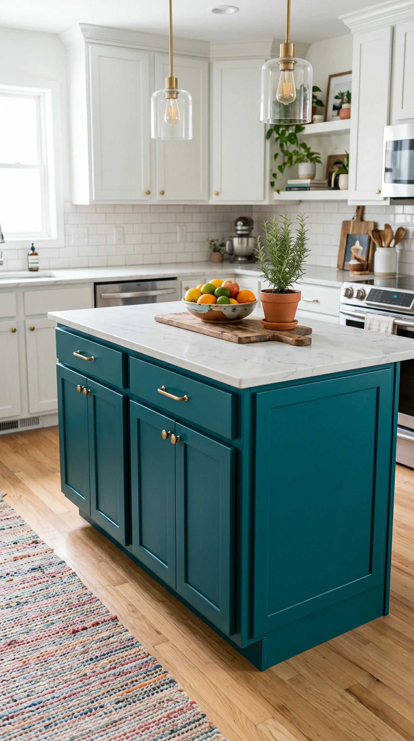
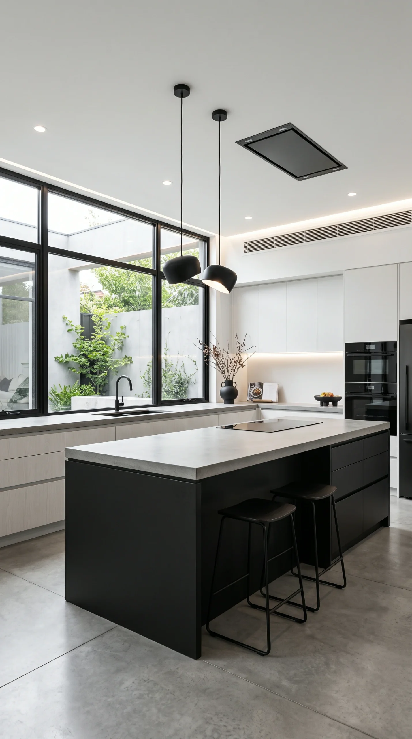
The standard, fail-proof two-tone rule is: keep the perimeter cabinets light (white or cream) and paint the massive island a dark, grounding color.
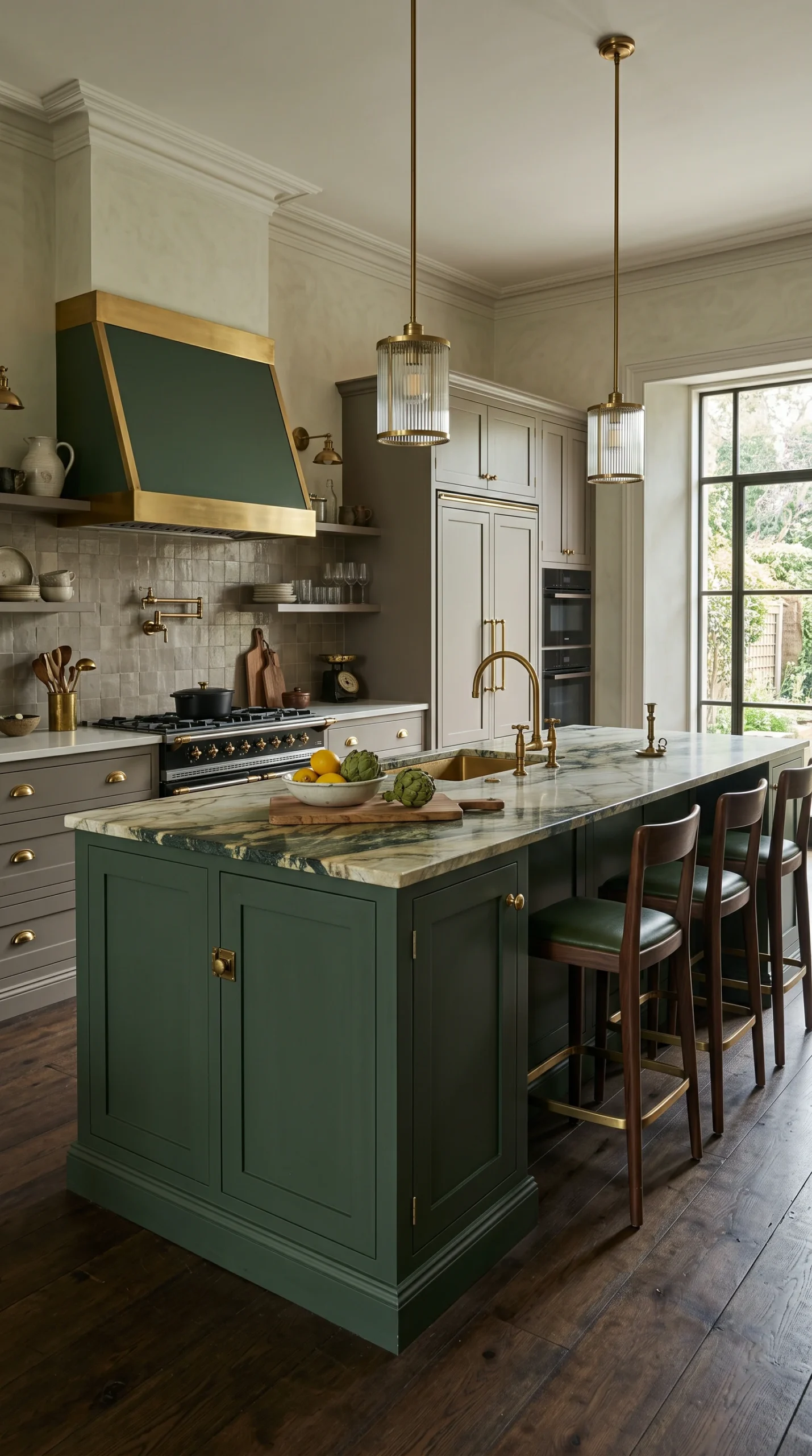
A massive bright red or yellow island looks like a fast-food restaurant. Use heavily muted, deeply saturated jewel tones (navy, forest green) instead.
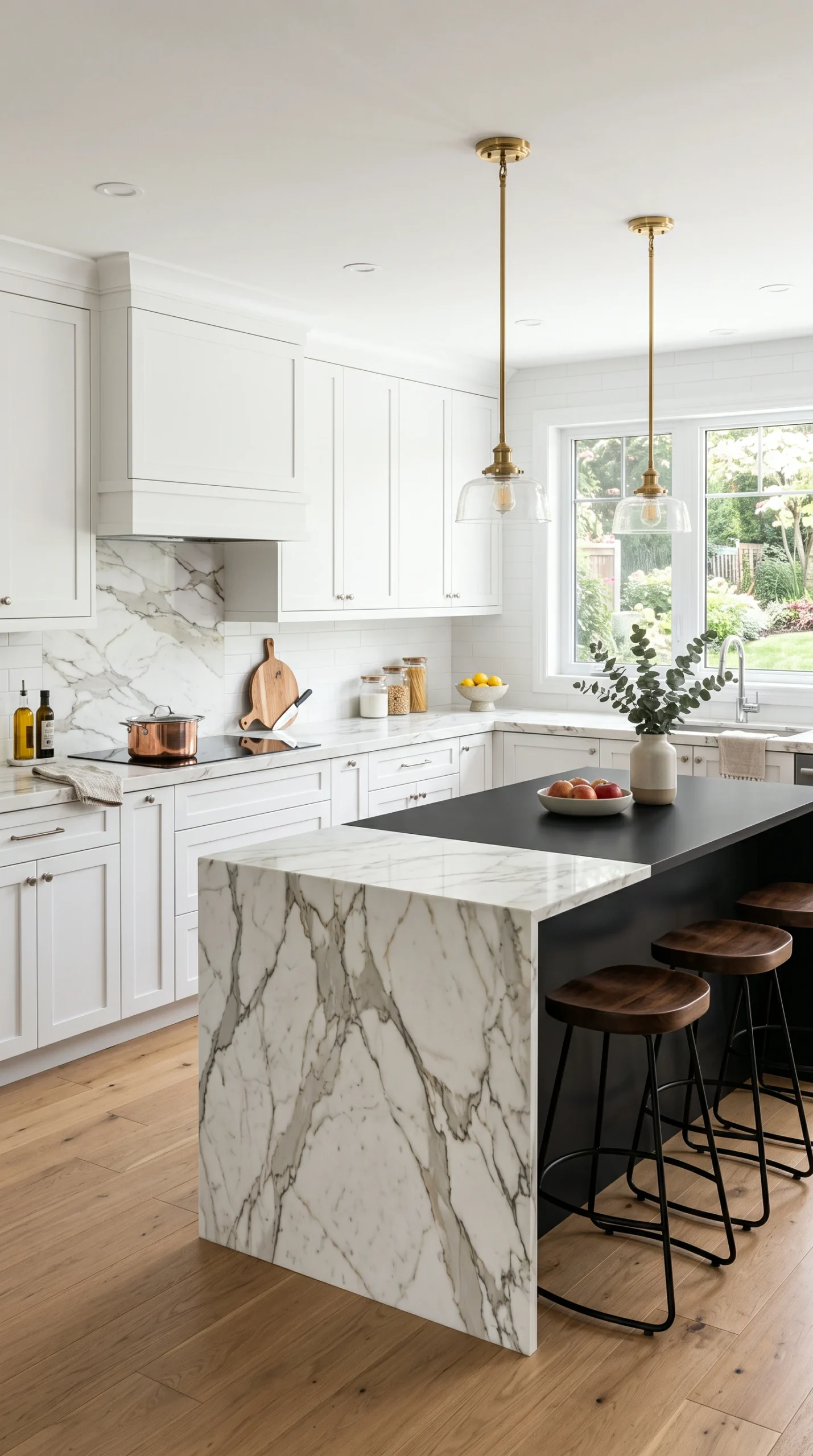
If the island base color contrasts sharply with the perimeter cabinets, using the exact same countertop on both helps unify the room visually.
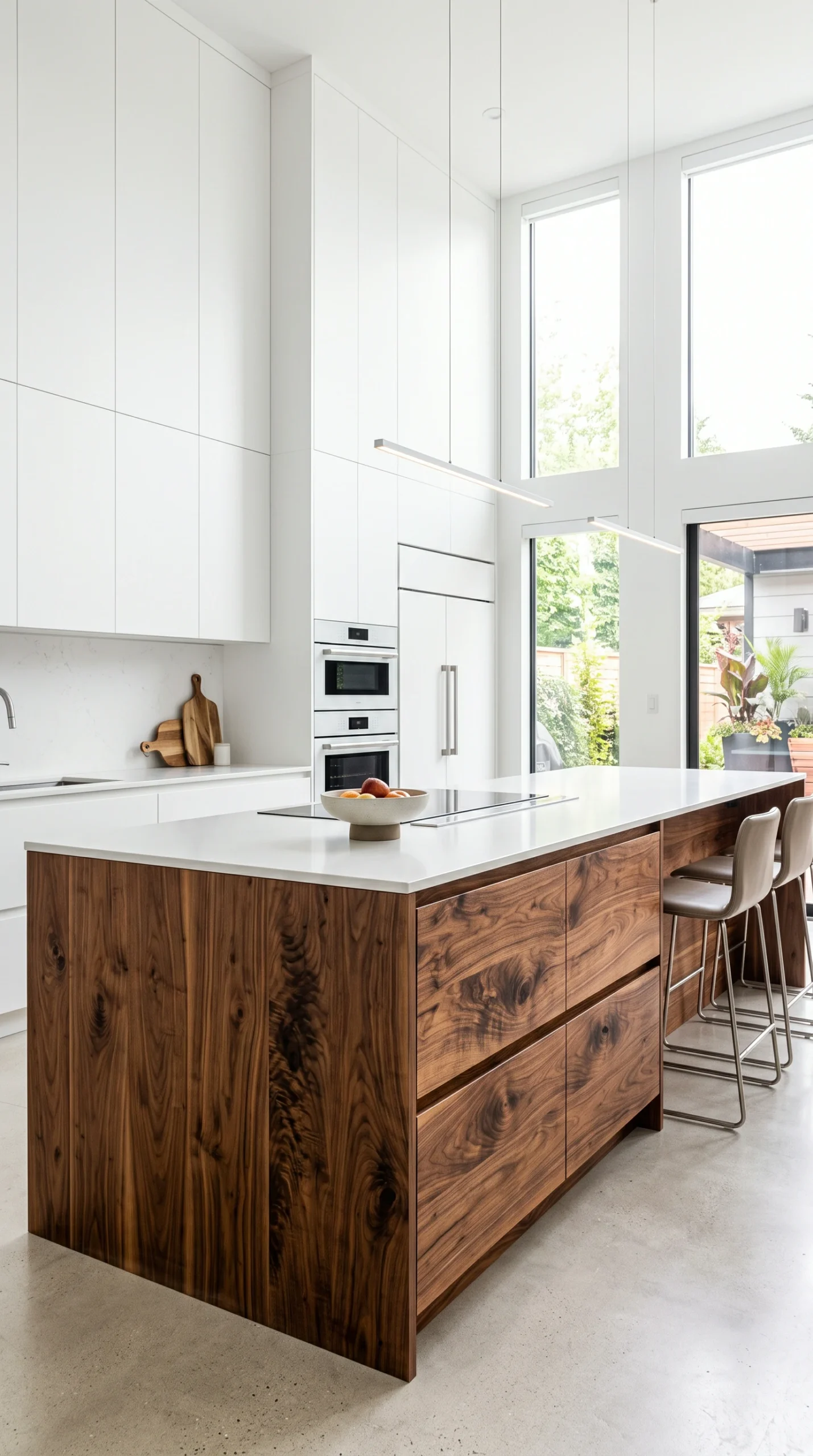
The contrasting 'color' doesn't have to be paint. A heavily grained, raw walnut island against crisp white perimeter cabinets is incredibly luxurious.
If the island is navy and the perimeter is white, use the exact same unlacquered brass hardware on all cabinets to create a cohesive 'thread'.
Paint the toe-kick (the recessed base) the exact same dark color as the island base to ensure it looks like a solid, heavy piece of furniture.
The absolute fundamental principle of executing kitchen island color ideas in a two-tone kitchen is the concept of ‘visual grounding’. The human eye expects heavier, darker items to be lower and central, while lighter items should float upward and outward. Therefore, the most successful, universally appealing two-tone kitchens feature light, airy perimeter cabinets (crisp white, soft cream, or pale greige) wrapping the walls, contrasted perfectly by a massive, deeply dark island in the center of the room. A dark navy blue, matte black, or charcoal grey island acts as a massive visual anchor. It grounds the entire room, preventing a stark white kitchen from feeling sterile, floaty, or like a hospital operating room.
When injecting color into a kitchen, the island is the safest, most impactful place to do it. However, your kitchen island color ideas must rely on heavily muted, saturated tones, never bright primary colors. A bright ‘fire engine’ red or ‘lemon’ yellow island is highly aggressive and looks immediately dated and cheap. To achieve a high-end designer aesthetic, you must add ‘mud’ to the color. Instead of bright blue, use a deeply saturated, almost-black navy (like Hale Navy). Instead of bright green, use a dark, moody forest green or a muted, greyish olive. These deep, muddy jewel tones provide incredible color and personality while remaining profoundly sophisticated and timeless.
A ‘two-tone’ kitchen does not strictly require two different colors of paint. Some of the most breathtaking kitchen island color ideas simply contrast painted perimeter cabinets with the rich, raw texture of natural wood. If you have a kitchen wrapped entirely in stark, modern white flat-panel cabinets, placing a massive, heavily grained natural walnut or white oak island in the center is an absolute masterclass in design. The incredible warmth, heavy texture, and organic variation of the wood grain provide a desperate, beautiful relief from the flat, sterile white paint, transforming the cold room into a warm, inviting luxury space.
When you aggressively contrast the island color against the perimeter cabinets, you introduce intense visual friction. You must carefully unify the room to ensure the island doesn’t look like a mistake that was dragged in from another house. The best way to unify kitchen island color ideas is through repetition. If you have a navy blue island and white perimeter cabinets, use the exact same countertop (e.g., Calacatta quartz) across the entire kitchen. More importantly, use the exact same hardware. Heavy, unlacquered brass pulls installed on both the white cabinets and the navy island act as a visual thread that perfectly ties the two entirely different cabinet colors together into one cohesive design.
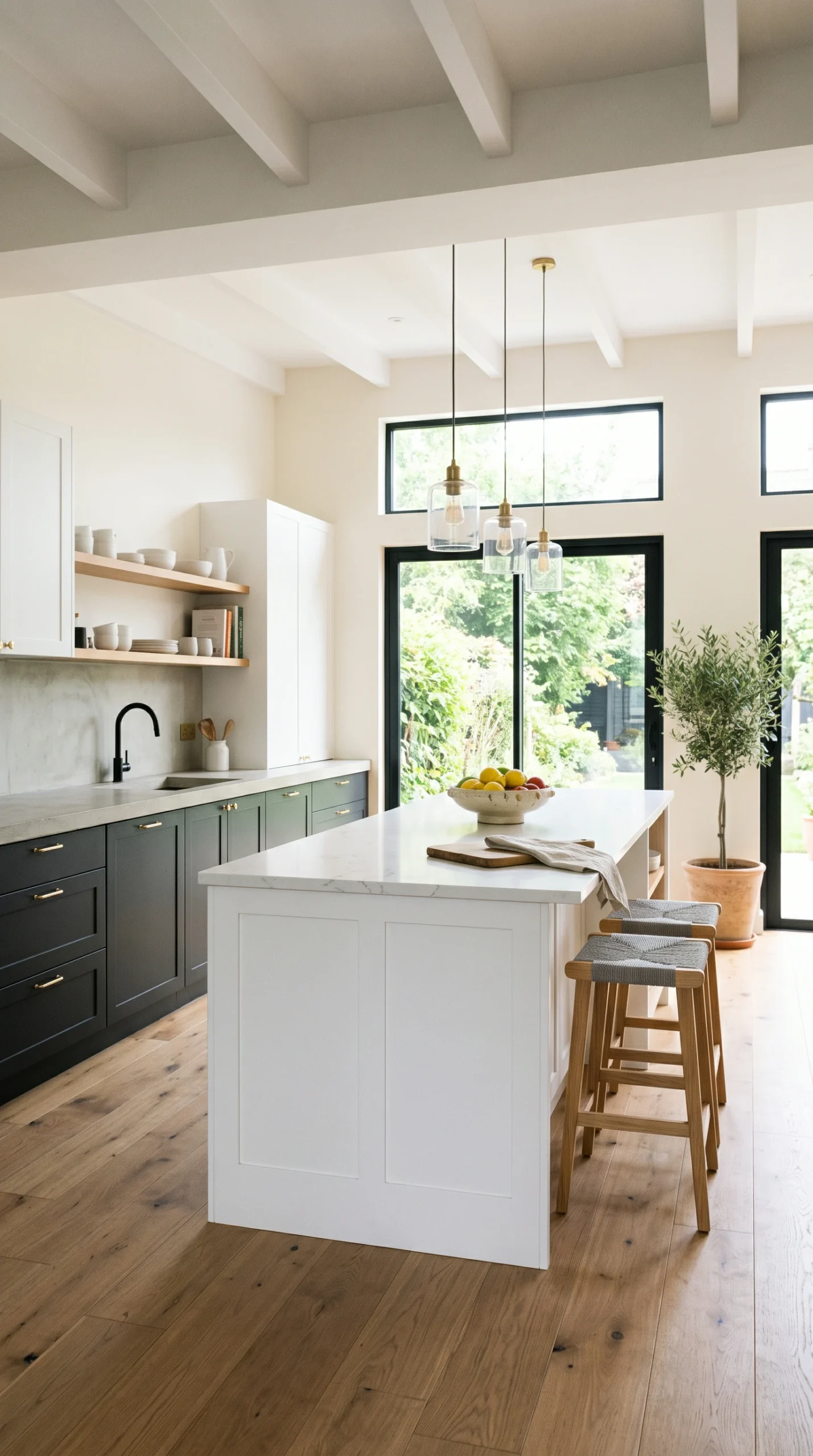
While the standard approach is ‘light perimeter, dark island’, advanced designers occasionally execute the ‘reverse’ two-tone layout. In this scenario, the perimeter base cabinets are painted a dark, moody color (like forest green), and the island is painted a crisp, stark white. This approach is highly dramatic and creates a very moody, enveloping kitchen. However, this reverse layout only works successfully in kitchens flooded with massive amounts of natural light. If you attempt a dark perimeter in a small, windowless kitchen, the dark walls will aggressively close in on the room, making it feel like a tiny, claustrophobic cave.
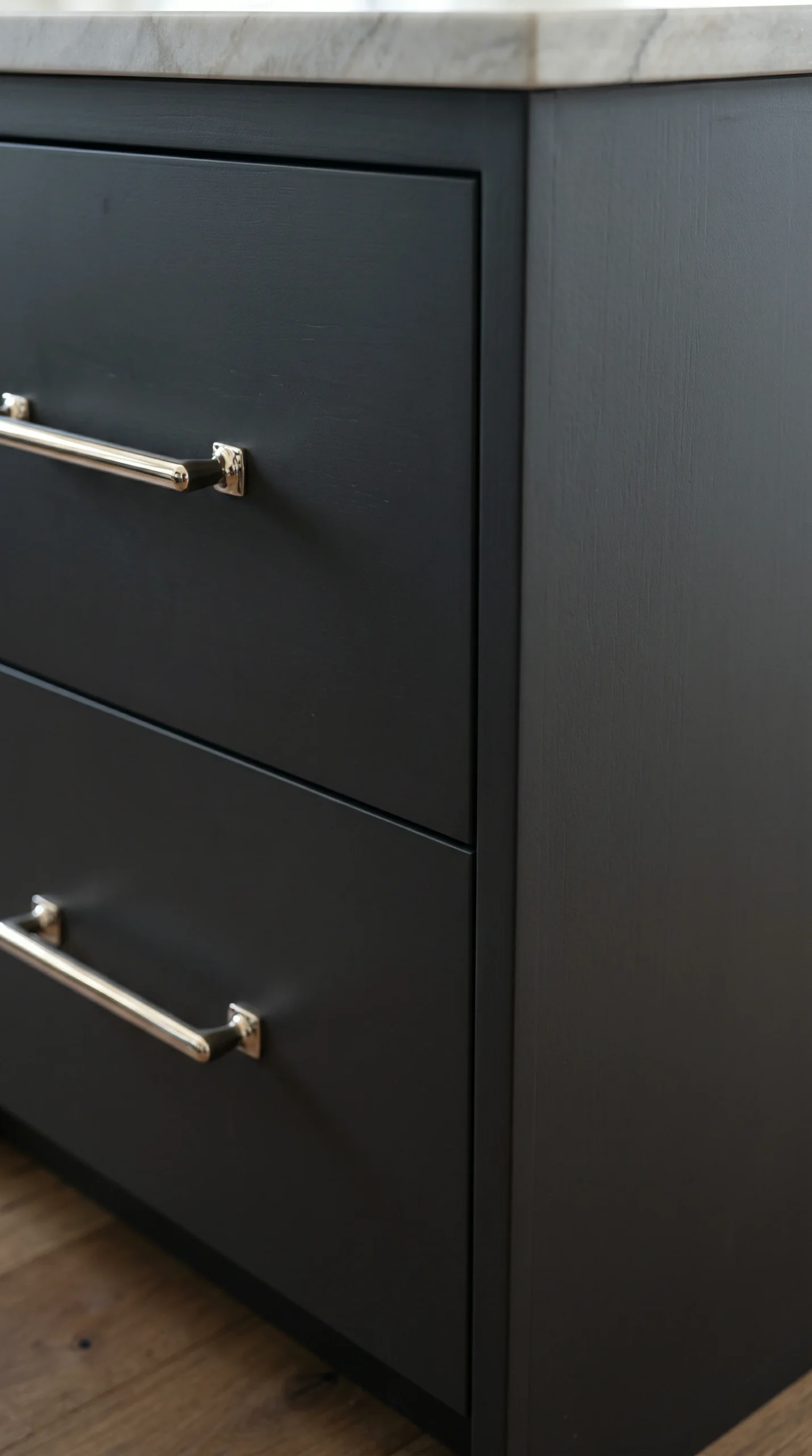
Finally, the actual sheen of the paint you choose for your kitchen island color ideas is critical. Because the island sits in the center of the room, it will be hit by light from every single window and ceiling fixture. If you paint a dark navy island in a high-gloss or semi-gloss finish, the heavy glare from the lights will highlight every single fingerprint, dent, and speck of dust, making the dark color look cheap and plastic. You must insist on a durable, dead-flat matte or very low-sheen satin finish for dark islands. The matte finish absorbs the light, making the dark color look incredibly rich, deep, and velvety.