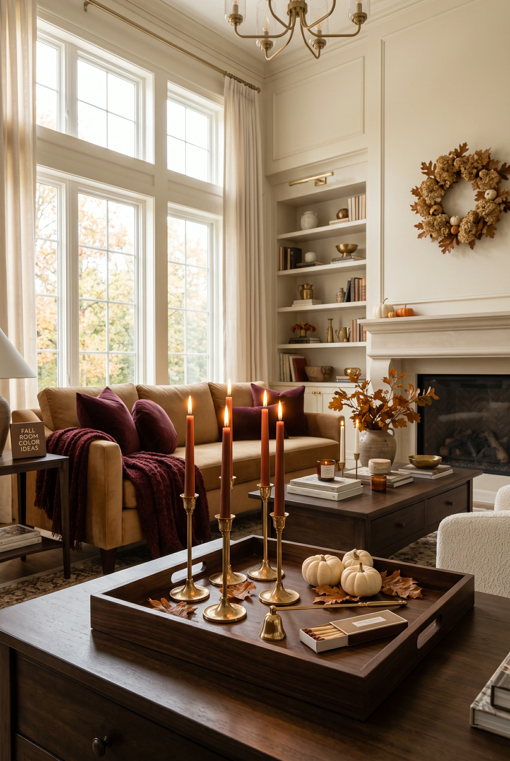
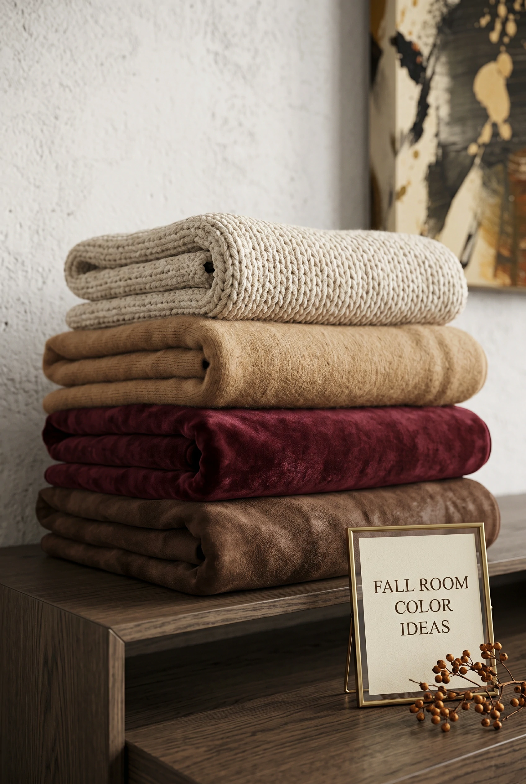
Use a neutral base for 60% of the room, a secondary warm color (like camel) for 30%, and a deep, bold autumn accent (like burgundy) for the final 10%.
Skip the neon, artificial oranges. Opt for deeply sophisticated, muted versions like burnt rust or rich terracotta.
Chocolate brown is the ultimate grounding autumn color. Use it heavily in your woods, leathers, and heavy textiles.
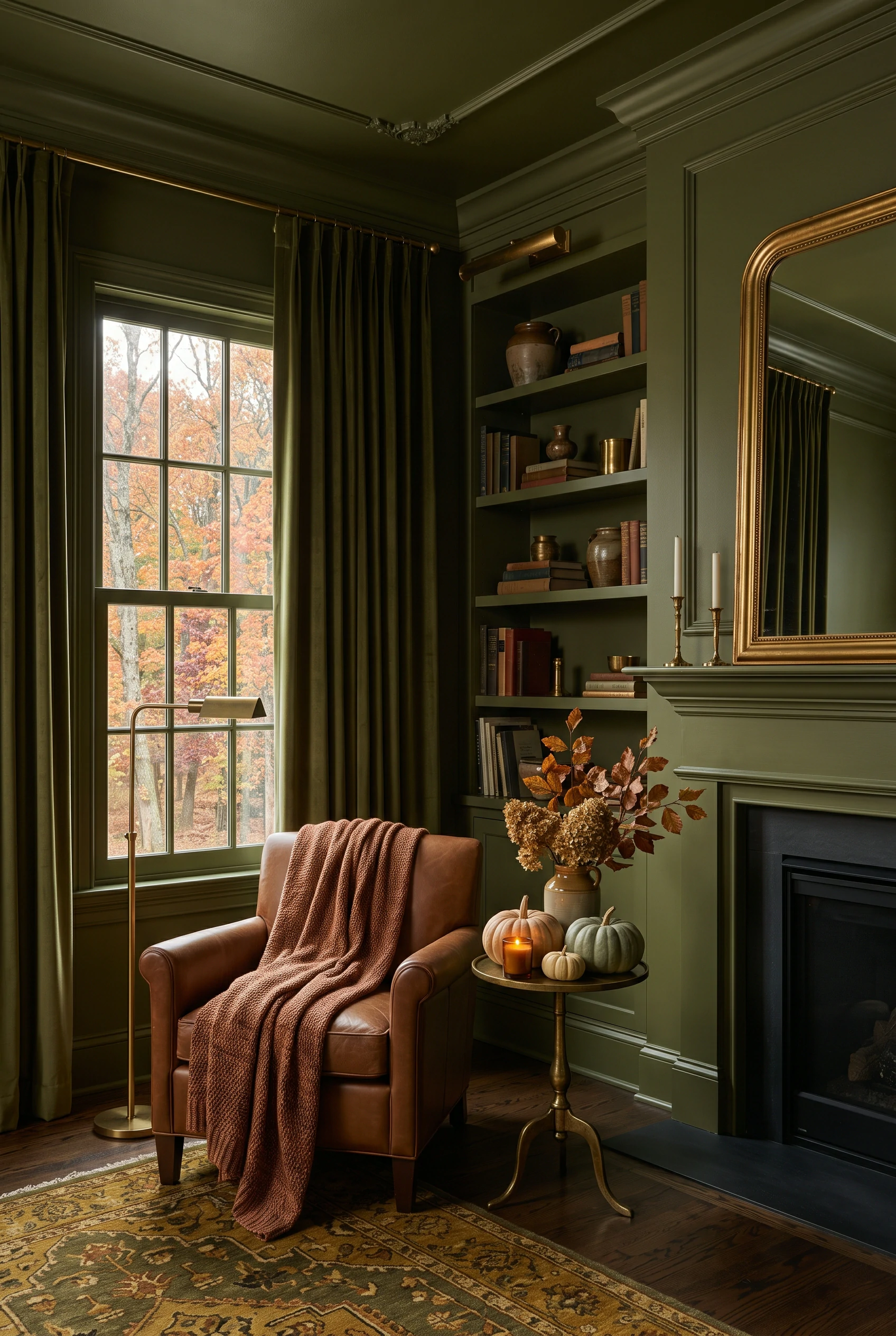
For massive impact, paint your walls, trim, and ceiling the exact same deep, moody autumn color.
Swap out stark, cool whites and blue-greys for warm, creamy oats, beige, and warm taupe.
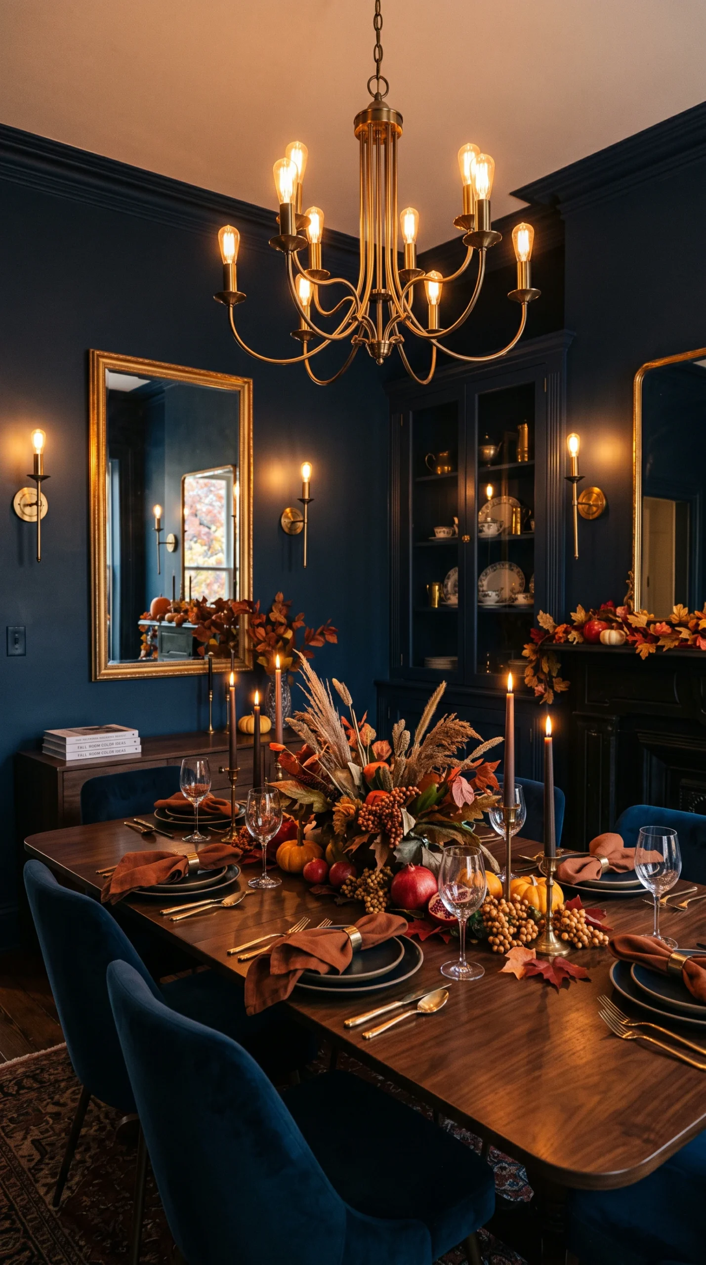
Autumn colors look entirely different under harsh light. Always test your fall paint or fabric swatches exclusively under warm (2700K) lighting.
When most people brainstorm fall room color ideas, they immediately default to bright, artificial orange. However, highly sophisticated, professional autumn design strictly avoids these neon, Halloween-style hues. To achieve a truly elegant and stylish autumn home, you must look to the deeper, more nuanced colors of the changing landscape. The absolute pinnacle of modern autumn design relies heavily on deep burgundy, rich chocolate brown, warm caramel, and muted olive green. These deeply saturated, complex colors evoke the exact same cozy, seasonal feeling as orange, but they do so in a vastly more mature, luxurious, and timeless manner, ensuring your home looks like a curated design showcase rather than a seasonal craft store.
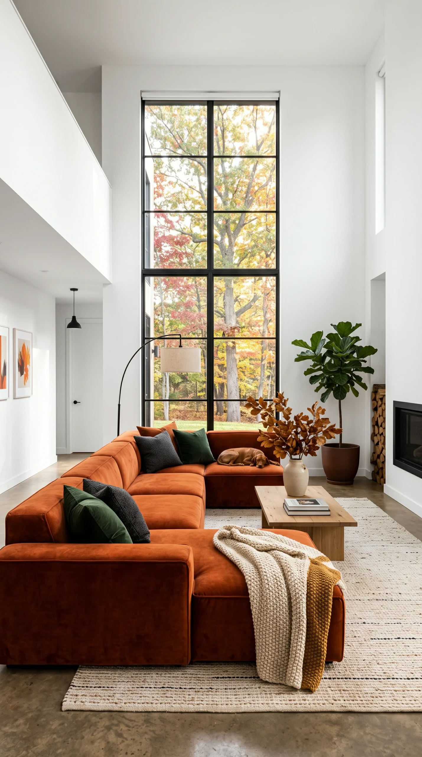
To flawlessly execute your fall room color ideas without overwhelming the space, you must strictly adhere to the designer’s 60-30-10 rule. Your room should be 60% a warm, grounding neutral base (like creamy oat walls or a massive beige sofa). 30% of the room should be a secondary, warm supporting color (like warm camel or muted olive green used in a large area rug or curtains). Finally, the remaining 10% is dedicated to your most intense, bold autumn accent color (like deep burgundy or burnt rust, deployed strategically through throw pillows, a single vase, or a piece of abstract art). This strict mathematical ratio guarantees your autumn color palette feels perfectly balanced and highly intentional.
If there is one single color that anchors the best fall room color ideas, it is rich, chocolate brown. Brown is the ultimate grounding color, providing a sense of intense security, earthiness, and physical warmth. Introduce heavy doses of chocolate brown through your large foundational pieces. A distressed dark brown leather sofa, a heavy walnut coffee table, or massive, dark chocolate velvet drapes provide a stunning, deeply warm backdrop that makes every other autumn color in the room pop with incredible intensity. Brown replaces stark black in the autumn palette, providing necessary darkness and contrast but with a vastly warmer, cozier undertone.
Deep burgundy is currently dominating the 2026 design trends, making it an essential component of your fall room color ideas. Burgundy is an incredibly rich, sophisticated color that immediately reads as high-end and luxurious. Because it is so intense, it is best used as your 10% accent color or, if you are daring, as a massive statement. A pair of heavy, deep burgundy velvet pillows on a cream sofa instantly transforms the room for autumn. Alternatively, painting a single, dramatic accent wall (or utilizing a deeply patterned burgundy wallpaper) behind your bed or sofa creates a breathtaking, deeply cozy focal point that defines the entire autumn aesthetic.
You do not need to paint your walls burgundy to embrace fall room color ideas; you simply need to warm up your neutrals. Stark, architectural whites and cool, blue-toned greys look icy and deeply uninviting when the weather turns cold. You must actively swap these cool neutrals for their warm counterparts. Change stark white pillows for creamy oat or warm vanilla. Swap cool grey blankets for warm taupe or mushroom. By subtly shifting the undertone of your room’s baseline colors from cool to warm, you drastically raise the visual ‘temperature’ of the space, creating a highly cozy, inviting environment without using any loud or bold colors at all.
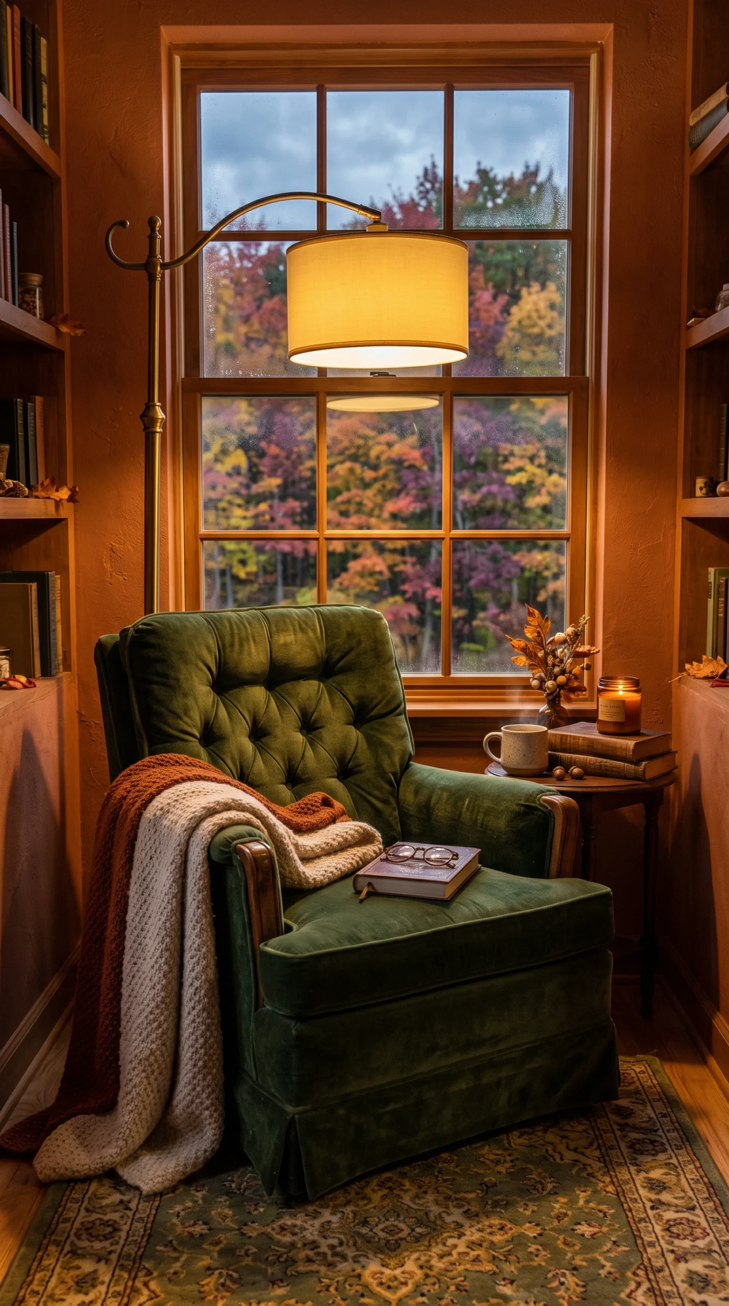
Finally, you can never separate your fall room color ideas from your lighting strategy. Deep, rich autumn colors (like olive green and burgundy) absorb a massive amount of light. If you do not adjust your lighting, these beautiful colors will look like black, depressing voids in the evening. You must rigorously utilize multiple, low-level warm light sources (like table lamps and heavy clusters of candles) placed directly next to your deep colors. The warm, 2700K light grazing across a chocolate brown or deep rust fabric will aggressively bring the color to life, highlighting its richness and making the entire room glow with an unparalleled, cozy autumn warmth.