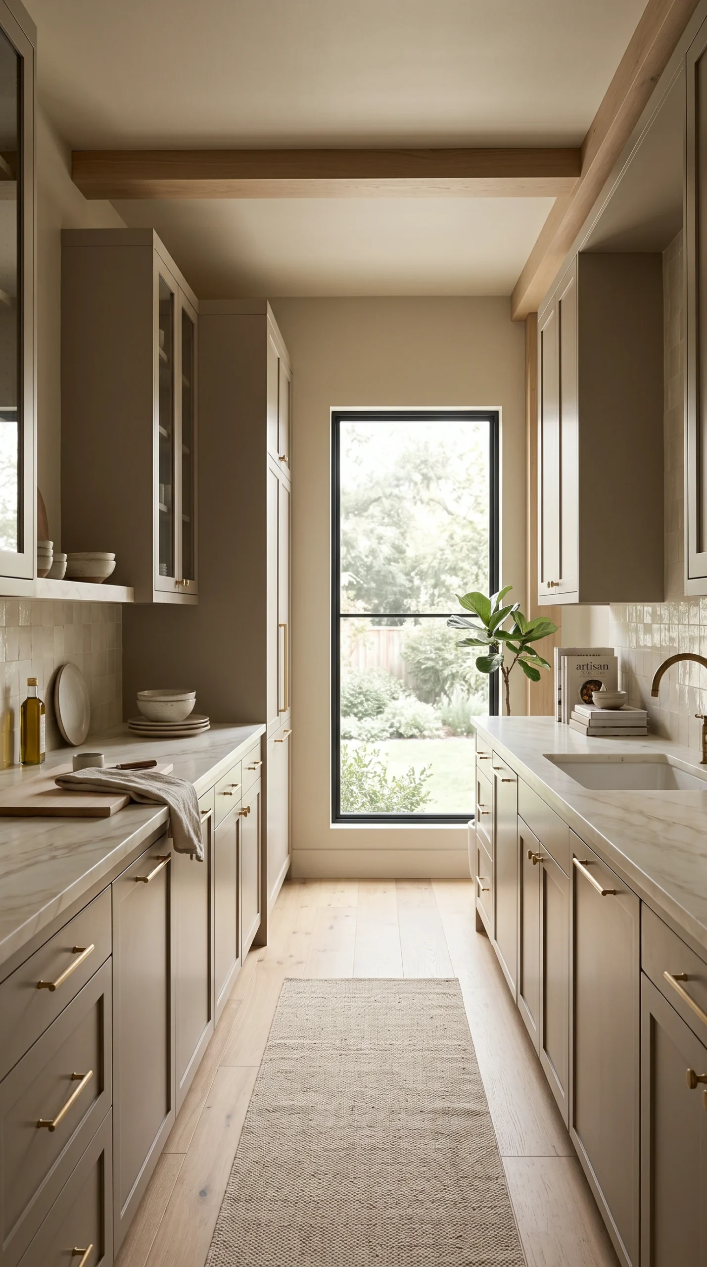
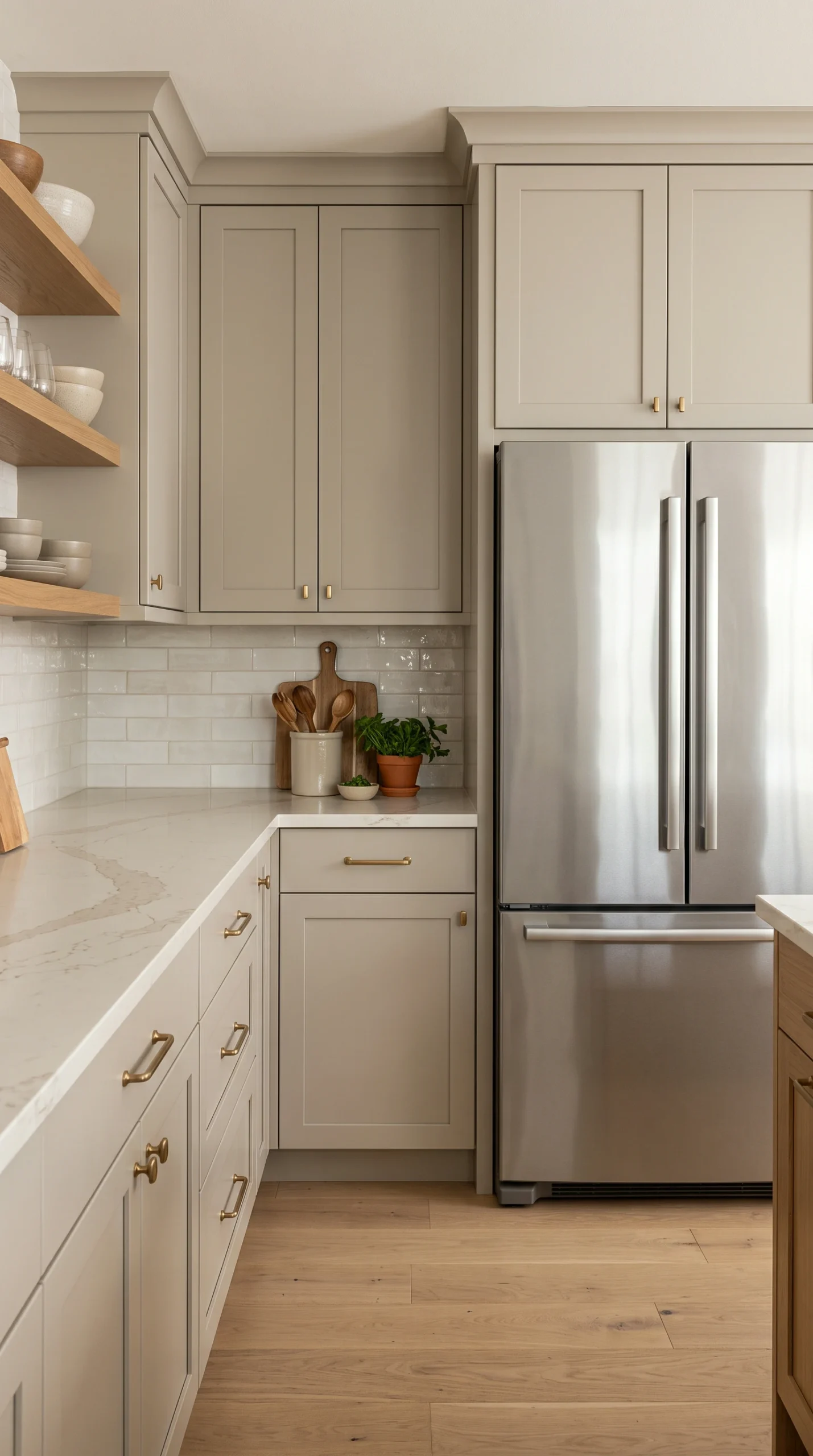
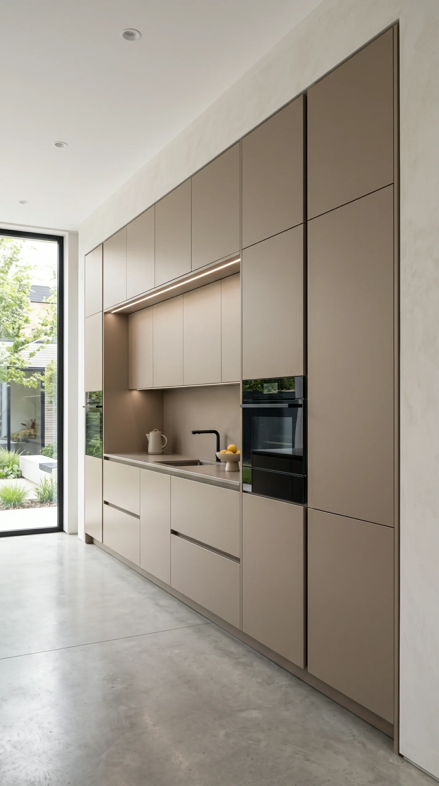
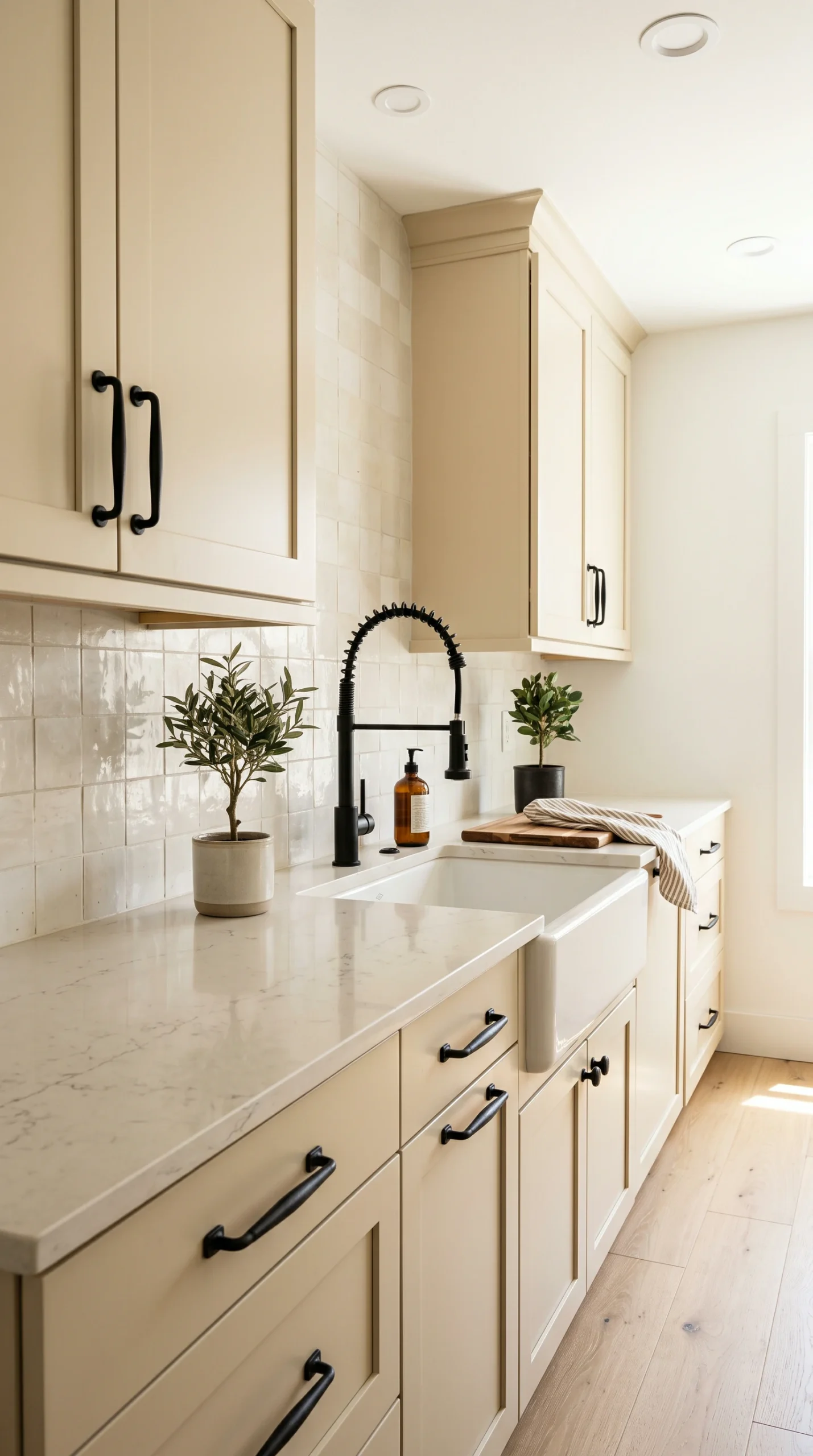
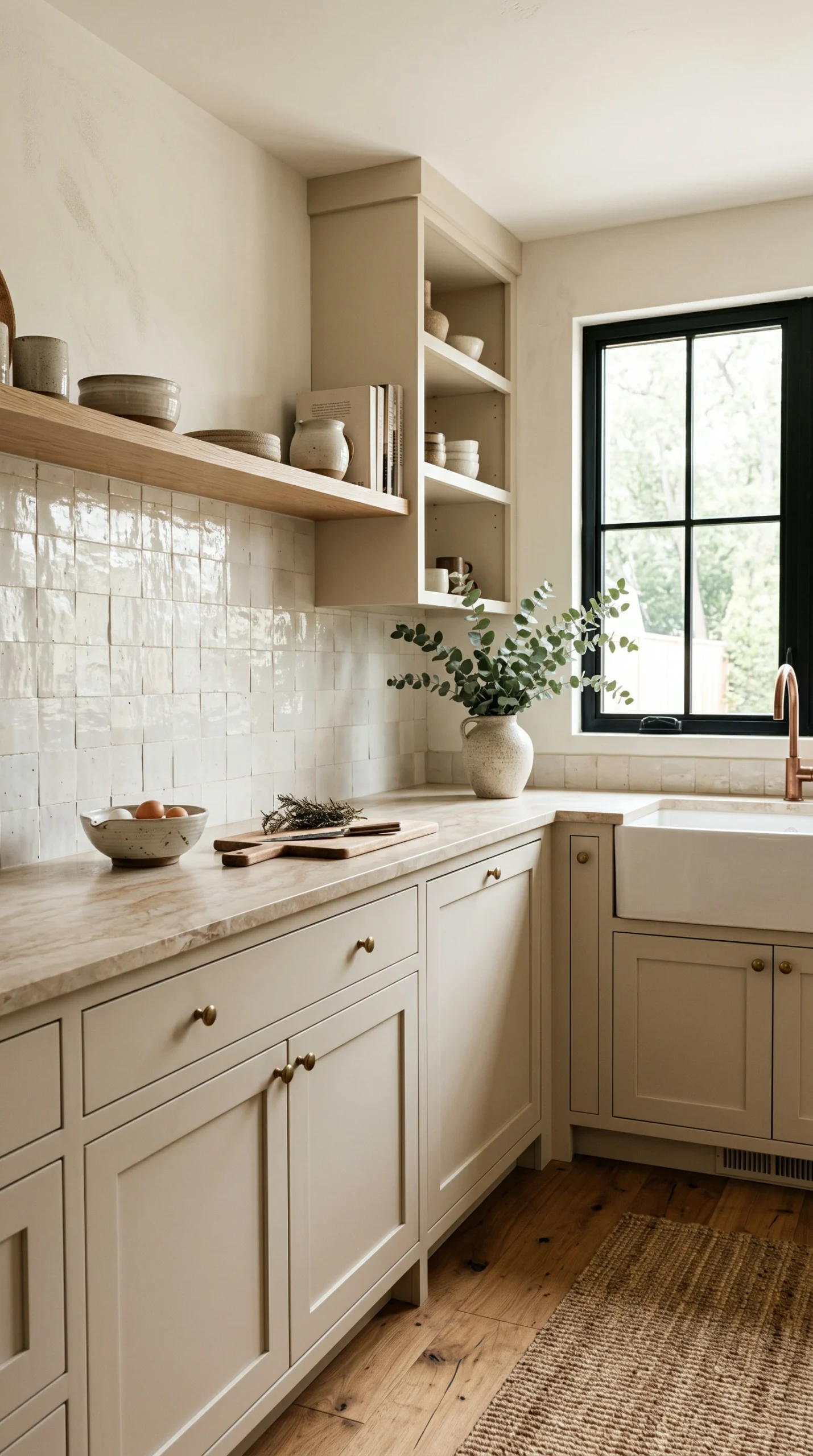
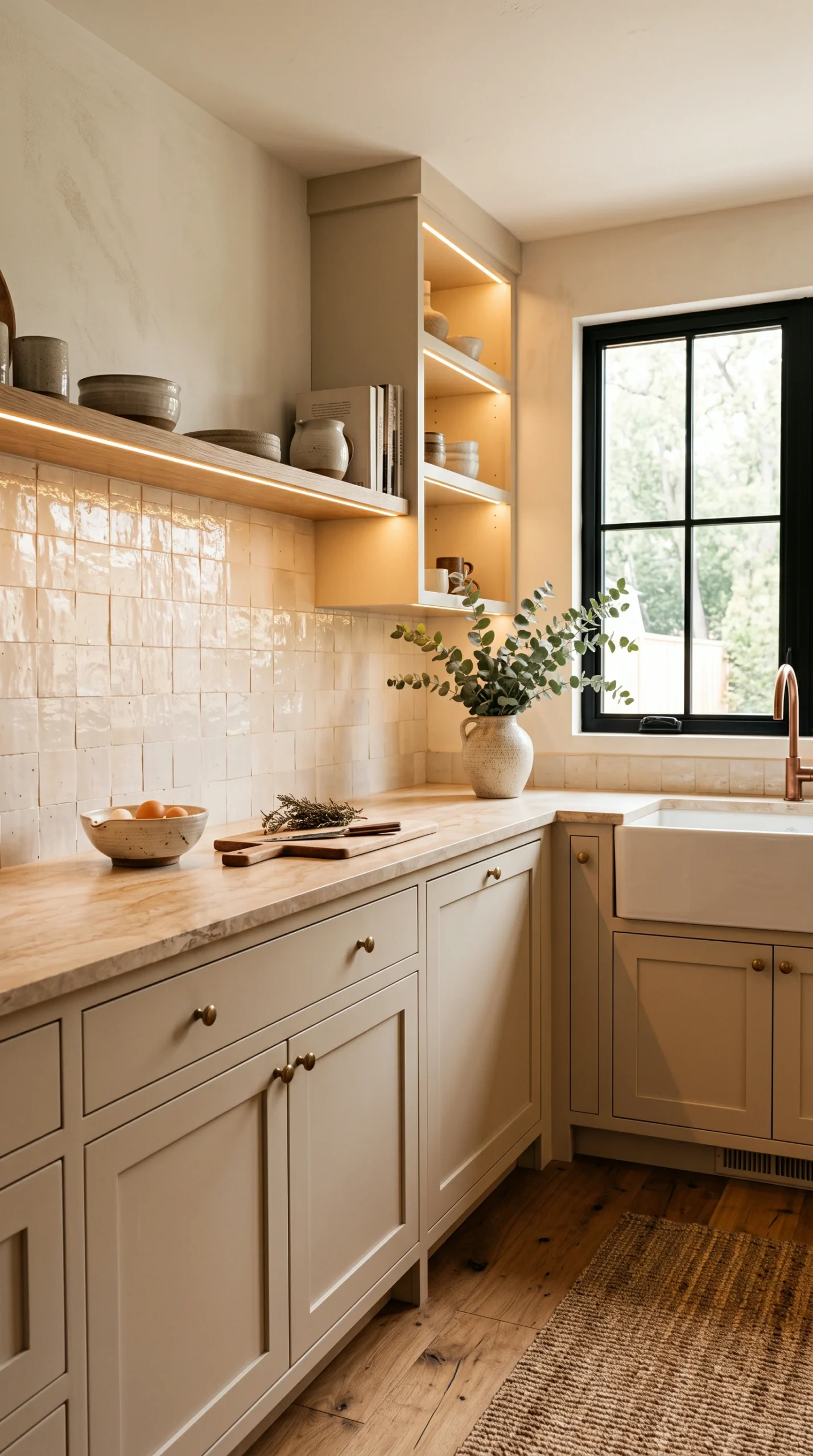
The best warm neutrals are 'greige'a perfect blend of cool gray and warm beige. This makes them incredibly versatile, acting as a bridge between warm wood floors and cool stainless steel appliances.
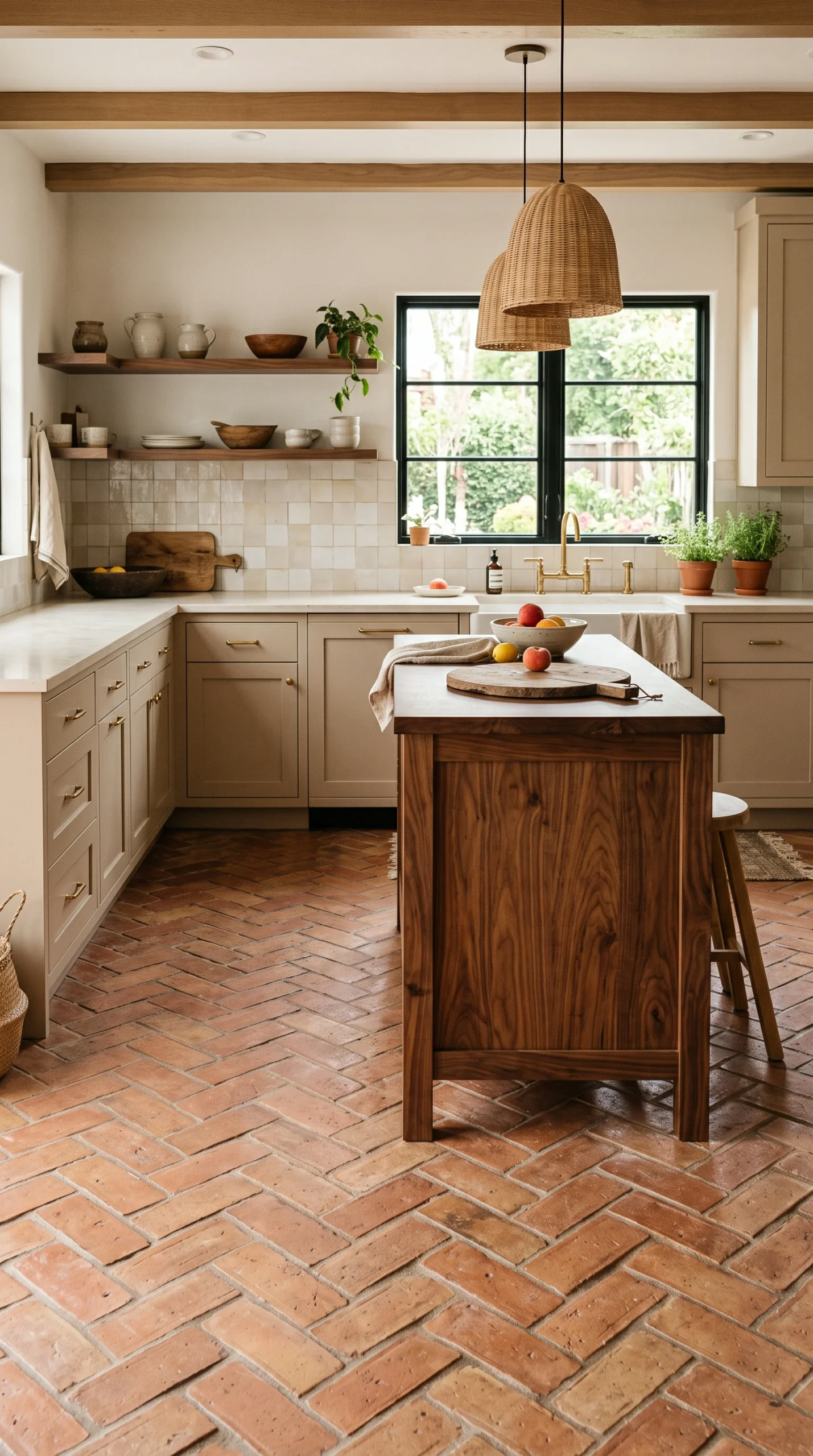
Warm neutrals sing when paired with natural wood tones. Incorporate white oak flooring or a walnut island to enhance the organic, earthy feel of the taupe or mushroom cabinetry.
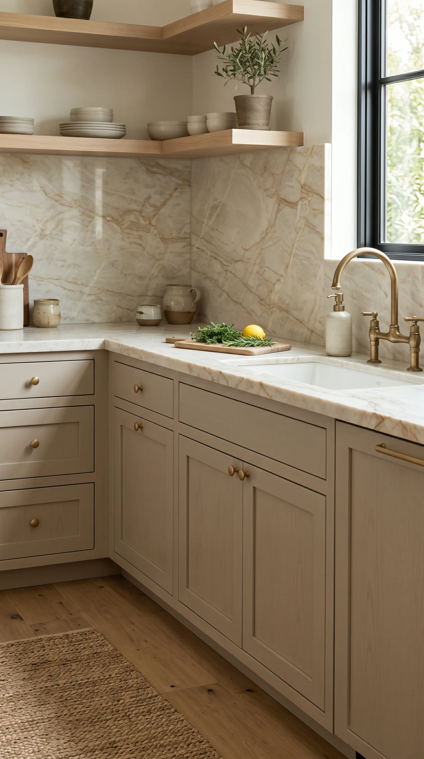
Pure, icy white quartz can look harsh and clinical next to warm, muddy cabinets. Choose a countertop with a slightly creamy base or warm gold/brown veining (like Taj Mahal quartzite) for harmony.
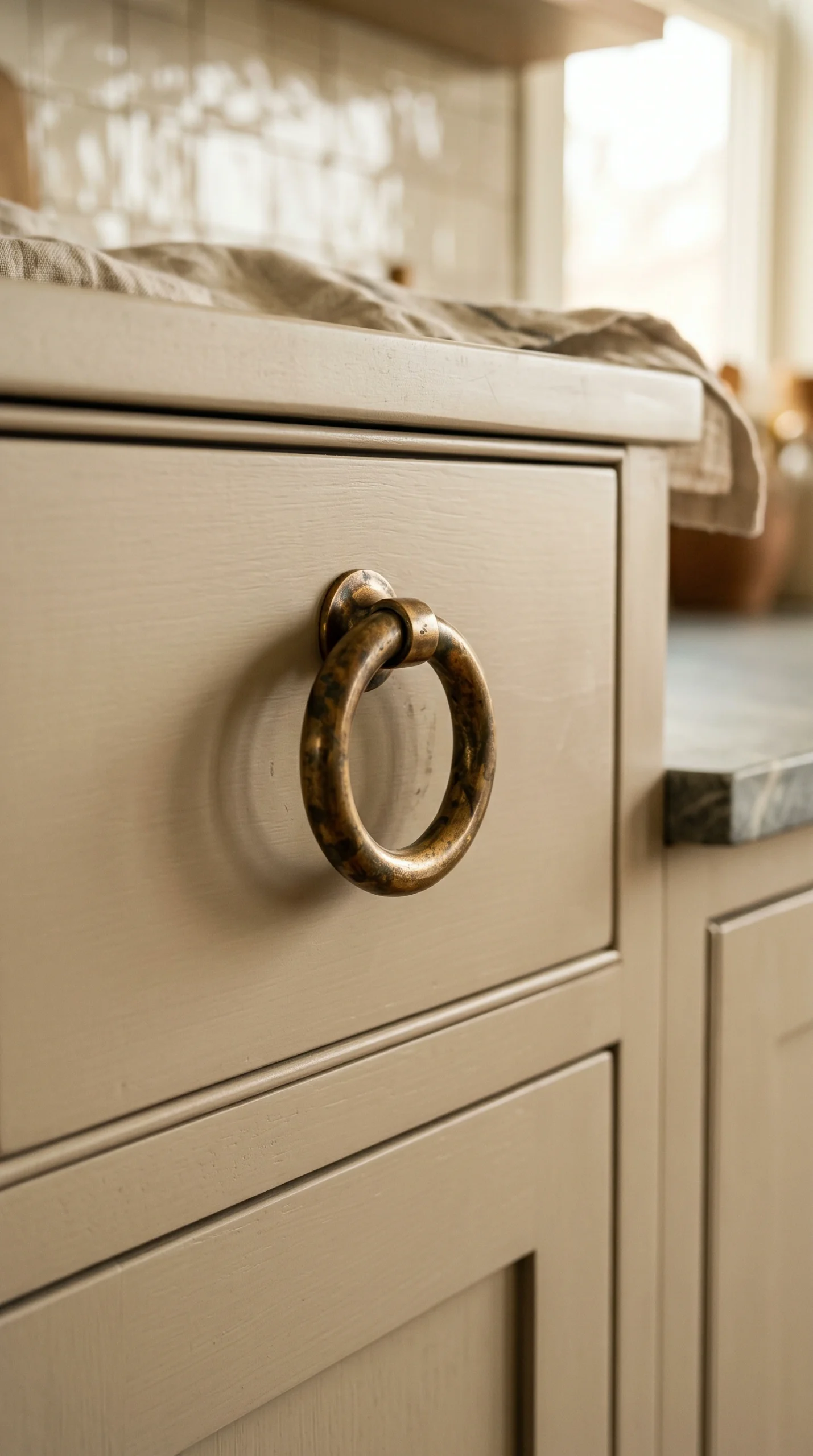
While polished nickel looks crisp, unlacquered brass or antique gold hardware enhances the historic, cozy warmth of neutral cabinets, adding a layer of sophisticated patina.
For a highly sophisticated look, paint the walls a slightly lighter version of the cabinet color. This 'tonal' approach wraps the room in warmth without creating jarring contrasts.
Neutral paints are notorious 'chameleons.' A taupe might look pink in morning light or green at night. You must paint large sample boards and test them in your specific kitchen lighting.
A definitive shift in neutral kitchen cabinet colors is the rise of ‘mushroom’ and ‘taupe’ cabinetry. Homeowners are actively seeking refuge from the cold, clinical feel of the all-white and stark gray kitchens that dominated the previous decade. Mushrooma complex, muddy blend of beige, gray, and sometimes a hint of greenprovides the perfect antidote. It offers the visual lightness required to keep a kitchen feeling expansive, but it introduces a profound, earthy warmth. This creates an atmosphere that is inherently cozy, relaxed, and deeply sophisticated. These warm neutrals act as a gentle backdrop, allowing the texture of the materials (rather than the shock of a bright color) to dictate the design narrative.
The power of neutral kitchen cabinet colors lies in their versatility, and ‘greige’ is the ultimate chameleon. Because it sits directly on the boundary between warm (beige) and cool (gray), it acts as a universal bridge within a kitchen’s material palette. A greige cabinet can comfortably sit next to a cool-toned stainless steel refrigerator without clashing, while simultaneously harmonizing beautifully with a warm, golden-oak hardwood floor. This flexibility makes warm neutrals an incredibly safe and enduring investment, as they allow homeowners to change out hardware, rugs, and decor over the years without ever needing to repaint the foundational cabinetry.
When executing a design using warm neutral kitchen cabinet colors, selecting the appropriate countertop is critical for maintaining harmony. Stark, pure white quartz or marbles with icy blue veins can look glaringly clinical and mismatched against soft, earthy cabinetry. Interior designers consistently recommend natural stones that possess inherent warmth. Taj Mahal quartzite, with its creamy base and soft taupe and gold veining, is arguably the most perfect pairing for mushroom cabinets. Similarly, a honed Crema Marfil marble or a warmly veined Calacatta Gold provides the necessary soft, organic texture that complements the cozy, grounded nature of the paint.
While warm neutral paint provides a cozy foundation, a kitchen composed entirely of painted surfaces can still feel somewhat flat. The most effective way to elevate neutral kitchen cabinet colors is by aggressively incorporating natural wood. This represents the ‘modern organic’ aesthetic at its finest. Introducing thick, floating shelves made of natural white oak, or constructing the central kitchen island from a rich, clear-finished walnut, provides essential visual friction. The natural grain of the wood breaks up the smooth, painted surfaces, adding a layer of tactile, organic warmth that is fundamental to creating a welcoming, high-end environment.
Hardware serves as the jewelry of the kitchen, and its finish can dramatically alter the mood of a neutral space. While polished chrome or nickel provides a very crisp, slightly more formal look against taupe cabinets, it can sometimes feel a bit chilly. To fully embrace the cozy potential of neutral kitchen cabinet colors, interior designers almost exclusively turn to warm metals. Unlacquered brass, which develops a beautiful, darkened patina over time, or a soft, brushed gold, looks spectacular against warm gray and beige tones. These warm metals glow subtly against the earthy paint, providing a luxurious, historically grounded finishing touch.
To create a truly enveloping, sophisticated atmosphere, consider the relationship between the cabinet color and the wall paint. Rather than defaulting to a stark white wall (which creates high contrast), a highly elegant approach is to use a ‘tonal’ palette. This involves painting the kitchen walls a color that is one or two shades lighter than the neutral kitchen cabinet colors. For example, if the cabinets are a medium mushroom, paint the walls a soft, warm ivory or a very pale putty. This low-contrast approach wraps the entire room in subtle warmth, creating a seamless, deeply calming environment that feels incredibly bespoke and thoughtfully designed.