Bookshelf Styling Mistakes to Avoid for a More Polished Look

A bookshelf is the most exposed structural element in a room, making it completely unforgiving to design errors. A single styling mistake can instantly downgrade a high end living room into a cluttered, chaotic storage space. This guide explores the most critical bookshelf styling mistakes to avoid when attempting to curate a polished, professional display. Discover why tiny knickknacks destroy visual flow, how improper visual weighting makes a shelf look unstable, and the devastating impact of ignoring negative space. Whether you are battling large built ins or a single floating shelf, these expert corrections will help you engineer a flawlessly sophisticated sanctuary.

Style Type

Professional Restraint / Tailored Modern

Budget

Accessible (Focuses entirely on editing and rearranging existing items)

Difficulty

Intermediate (Requires the strict editing of personal collections and strict adherence to scale)

Best For

Living Rooms, Home Libraries, Built In Units, Open Concept Spaces
Visual Inspiration

Correcting the Chaos

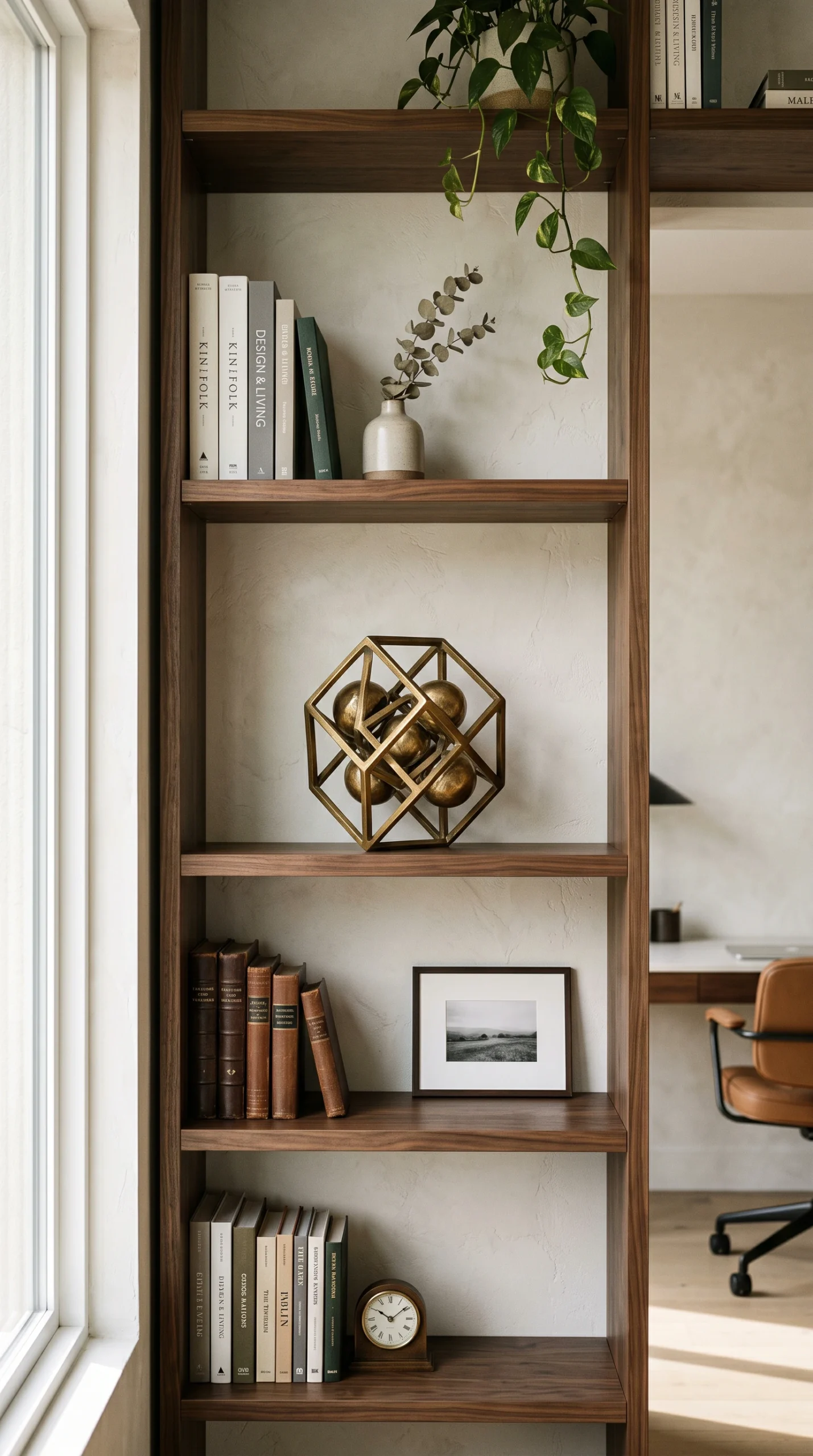
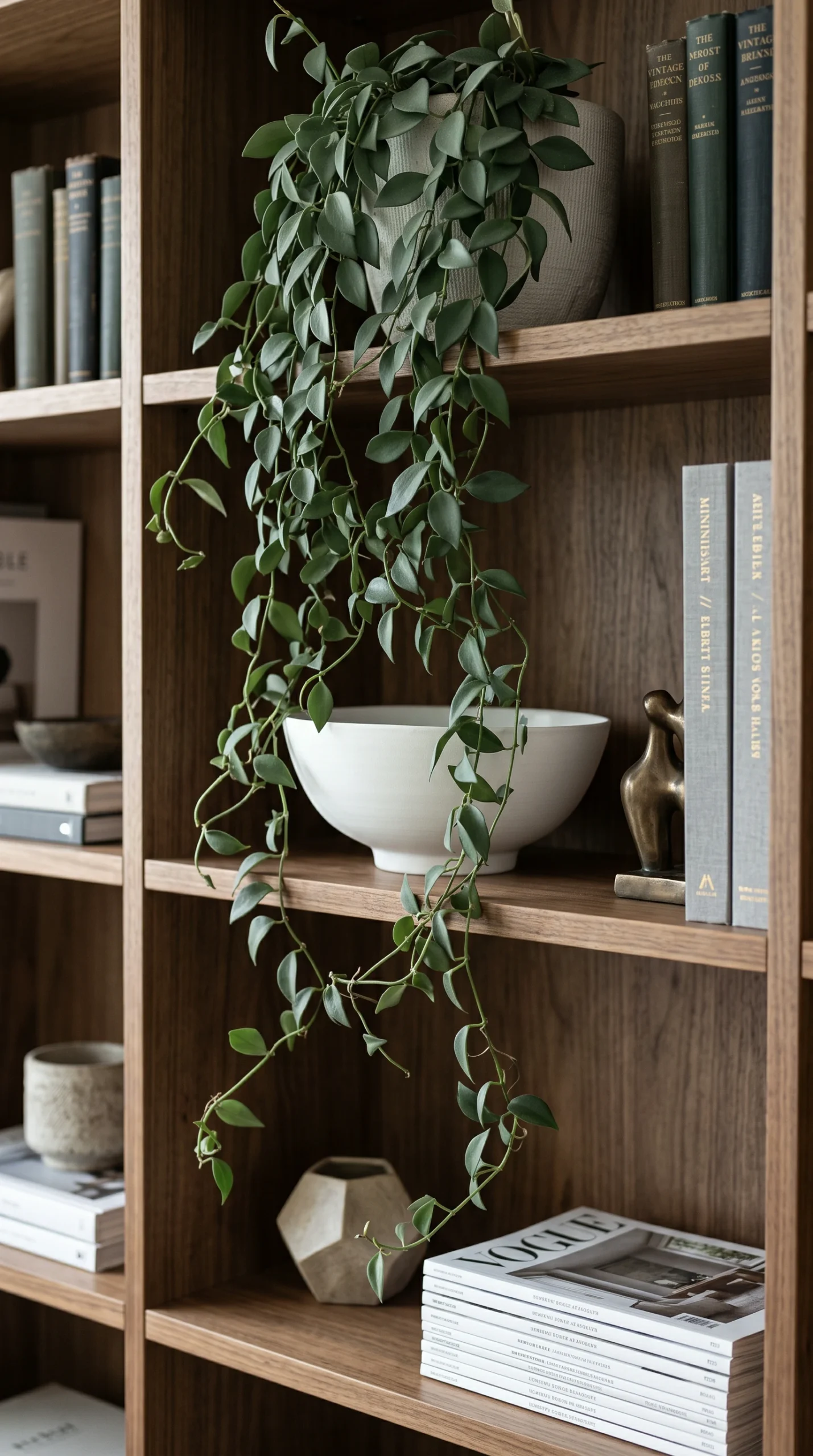
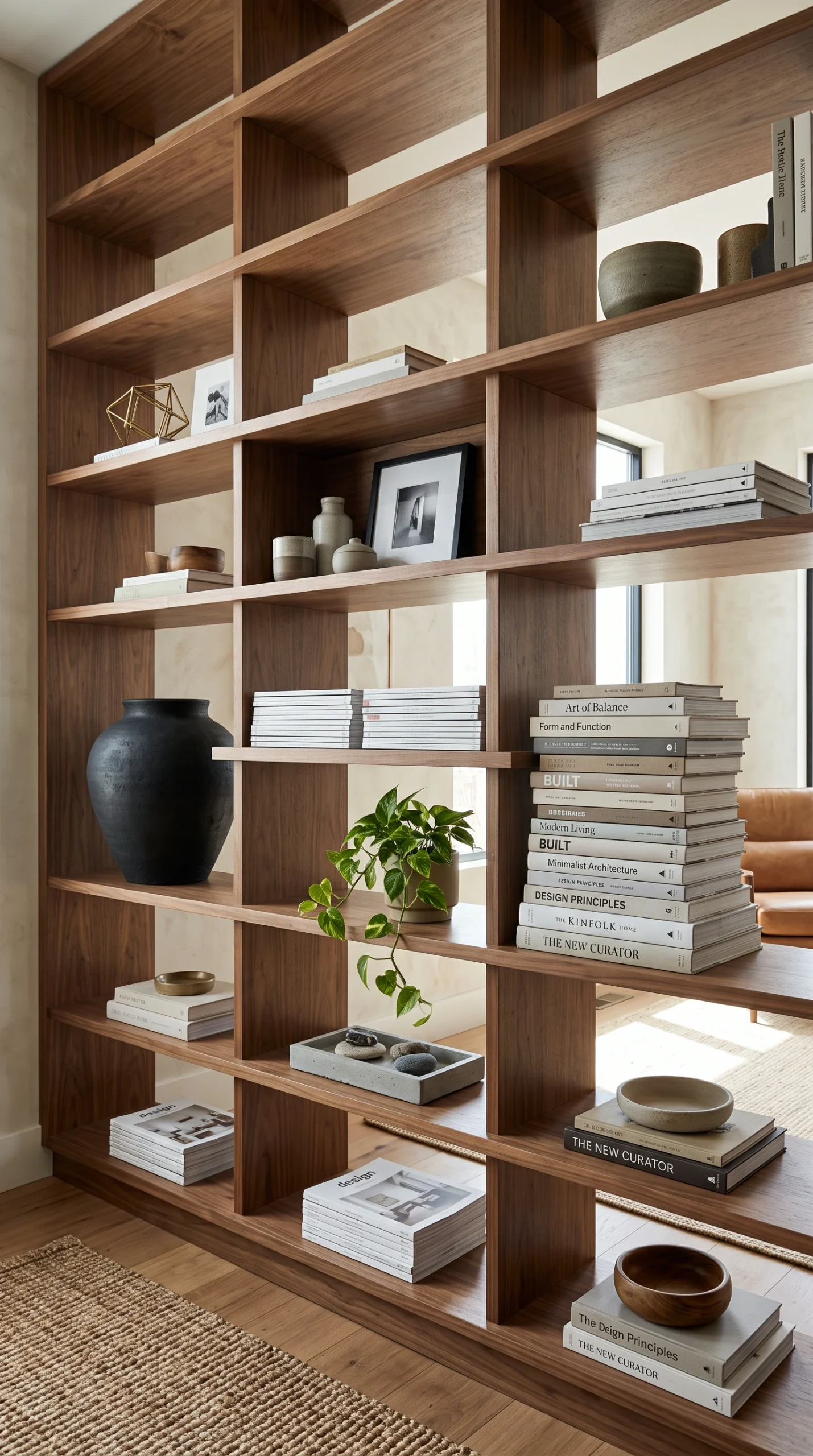
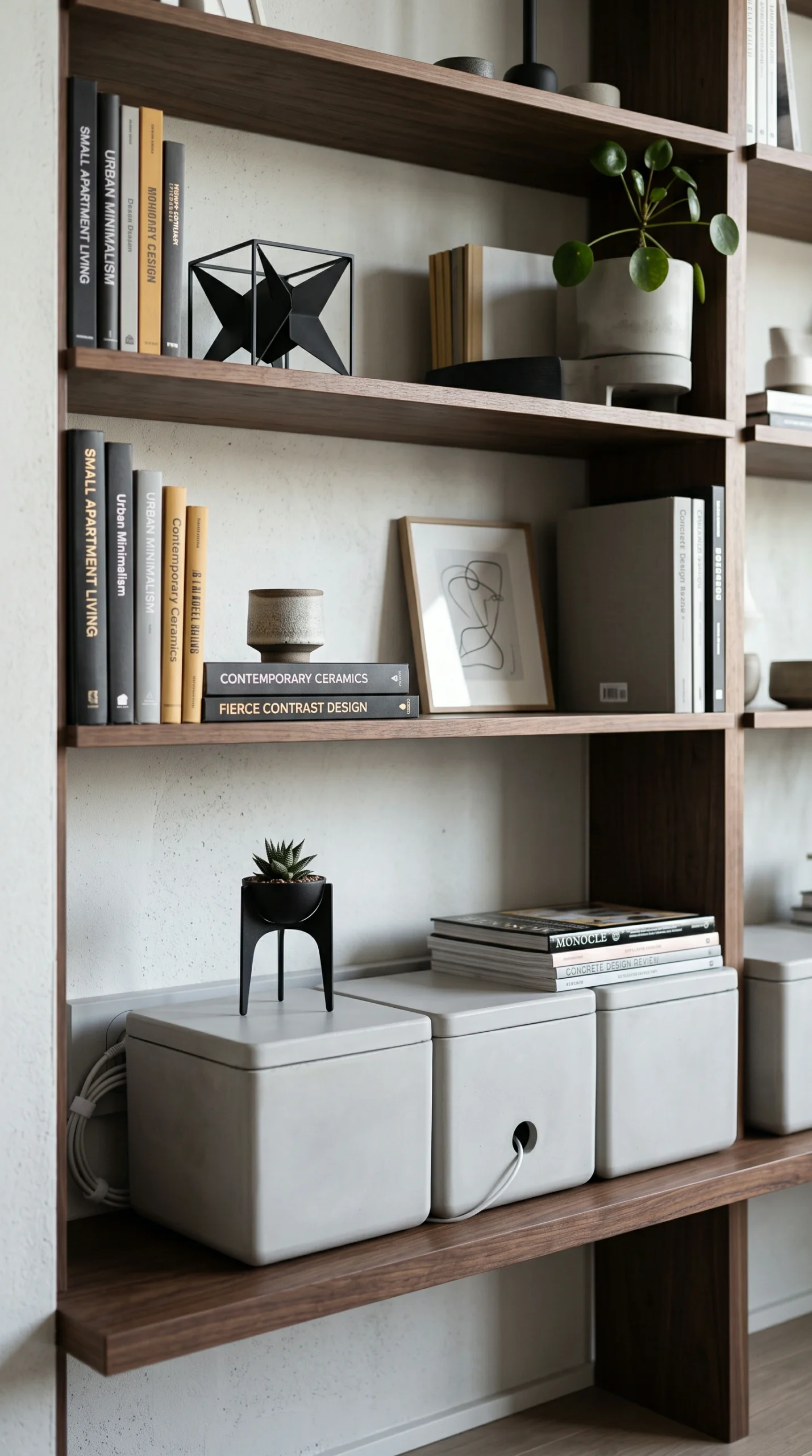
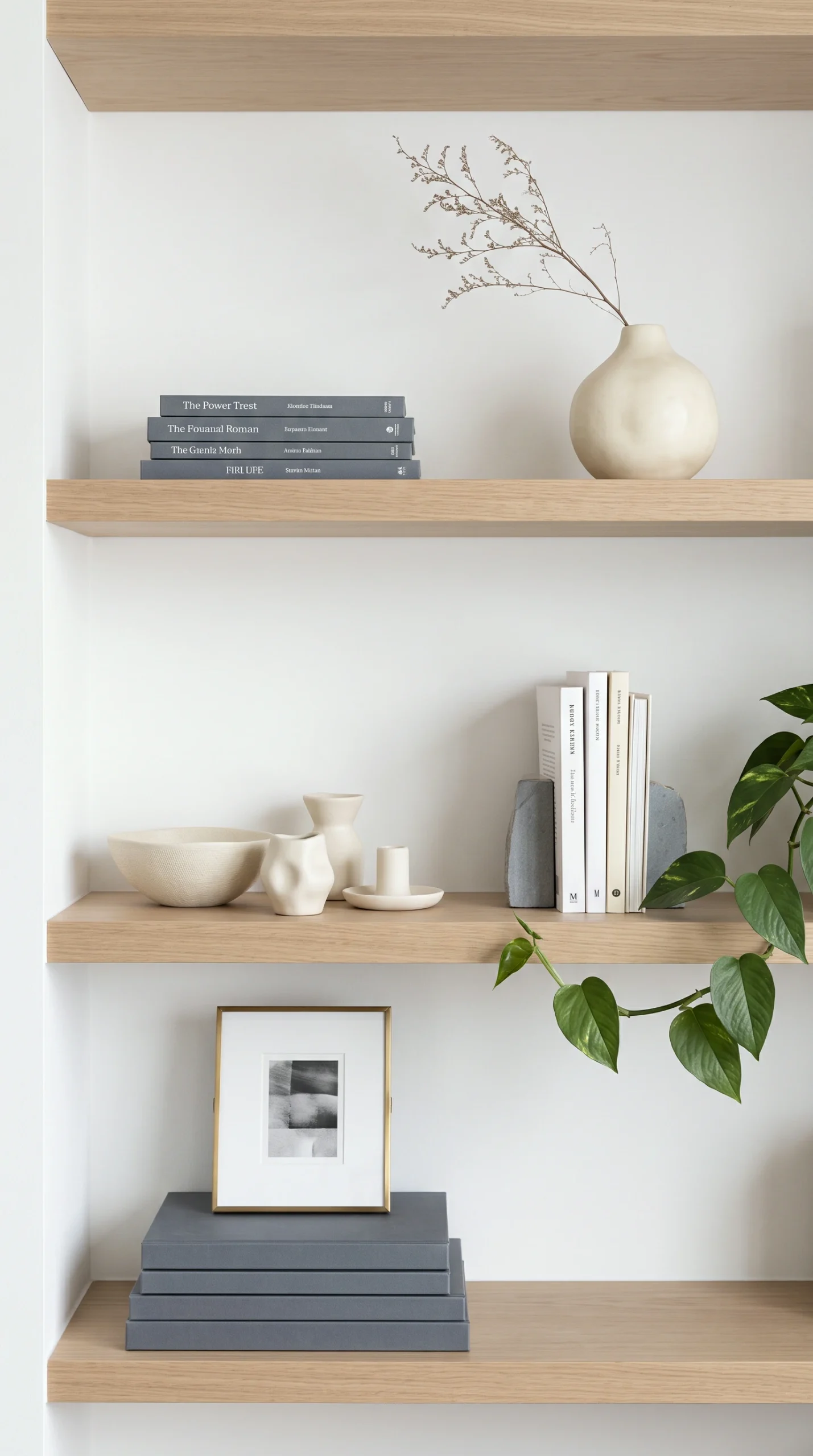
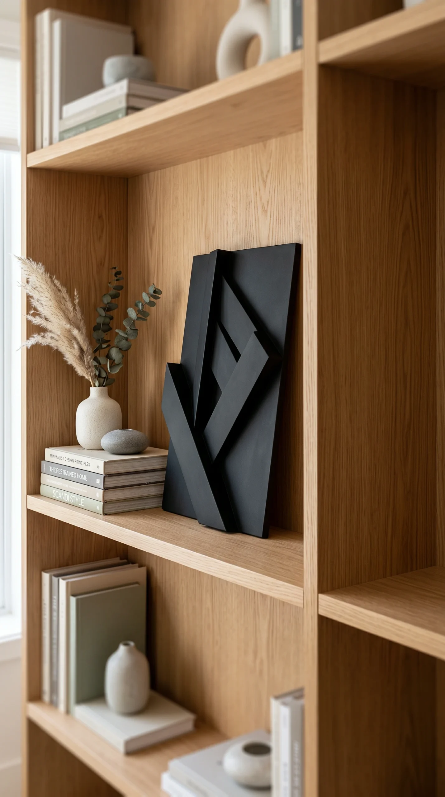
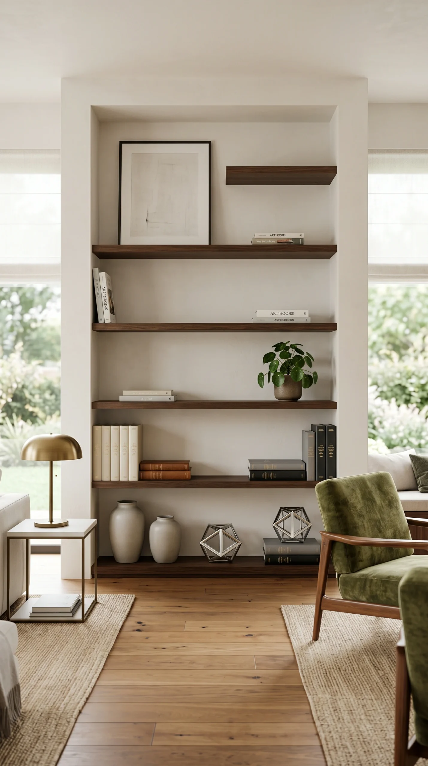
An inspiring visual gallery demonstrating the immediate impact of removing tiny clutter, grounding heavy objects on bottom shelves, and introducing large negative space to transform a messy bookshelf into a highly polished structural feature.
Color Palette

The Restrained Polish Palette

A strictly controlled, high contrast collection of deep slate greys, crisp optical whites, and warm natural woods designed to eliminate visual noise and correct chaotic styling errors instantly.

Deep Slate Grey

#2B2B2B

Optical White

#FDFDFD

Warm Natural Wood

#8B7355

Matte Black

#1A1A1A

Soft Concrete

#D3D3D3

Raw Plaster

#EAE0C8

Muted Forest

#4A6B5D

Creamy Alabaster

#F5F5DC

Antique Brass

#D4AF37

Ash Grey

#A9A9A9

Design Guide

Rules for Polished Correction

Execute these strict spatial planning rules to immediately correct common bookshelf styling mistakes and ensure your shelves look intentionally curated.

The Knickknack Ban

The most devastating mistake is filling a shelf with dozens of tiny, disparate objects. Remove all small items immediately and replace them with a single, large Raw Plaster bowl or structural sculpture.

Top Heavy Instability

Never place your heaviest visual items on the top shelves. Move large art books, heavy wooden boxes, and dark ceramics to the absolute bottom shelves to ground the unit and fix top heavy instability.

The Monotony of Verticals

Sticking all your books upright in a straight line looks like a sterile library. Break the monotony instantly by turning half of the books into flat, horizontal stacks to serve as decorative pedestals.

Ignoring Negative Space

Packing a shelf end to end is a catastrophic error. You must force yourself to leave at least one third of every shelf completely bare. This empty space is what makes the styling look expensive.

Glossy Dust Jackets

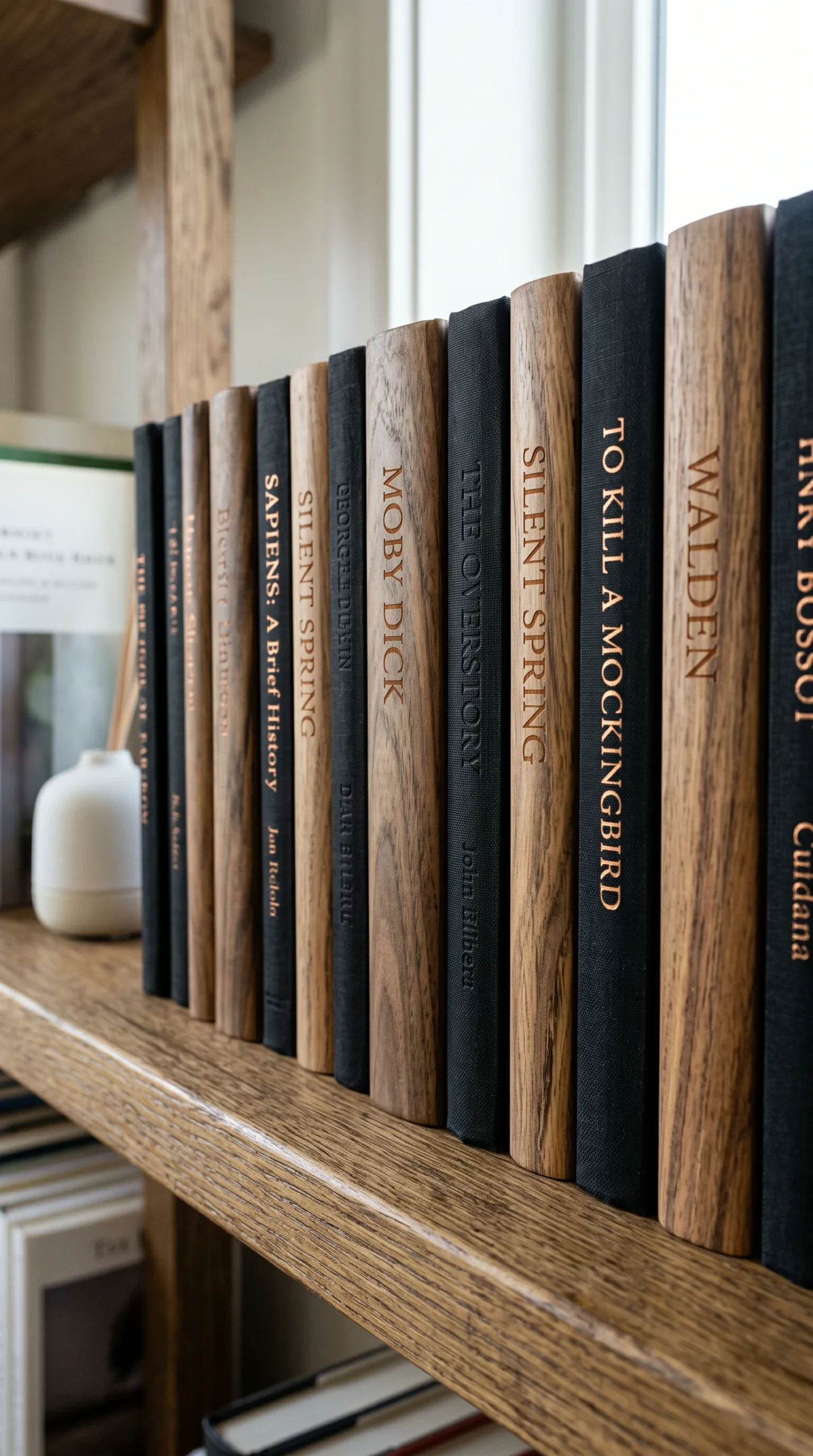
Shiny, ripped, or chaotic dust jackets create immense visual noise. Remove them to reveal the solid, highly textured cloth hardcovers underneath, instantly unifying the entire collection.

The Symmetrical Trap

Do not perfectly mirror the left and right sides of a shelf. Symmetrical styling looks incredibly rigid and amateur. Use asymmetrical balance—placing a heavy object on the left and a dense stack of books on the right.

The Complete Guide

The Complete Guide to Polished Shelving

Styling a bookshelf is an exercise in extreme visual restraint. It is incredibly easy to fall into the trap of using open shelves as a dumping ground for every photo frame, souvenir, and paperback book you own. When this happens, the entire room feels instantly suffocating.

A successful shelf display is not about showing off your belongings; it is a carefully crafted exhibition of form, negative space, and structural balance. The most brilliant shelf decor tips rely on a strict editing process, an obsession with large and solid scale, and a philosophy of collected luxury. By identifying and correcting the most common styling mistakes, you can transform a chaotic storage unit into a deeply serene, breathtakingly polished focal point.

Eradicating Visual Clutter (Featuring Bookshelf Styling Mistakes)

When evaluating your bookshelf decorating ideas, you must become ruthless in your editing. The absolute most common and destructive mistake in shelf styling is the accumulation of tiny objects. A collection of small picture frames, tiny figurines, and delicate glass vases creates intense visual noise.

From across the room, these small items blur together to look like garbage. You must eradicate them completely. Replace clusters of tiny objects with single, large and solid pieces.

A large Soft Concrete bowl or an oversized piece of leaning art carries immense visual weight and commands the space with authority. If you must display smaller items, group them strictly in odd numbers (the rule of threes) and elevate them by placing them on top of a horizontal stack of books.

Correcting Top-Heavy Imbalance

The structural integrity of a bookshelf is entirely visual. A large mistake homeowners make is placing heavy objects on the top shelves. When you place a dark, thick stack of books or a large Deep Slate Grey vase near the ceiling, the entire shelving unit looks incredibly top heavy and precariously unbalanced.

You must correct the visual gravity of the display. Strip the shelves and begin again at the floor. Place your heaviest visual anchors—large woven baskets, thick art books, and large wooden boxes—on the absolute bottom twenty percent of the shelves.

This physically grounds the architecture. As you move up the shelves, the objects must become lighter in color and more delicate in scale, allowing the unit to feel airy and expansive near the ceiling.

Embracing the Power of the Void

The final and most difficult mistake to correct is the fear of empty space. The human instinct is to fill every single inch of a horizontal surface. Packing a shelf end to end with books leaves the eye nowhere to rest, creating a feeling of claustrophobia in the room.

You must actively engineer negative space. Empty space is the ultimate luxury in interior design. Aim to leave at least one third of every single shelf completely bare.

If a shelf feels too busy, immediately remove half the items. By ensuring that your scale is large and solid, your visual weight is anchored at the base, and your negative space is protected, your shelves will transform into a highly polished, high end sanctuary.
Where It Works Best

Optimized Polished Zones

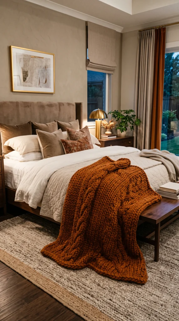
The principles of large and solid scale, bottom heavy anchoring, and strict negative space can correct the styling of any open concept shelving unit.
FAQS

Frequently Asked Questions

Expert tips on correcting shelf decor mistakes, mastering negative space, and achieving a flawlessly polished bookshelf display.
It is likely filled with too many tiny objects. A collection of small knickknacks always reads as clutter. Remove them immediately and replace them with a few large, large and solid accessories to polish the look.
You must leave at least one third of every shelf completely empty. This negative space is a crucial design element that allows the eye to rest and makes the pieces you do display look expensive.
Yes. Sticking all books upright creates a rigid, boring library aesthetic. Break the monotony by turning some books into flat, horizontal stacks to serve as decorative pedestals for your accessories.
You have likely placed heavy visual items on the top shelves. Always place your darkest, thickest books and heaviest accessories on the absolute bottom shelves to visually ground the entire unit.
Removing them is a classic designer trick. Glossy, chaotic dust jackets create intense visual noise. Removing them reveals the highly textured, solid cloth covers underneath, which instantly unifies the display.
Yes, perfectly mirroring the left and right sides of a shelf looks incredibly amateur and rigid. Aim for asymmetrical balance—place a heavy object on the left and balance it with a dense stack of books on the right.
Do not scatter dozens of tiny frames across the shelves. Print a few select photos in black and white, place them in identically sized, high quality matte frames, and group them intentionally in one area.
No, this flattens the display completely. You must layer your objects. Lean art against the back wall, place books in the middle ground, and position small accessories in the very front to create large visual depth.
Unconcealed functional clutter like internet routers, loose cables, or stacks of mail. These must be completely hidden inside solid wooden boxes or dark woven baskets on the lower shelves.
Step back across the room. If your eye darts around frantically, the shelf is too busy. Remove items until your eye can glide smoothly across the display, resting easily on the pockets of negative space.
Recent Inspiration

Discover More Home Decor Ideas

Explore the latest interior design trends, decorating inspiration, and beautifully curated spaces to spark new ideas for every room in your home.
Fall Bedroom Decor Ideas for a Cozy Autumn Retreat

Transform your sleeping space into a warm sanctuary with the best fall bedroom decor ideas.…
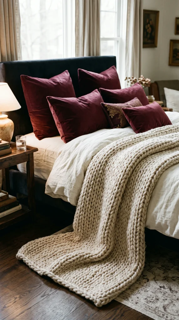
Cozy Fall Bedroom Ideas with Warm Colors and Soft Textures

Create the ultimate autumn retreat with cozy fall bedroom ideas. Discover how to effortlessly blend…
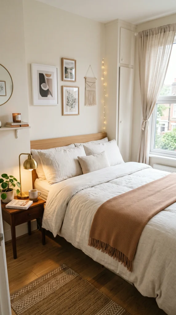
Small Fall Bedroom Ideas That Make Your Space Feel Cozy

Maximize comfort in tight spaces with the best small fall bedroom ideas. Discover space-saving tips,…
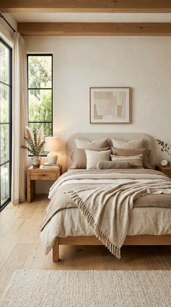
Neutral Fall Bedroom Decor Ideas for a Modern Cozy Look

Achieve a sophisticated aesthetic with neutral fall bedroom decor ideas. Explore how to use warm…
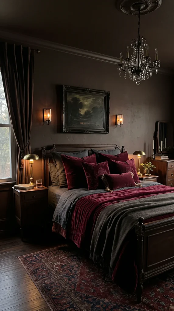
Fall Bedroom Color Ideas to Create a Warm Autumn Aesthetic

Transform your room with expert fall bedroom color ideas. Discover the best autumn bedroom colors,…
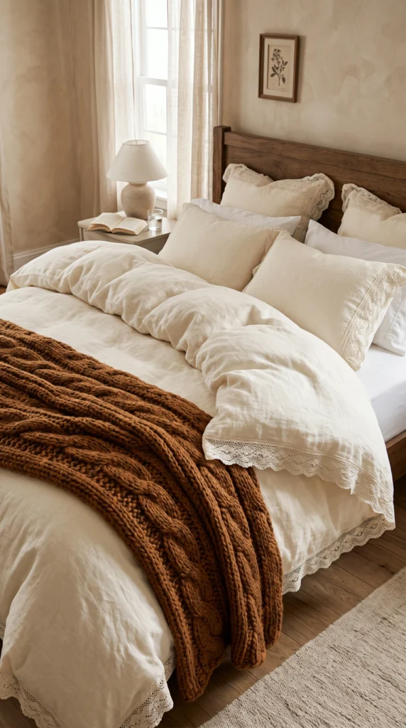
Fall Bedroom Bedding Ideas for the Coziest Autumn Look

Master the art of bed layering with the best fall bedroom bedding ideas. Discover cozy…

✦ Showome

Welcome! Please enter your details to chat with our interior designer.