#1C2841
#8B0000
#F5F5DC
#2B2B2B
#E6D5C3
#FDFDFD
#D4AF37
#4A6B5D
#1A1A1A
#D2B48C
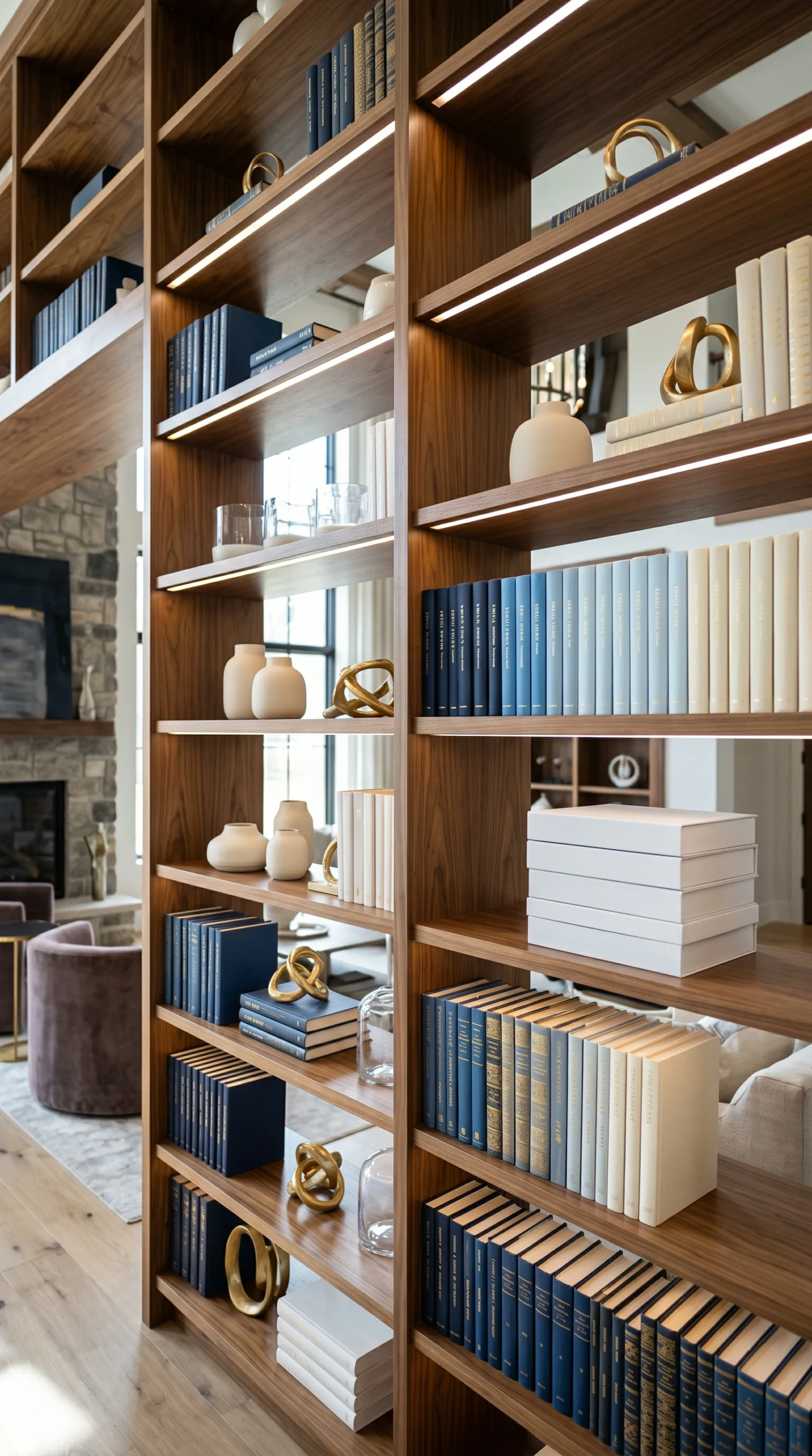
Instead of harsh blocks of color, arrange your books in a smooth gradient. Transition from dark Midnight Navy to light blue, then into Creamy Alabaster. This technique softens the display and creates a highly sophisticated, flowing installation.
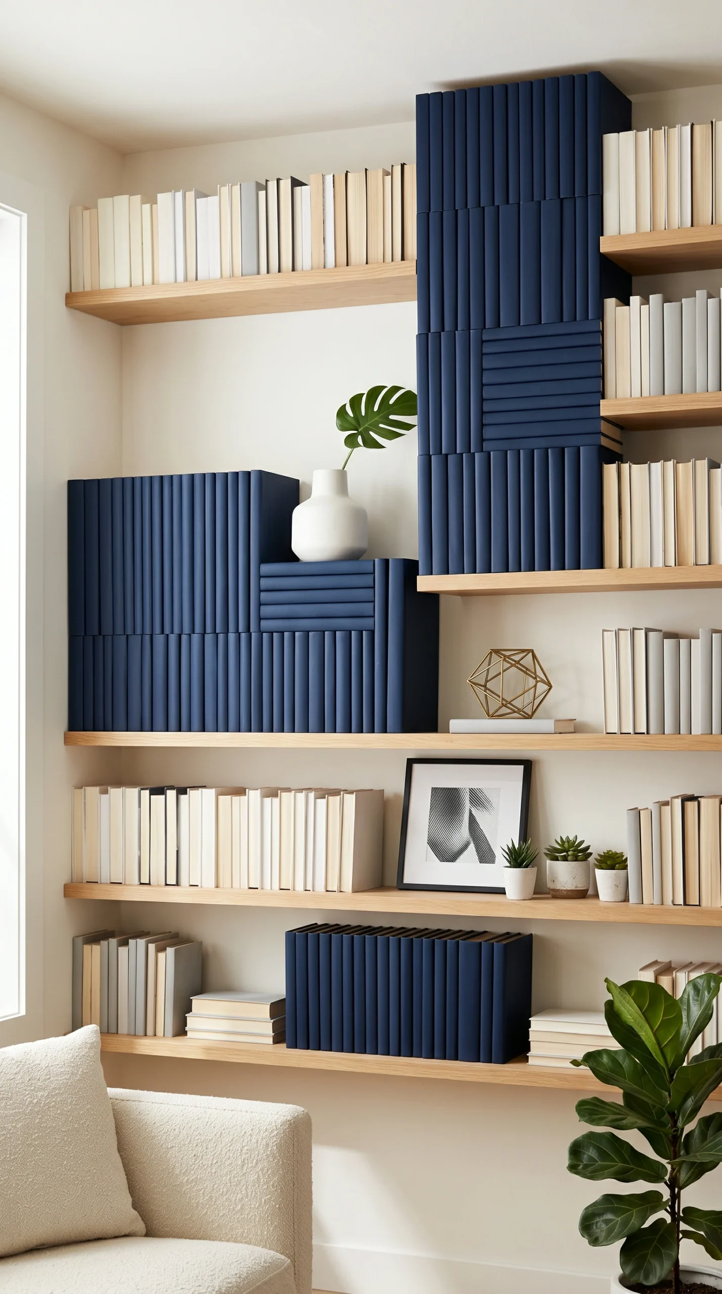
For a bold, contemporary look, isolate colors completely. Dedicate one entire shelf strictly to Deep Crimson spines, and the shelf below it strictly to Charcoal Slate spines. This creates intense, structural stripes of color.
A large wall of pure color can be overwhelming. You must break up the books with neutral accessories. Insert a stack of Optical White books or a large Raw Plaster ceramic vase to provide essential visual relief.
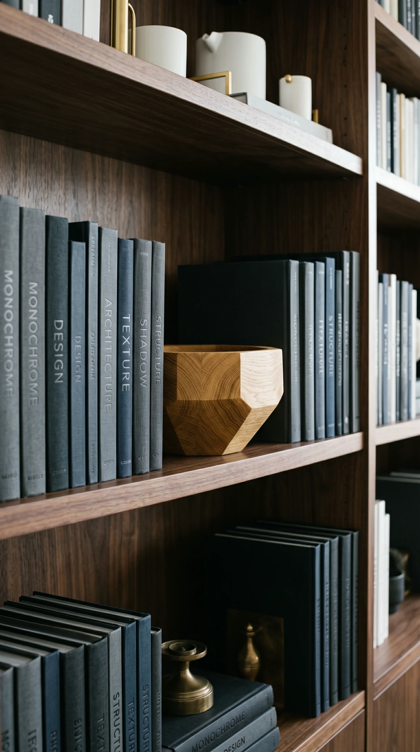
You cannot achieve perfect color coordination with glossy, chaotic dust jackets. Remove them to reveal the solid, textured cloth hardcovers beneath. This instantly elevates the sophistication of the entire collection.
If you have a large section of dark books, place them on the bottom shelves. Placing heavy black or navy blocks on the top shelves makes the unit look top heavy and precariously unbalanced.
If you are transitioning between two clashing colors, such as red and green, use a stack of white or light grey books as a buffer zone. This prevents the colors from vibrating against each other and keeps the transition smooth.
Organizing a large book collection is a daunting task. While organizing alphabetically is functionally superior, it is aesthetically disastrous. The random distribution of bright red, neon yellow, and stark black spines creates an unrelenting visual noise that dominates the room.
A successful color coordinated display is an exercise in chromatic control. The most brilliant decorative bookshelves rely on a rigorous sorting process, an obsession with gradient flow, and a philosophy of structural impact. By treating your book collection as a large, interactive painting rather than a filing system, you can engineer a deeply serene, breathtakingly organized focal point.
When drafting your color-coordinated bookshelf ideas, the most sophisticated technique you can employ is the ombre fade. This method completely eliminates the harsh, rainbow-like stripes that can make a shelf look juvenile. You must begin by stripping every single book of its dust jacket.
Sort the naked hardcovers into broad color families on your floor. Begin on the top left shelf with your lightest colors—the optical whites and creamy alabasters. Slowly transition across the shelf into soft yellows, then pale greens.
As you move down the shelving unit, the colors must deepen. The bottom shelves should house your heaviest visual weights: the deep navy blues, forest greens, and charcoal slates. This cascading waterfall of color draws the eye fluidly down the unit, creating an incredibly calming, highly organized structural installation.
If your interior design style leans heavily modern or contemporary, the ombre fade may feel too soft. Instead, you must execute harsh color blocking. This technique treats books as structural building blocks of pure color.
Dedicate distinct sections of the shelving unit to a single hue. Fill the entire top right cubby strictly with Deep Crimson spines, and the cubby directly below it with Matte Black spines. To prevent this from looking chaotic, you must introduce intense negative space and neutral interruptions.
If an entire shelf is blue, break it perfectly in the center with a large, Optical White ceramic bowl. This stark neutral object forces the eye to pause, providing crucial visual relief from the intense block of color.
The final layer of your layout planning involves the strict management of visual weight. Color has weight. A large block of dark books looks physically heavier than a block of light books.
You must never place your dark color blocks on the top shelves. If a cluster of Midnight Navy and Charcoal Slate books sits at the ceiling, the entire built in unit will feel precariously top heavy and oppressive. You must anchor the bottom twenty percent of the shelves with your darkest colors.
This grounds the architecture. Furthermore, distribute your warm metallic accents purposefully. A sleek Warm Brass bookend placed against a block of deep navy books creates intense, luxurious contrast.
By ensuring that your gradients are smooth, your neutral interruptions are scaled perfectly, and your dark colors remain grounded, your chaotic library will transform into a highly organized, high end sanctuary.
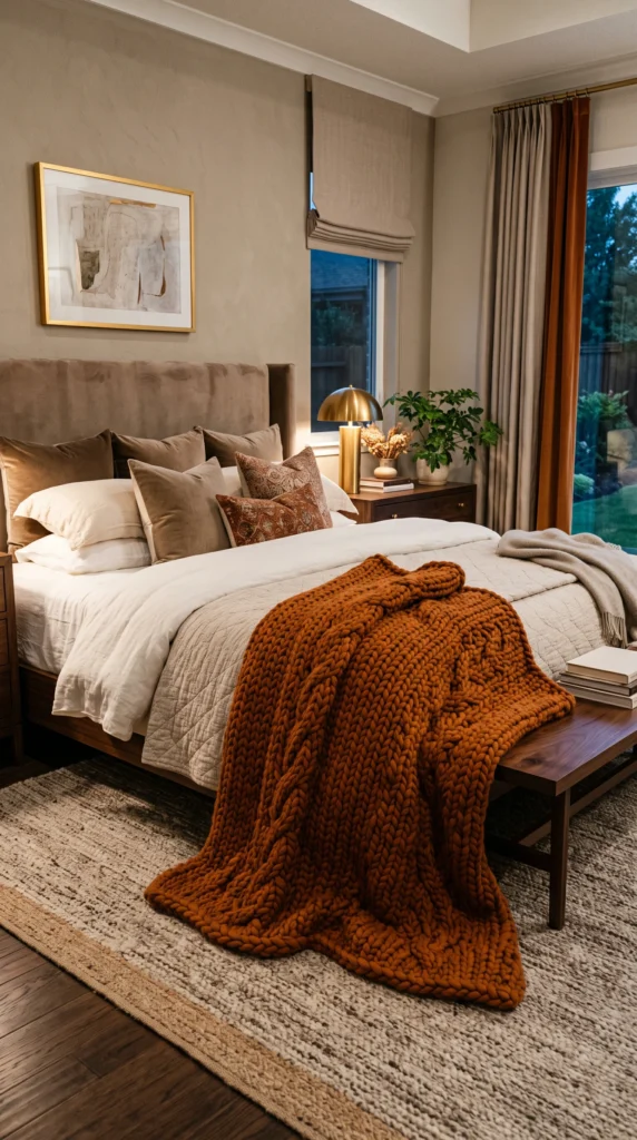
Transform your sleeping space into a warm sanctuary with the best fall bedroom decor ideas.…
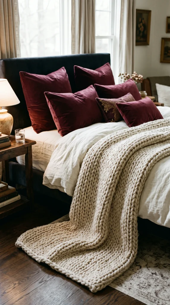
Create the ultimate autumn retreat with cozy fall bedroom ideas. Discover how to effortlessly blend…
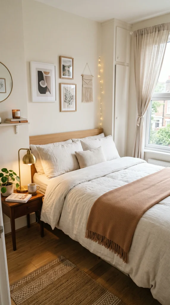
Maximize comfort in tight spaces with the best small fall bedroom ideas. Discover space-saving tips,…
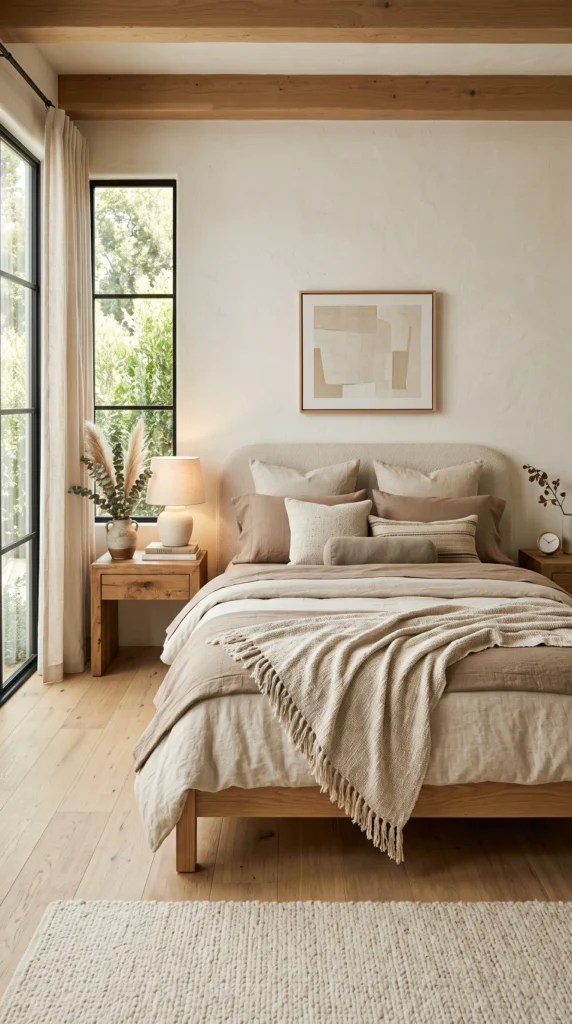
Achieve a sophisticated aesthetic with neutral fall bedroom decor ideas. Explore how to use warm…
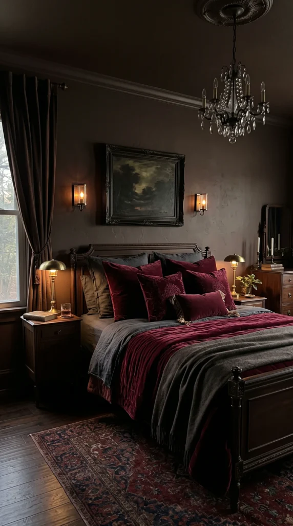
Transform your room with expert fall bedroom color ideas. Discover the best autumn bedroom colors,…
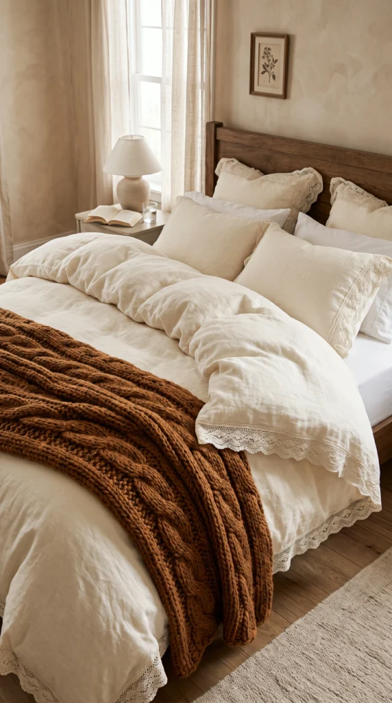
Master the art of bed layering with the best fall bedroom bedding ideas. Discover cozy…
Welcome! Please enter your details to chat with our interior designer.